 No it’s not the infamous
 fish bird shirt, but Ann Romney’s bold pattern choice for her appearance with her husband Mitt Romney on the Today Show this morning is a great lesson for all of us in fashion and about how much contrast is okay to wear in the prints we choose.
Aside from the fact that optic prints like the one she is wearing is generally a no-no for television because they jump a lot on the screen, when choosing prints, once must consider their own personal coloring to decide just how much bold contrast is acceptable to wear. So, let’s all learn from from Ann Romney’s mistake, shall we?
Using photos directly from my book Style Rx: Dressing the Body You Have to Create the Body You Want below, I am going to teach you all you need to know about choosing the right prints for you.
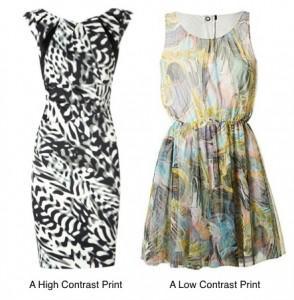
Print Intensity – Combining two colors together in a print creates a contrast between those two colors. For example, if those two colors are extreme opposites (like black and white) you have created a high amount contrast, which gives the print a high level of intensity. If, however, the color combinations found in the print are closer in relationship to each other (a combination of soft pastels, for example) you have created a low amount of contrast between the colors and that combination has a low level of intensity.


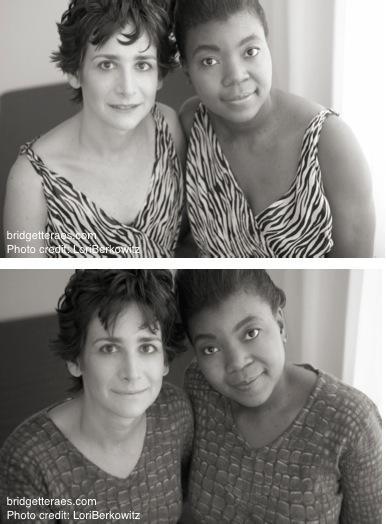
Just like color combinations in prints have an intensity level, so does your own personal coloring. Intensity levels vary from person to person, and can be high, low, or somewhere in between, which would be referred to as medium. Your own level is determined by the relationship of contrast between your hair, skin and eyes. The model on the left has a lot of contrast between her hair skin and eyes which creates a lot of contrast or a intensity in her coloring. The model on the right has much softer features, with her hair, skin and eyes being closer in color, therefore her the contrast in her coloring, her intensity level, would be low.
Why does this matter?
When choosing prints, it is important to consider your own personal intensity level as you’ll always look best when your personal intensity matches the intensity in the prints you choose.
Let’s look at some side-by-side comparisons for further explanation:

The model on the left which such high intensity has the ability to pull off such a bold print, whereas the model on the right gets drowned out by it. Conversely, looking at the photo on the bottom, the softer print worn by these two women, isn’t intense enough for the model on the left and makes her look washed out, yet for the model on the right it’s a perfect harmony with her coloring.
When someone with a low level of intensity in their personal coloring wears too much contrast in the color combinations they choose they look drowned out. When a person with a high level of intensity in their coloring chooses a color combination that is too soft or low in contrast, they look washed out.
Where Ann Romney went wrong


