Over the weekend I headed to Boston for a wedding. As it was my first time driving there (by myself), I blindly followed my GPS and the 4.5 hour drive turned into a 9 hour nightmare! At one point while sitting in traffic, I noticed a small truck in front of me with the words “Angry Orchard” emblazoned on the back. I’m not a hard cider drinker so I was unaware of the brand. The unexpected combination of “angry” and “orchard” struck me. When I think of an orchard the words apples, healthy, organic, family, warm pie, etc. come to mind. But angry? Not usually.
With nothing else to do but contemplate for hours upon hours, I started thinking about “angry interiors.” What would they consist of? Dark colors, industrial design, hard lines, the absence of soft accessories? Would anyone want a space that felt angry? Instead, I think a room that combines two completely contradictory styles can be interesting and elegant. To me, the name Angry Orchard conjures up a style like “rough luxe.” The concept is similar to a beautiful orchard with a bite to it.

J Brand jeans via Shopbop.
Purposefully torn jeans embody the idea. When done right, they’re tasteful, sexy but still a little undone and anything but frilly. Could this be pulled off through a chic chair with slashed upholstery?
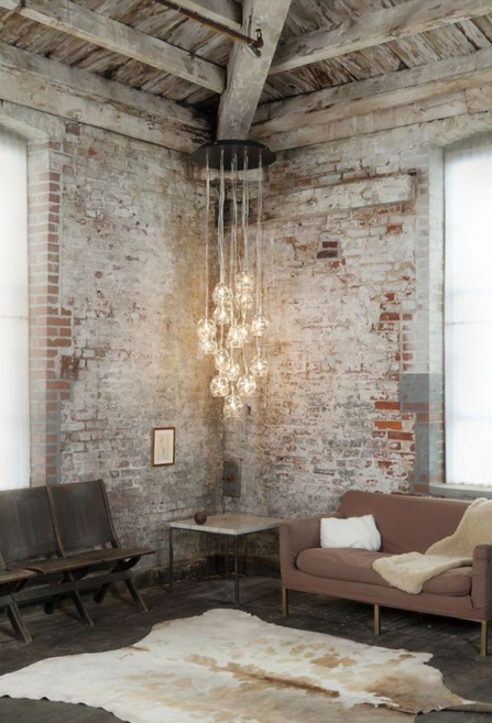
John Pomp Studios via Dering Hall.
Industrial design definitely gives the impression of stylish rebellion. This space illustrates this with the old brick walls, exposed beams and distressed wood floors.
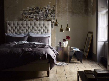
Via Pinterest.
The stripped down aspects, like the peeling walls and scuffed wood floors, are moody and the luxurious bedding and tufted headboard are more contemporary and completely unexpected. This is the epitome of an Angry Orchard interior.
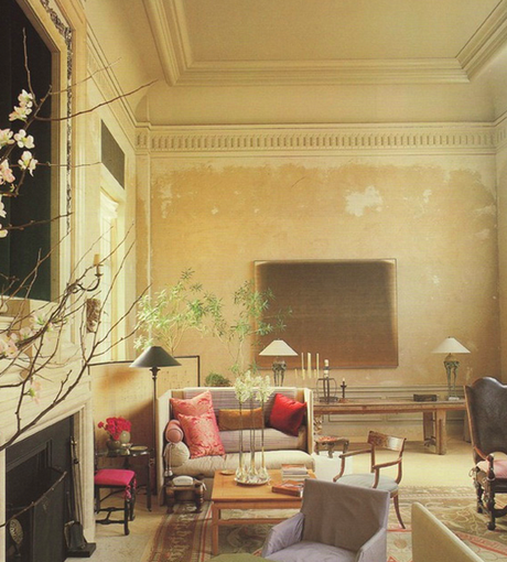
By John Saladino.
The architectural elements have been preserved and the color palette is serene, but there is a dilapidated, tough feel. The dissonance is creative and stunning.
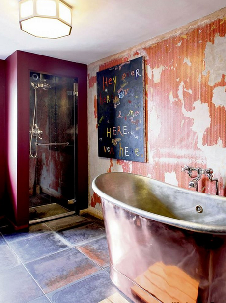
Via Rough Luxe Hotel.
This space is actually from the Rough Luxe Hotel. Opposites attract with glamour, modern art and soft colors mixed with the original, distressed walls and antique pieces that capture a moment in history.
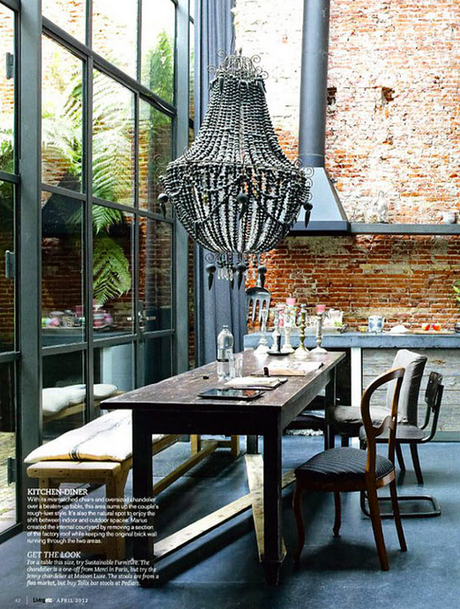
Via House to Home.
This Amsterdam home is a former factory. The dining area is a mix of rustic, industrial, vintage and contemporary. The raw materials, weathered table and concrete walls paired with mismatched chairs, a gray color scheme and an opulent statement chandelier make it quirky and textured. It’s surprisingly inviting.
What do you think of unpredictable combinations? Can you reconcile opposites, like Angry Orchard or rough luxe (or I-95 north of NYC and smooth traffic)?
If you’re interested in an eclectic space with unexpected details, contact Iris Interiors.

