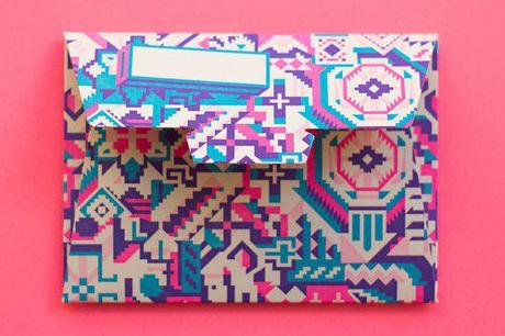
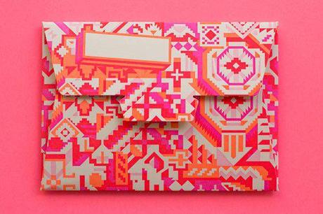
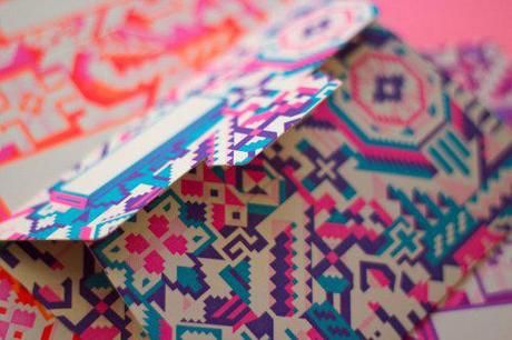
If you haven’t seen the paper-licious aerograms from the lovely folk at the hungry workshop then you are in for a colourful, letter-pressed treat! Simon Hipgrave spoke to us about their new letterpress aerograms and the inspiration behind these neon-tastic paper numbers!
We notice they are ‘formular’ aerograms. What key aspects in the design did you need to include when you were creating this product?
Formular aerograms are simply aerograms which don’t have an official postage paid built in. Which means they can be issued by private companies such as ourselves.

You mention the graphics are inspired by Native American design.
Was there any particular reason you were inspired by this direction?
The older I get the more I am starting to be a believer in things that are meant to be. Jenna grew up in a small town called Missoula (in Montana, USA), she has fond memories of spending summers at Native American pow wows. Before I met Jenna, when I was about twelve I visited the states and travelled through Missoula to visit my Native American cousins, and just so happened to attend one of these pow wows in Jenna’s home town. It was very likely that Jenna was there too, probably watching the procession mere meters away though we didn’t actually meet until 9 years later, on the other side of the planet, in Brisbane.
The pow wow was a place where Jenna and I never met, but we quite easily could have. So while neither of us are Native American that event is a place I often think about when I think about why I married the woman I did. It seems more and more possible that it was out of my hands.
We had the inspiration, but while we were working on the design we were having a bit of a mental block making the shapes quite right. So we went for a stroll and stumbled across a very old, very worn couch in a shopfront window just up the road. It was covered in a ghastly pattern, but it was perfect for our purposes – so we used that as a base and modified it for our aerograms.

Neon is very on trend and also often used in The Hungry Workshops projects. What is it that you love so much about neon colours?
Neon colours (like letterpress itself), lights up your senses. It tickles your eyes like letterpress tickles the tips of your fingers. Together they remind you that you are an offline, physical thing and hopefully they get your hands off the keyboard and eyes off the screen long enough so you can take a second and look up and appreciate the awesome, bright, smelly and tasty world around you.
When choosing the paper stock, were there any particular reasons you chose Stephen Scrambled White?
Its locally available, carbon neutral and gets a reasonable impression.

330gsm is quite a heavy weight grammage. Any reason why you went heavier rather than a lighter weight like the more traditional aerogram?
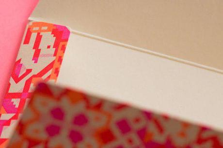
We didn’t want to use any glue so the aerogram had to be self closing with tabs, the heavier weight makes it sturdier. It also has the bonus of being just that little bit more physical. It feels good to hold.


