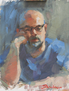
Rick
14 x 11
original
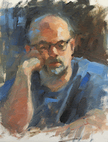
I finished the portrait of him in the dim light of the studio, and felt it was a decent likeness, but, when I looked at it the next day, it felt like someone else's work. After considering it for a while, I realized that the high contrast really plagued me. My favorite paintings are those that maintain a closer value range. No deep shadows and spotlight effects for me; I like my shadows to be colourful and midtoned, and my lights to be well below white. So I spent some time fiddling with this painting to see whether I could turn it into something that felt right to me. I know, some of you will prefer the original, and that's ok; that's your aesthetic. But to be an artist is to find your own taste and follow it wherever it leads. If other people like the things that you do that's gravy, but it's not necessary. You can only paint to suit yourself.First, I lightened all of the shadows, making them have distinct colour, and better shapes. Immediately, the work felt less harsh and illustrative to me.
Next, I toned down the chroma in the blue of the shirt and the background. It was a very blue shirt, but the color seemed to shout at me with its intensity. By adding some yellow ochre and then reapplying the blue, I got a nice, tertiary mixture happening on the surface that felt more in keeping with the subdued palette that I'd introduced into the background. The color flowed better from subject to background, as well.
Finally, I changed the design of the lights in his shirt in order to move the eye through the painting in a circular manner. Now, instead of charging up the strong diagonals of the original shirt shapes, the eye gently circles within the shapes of the shirt and follows the forearm up to the face. The viewing pace has changed from abrupt and choppy, to reflect the quiet, gentle mood of the pose.
A painting can look a thousand different ways, and there are no rights and wrongs, only paintings that feel false and paintings that feel right - to the painter. While the original painting had some merit and was fresh and immediate, it didn't resonate with me at all. The altered version seems right to my eyes, and those are the only eyes that count.
Happy painting!

