TAKEAWAY: It is definitely not all black or white when it comes to defining the look and feel of a website, or any platform for that matter. PLUS: United States pride: plenty of reason to celebrate being American this week
The light and bold of it all
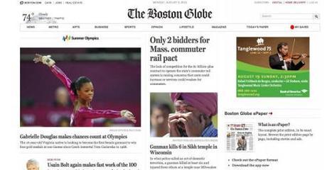
Home page of The Boston Globe, http://www.bostonglobe.com
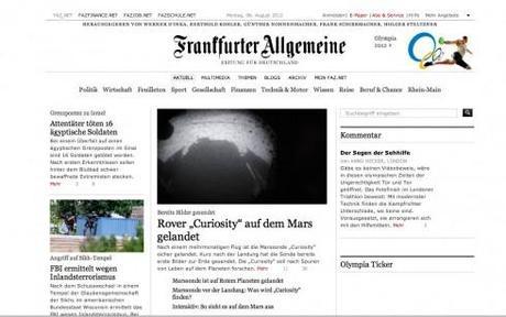
Home page of the Germany’s FAZ; http://www.faz.de
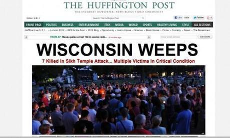
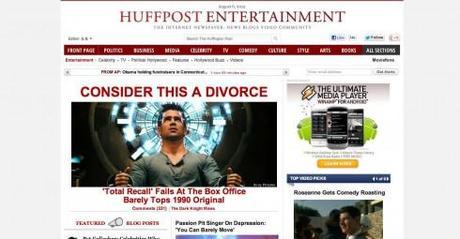
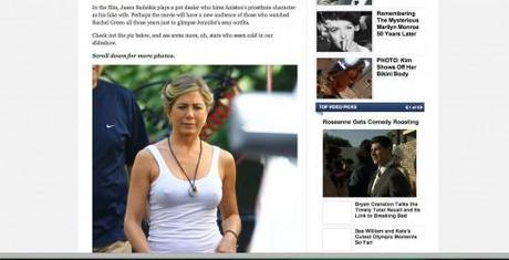
Home page and internal screens The Huffington Post, http://www.huffpost.com
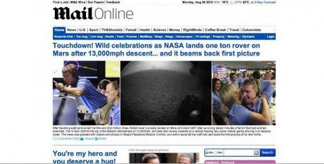
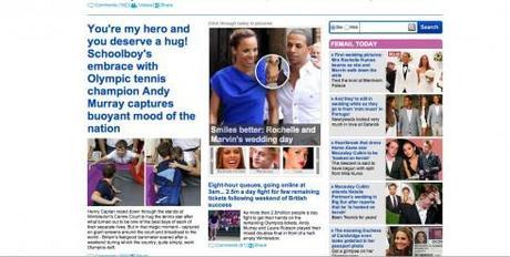
Home page and internal screen for the UK’s The Daily Mail, http://www.mail.com
These websites establish a good happy medium
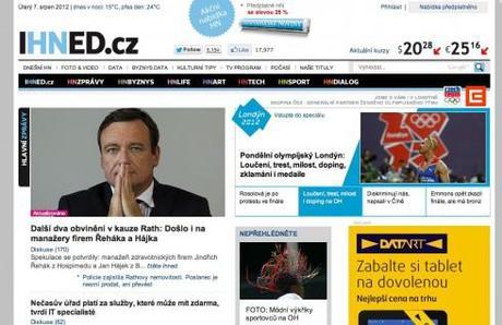
Home page of Hospodarke Noviny , http://www.Ihned.cz
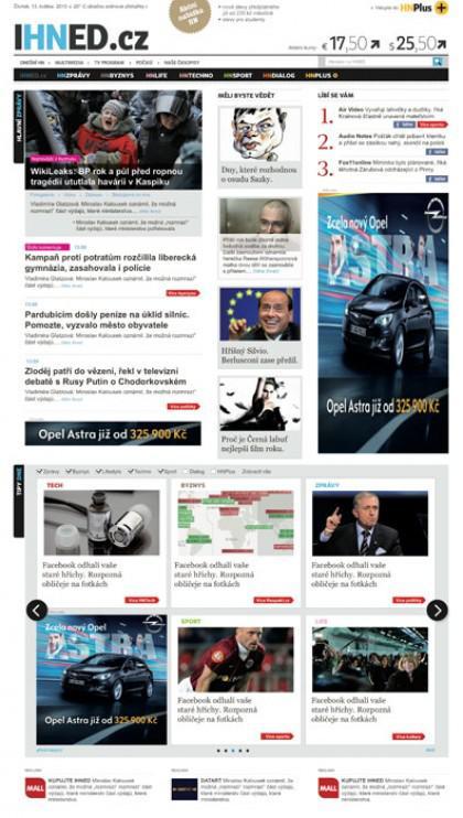
The website of Hospodarke Noviny was created by Mario Garcia Jr., working closely with the http://www.ihned.cz team in the Czech Republic.
For a case study, go here: http://www.garciainteractive.com/portfolio/ihnedcz
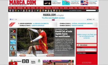
Home page of Spain’s Marca, the sports daily, http://www.marca.com
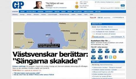
Home page of Sweden’s Goteborgs Posten, http://www.gp.se

Home page of Indianapolis Star, http://www.indy.com
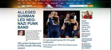
Home page of nbc.news, http://www.nbc.com
The world of news design is coming to the point where it is either sophistication, an oasis of white space and controlled typographic emotions OR loud, bold, look-at-me-first, over the top and no visual regrets.
Regardless of platform, what we seem to be missing is the in between, the dancer who can do the salsa, the tango and the waltz. Am I the only one observing this phenomenon?
Used to be that at design briefings we would consider a variety of possibilities. Today, on the other hand, it is the two extremes that prevail.
We have discussed the styles of tabloid design in this blog recently.
So, today, let’s take a look at the state of the art of news websites.
In this corner, the contemporary, controlled, white space driven and elegant websites, such as The Boston Globe and Frankfurter Allegemeine. On that other corner, ready to knock out its opponent and anyone else who fails to notice them, The Huffington Post and The Daily Mail.
Before we continue, let me reassure you that I am not indicating that one corner has it right and the other missed the mark. Not at all. These websites and its creators know well what they are doing.
And, when forced to look for the in between, all we find is one after the other, websites that lack personality, look like every other website and are not sure if they wish to be the window of a supermarket, a department store or Tiffany’s.
I am sure that there are many of what I would call contemporary design websites, and I would like to hear more about them.
For now, some that stand out are Sweden’s Goteborgs Posten , Czech Republic’s Hospodarke Noviny, Indianapolis Star, NBC News and Spain’s Marca, the sports newspaper.
Watch short video clips of the websites discussed above
The Boston Globe
Frankfurter Allegemeine
The Huffington Post
The Daily Mail
Goteborgs Posten
Marca
America pride
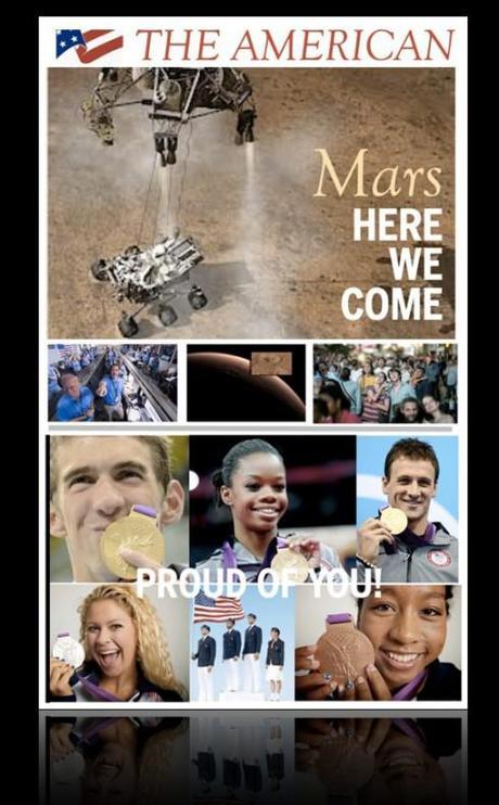
I have created my own fantasy front page to celebrate American pride
It has been a great week for the United States, and I feel all the pride here in Hong Kong.
Curiosity, a plutonium-powered Rover the size of a small car, has landed in Mars, and at the London Olympics, the US team has won 28 Olympic Gold medals (60 medals total as of this writing).
Something to be happy and proud about, and much needed at a time when the news seems to be all bad, with commentators reminding us that Americans are doubtful of the country’s greatness.
I hope front pages celebrate these events with gusto.
It will be interesting to see how those front page editors in the United States make tough decisions to play these stories commanding attention in August, a month that we don’t usually associate with big news events.
I, for one, have done my own version of how I will use the front page to highlight the good news!
The iPad Design Lab: Storytelling in the Age of the Tablet
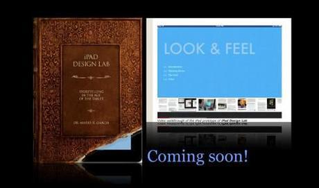
Video walkthrough of the iPad prototype of iPad Design Lab
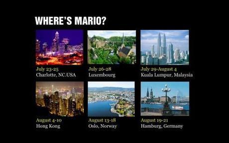
Mario Garcia’s upcoming speaking engagements:
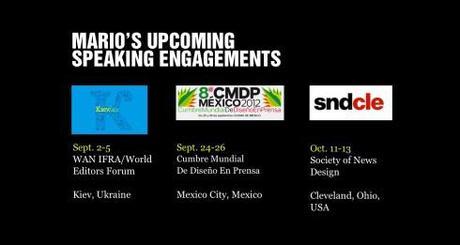
WAN-IFRA World Editors Forum, Kiev, Ukraine, Sept. 2-5
http://www.wan-ifra.org/events/64th-world-newspaper-congress-19th-world-editors-forum
Cumbre Mundial de Diseño en Prensa 2012: Mexico City; September 24-26
http://www.cmdprensa.com/mx2012/
SND (Society of News Design) Cleveland; Oct. 11-13

