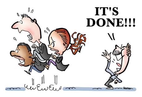
 Is there anything more important than the About Page, when it comes to a website?
If you’re thinking of hiring someone, isn’t it the first thing you’d look at?

It makes that crucial first impression, right?

So why has it taken me so long to get mine into decent shape??

(No, don’t answer that, it might embarrass me… 😳 )

I just finished giving my About Page an overhaul, and you can see it here. I also added a Contact Page.

I found a lot of conflicting advice on what to include on one’s About Page. Here’s what I decided to include, and why:

Header shot (photo) ✅

I included two: my kindergarten photo, and what I look like now (basically the same, except for the mustache 😂 ). A photo’s essential. Like it or not, we all judge by appearances.

A Little History ✅
A super-condensed version of how I got here. A backstory makes you more relatable.

Where I’m At ✅
Meaning, geographically. Seems weird, but I think people are more “real” when you know their general location.

Motto ✅
“My images are different, like your brand needs to be.”

Having a motto seems pretentious, but I stuck it in because it contains an essential truth: to succeed, you have to get noticed, and that means being different from your competitors. Illustration can help you break out.

Humor: What It Is, Why It Works ✅
It was important for me to be clear that humor is my specialty; it’s really how I think.

I included Clive James’ “Humor is just common sense, dancing” because, so often, humor is all about putting people at ease; it’s what makes communication possible.

The Things I Draw ✅
Just a list, but I wanted to show that illustration can take many forms.

Who I Draw Them For ✅
I mentioned a couple of big brands, and a couple of small businesses. The big names give me “social proof” (credibility), and the smaller names say I’m accessible.

Why Should You Hire Me? ✅
I listed 12 reasons, and I kept them short; one of the strongest: I’m an idea person who can help you figure out what you want to say, visually.

Where To Go From Here ✅
It makes a lot of sense to end with a call-to-action; I provided several options: learn more; read my testimonials; request a quote, etc.


Just a guess on my part, but I think it would be a mistake to make the page any longer than it is now. People’s attention spans are limited, mine included.

Also: I think the page seems longer than it really is because I use a fairly large type size, and a lot of white space.

So what did I leave out?

FWIW, here’s what I did not include on my About Page, and why:

Our Mission, Our Essence, Our Promise, Our Vibe, etc. 🚫
You see these on a lot of About Pages, and they always strike me as pretentious. Maybe “pro forma” is a better term: kind of a polite formality. They’re also an invitation to lapse into jargon, which is always a mistake, in my opinion. You can tell people what you do without calling it a “mission.”

Core Values 🚫
For me, this always smacks of political correctness. Stating your core values says you’re “woke,” that you support a cause (9 times out of 10, it involves global warming). I honestly believe we all support causes, and mine might be different than yours. That’s OK. No need to demand allegiance, I’ll do my best for you, and trust you to do the same.

Timeline 🚫
You see some pretty ones, but they take up a lot of space. Also: I think they tempt you to talk a little too much about yourself.

Video ❓
I might add one later. I think a slideshow would be a great way to let readers click thru work samples and client testimonials.

Story 🚫
Telling one’s “story” is dangerous. Not because of the bad things we’ve done, or the dumb things, but because we all like to talk too much about ourselves– and it’s not a good idea to bore your prospects to tears.

Aha! Moment 🚫
I’ve had plenty, but most are embarrassing: as in: why did it take me so long to see that??

Benefits 🚫
Listing benefits would make me sound like any other illustrator. Giving 12 reasons why you should hire me works better: it’s a way of defining value and (hopefully!) showing how I’m different at the same time.

What Problems I Solve ❓
I left this out because I was sure I’d be trying to cram in too much information. But I think it would work as a submenu (under About). I could use it to link to case studies that show how I helped specific clients.


