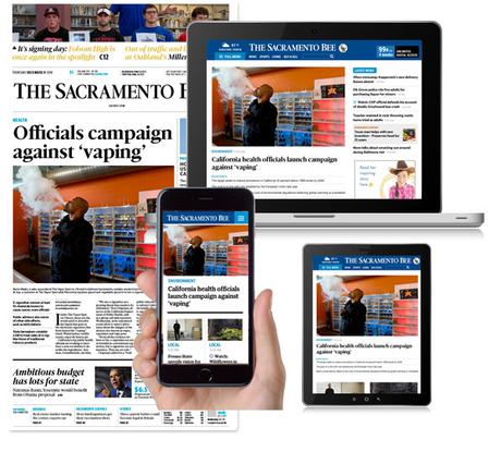
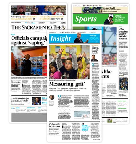
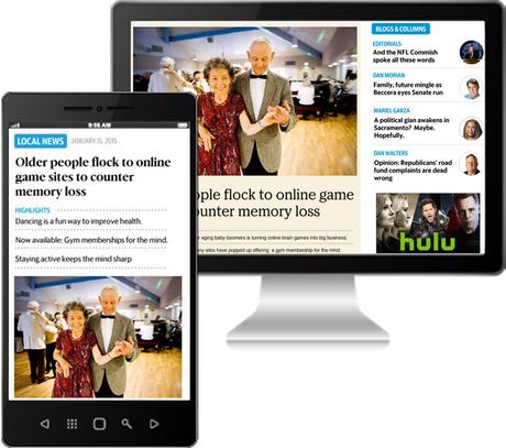
 We will update this post throughout the day as we receive pages, screens, and other relevant material to the launch.
It is the third time that we at Garcia Media collaborate on a project involving multiple titles for one media company. This time, our collaboration with The McClatchy Company challenged us to take 29 very different newspapers in almost as many US cities—The Miami Herald, The Sacramento Bee, Kansas City Star, Raleigh's News & Observer, and Fort Worth's Star-Telegram among them—and create a philosophy for presenting news in the era of the media quintet, define a storytelling strategy across platforms, and design a visual identity to would unify the titles, providing consistency while expediting production.
Our previous such "group" collaborations have been with American City Business Journals' 40 business weeklies across the United States and with Postmedia's eight Canadian daily newspapers, including the Ottawa Citizen and Montreal Gazette.
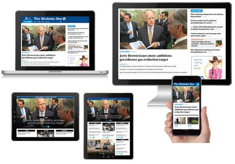
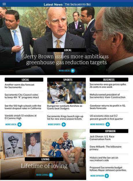
On May 12, three of McClatchy's California newspapers are the first out of the gate with the results of a total rethinking: The Sacramento Bee, The Modesto Bee and the Merced Sun-Star, with the Fresno Bee to follow the next week.
You can see highlights of the new products at new.sacbee.com and a video introducing The Sacramento Bee below. CEO Pat Talamantes is interviewed by NetNewsCheck about McClatchy's digital strategy here.


 The process
We began this project with a series of workshops in our tried-and-true method for collaboration. Our Garcia Media team, composed of Reed Reibstein, art director & project manager, and myself, worked closely with Anders Gyllenhaal, vice president for news, Mark Zieman, vice president for operations, and a small group of other executives. Kerry Bean would become the project manager as we moved from theory to reality, keeping track of all the many timelines and processes. In addition to Reed and I, we incorporated our two senior art directors Paula Ripoll and Rodrigo Fino, from our Garcia Media Latinamerica office in Buenos Aires, Argentina.
At the kick-off workshop, we introduced concepts for storytelling across platforms, conducted a review of the existing McClatchy titles, and showed some initial concepts of how we would envision a reinvented set of products from mobile to print. Through a series of discussions, practical hands-on sessions and with constant user testing of prototypes, we now are at the point where we can see how the concepts and the overall storytelling philosophy works in real life.
From the start we set out to redefine storytelling, particularly emphasizing the roles of print and mobile. To that end, we created prototypes using actual storytelling situations to define how each platform would cover everything from breaking stories to more in-depth analyses.
For print, the major challenge was to find ways to flow content differently, to incorporate new elements and phase out that which was no longer viable for a multi-platform media environment.
Here is how Anders Gyllenhaal, project leader, explains the transformation for the McClatchy titles:
On approaching change:
We've been working to keep up with the dramatic changes in readership for the past six or seven years on an incremental basis, rushing from one new development to the next. We realized that we needed to look at the entire publishing puzzle and rebalance how we worked. That meant a reset on how to do much better on digital publishing, the creation of a sustainable print edition, a deep rethink on storytelling and a fresh design.
The power of mobile
It's a lot to undertake at the same time, but the company felt this was the right time to do this. We can see far enough to take aim at important innovations. We have a good understand of the power of mobile and how to respond to that. We also want to end up with an overall system that is primed for continued change, since we know that the pace is only going to accelerate.
Talking to the readers
We spent a lot of time with readers, really listening to what they had to say, how they're using media, how we could provide better service to them. One of the important concepts to come out of that is the emphasis above all on the two tempos of news, what's happening right now, and then what is the deeper story behind that, what does it mean, what's the full story. Every part of this new publishing plan tries to make the most of those two levels of news.
As Anders notes, this has been a project about rethinking storytelling, promoting change, and listening and responding to users. We are happy that today's launch in California marks the beginning of a process of continuing to evolve McClatchy's print and digital products rapidly to meet the needs of its users.
The philosophy
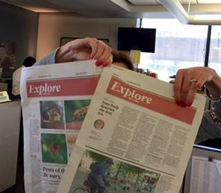 Early page proofs for print edition.
The overall philosophy underlying this project involves the following centerpieces:
The news cycle of today moves at two tempos: "lean forward" and "lean back," the "now" and the "in depth." In the lean-forward mode, information is presented as it happens and updated constantly, primarily for consumption on mobile devices. For the lean-back tempo, users are looking for rich storytelling that puts the news in context.
New designs and storytelling techniques have been specifically created for the web, print, tablet and phone in order to deliver the news all day, in fresh new ways—in the way readers want to experience it. Bullet-point summaries of many stories let users understand the key points quickly, and graphics, fact boxes, and other alternative story forms allow journalists to convey stories in whatever form is most effective.
An effort will be made to incorporate more pieces such as interactive maps, photo essays, and databases.
An energized print edition that emphasizes more in-depth news and analysis and a wide array of topics that are of interest in each community. Sections are organized by theme, with many papers using the A section for an edited summary of what's happening in the community, the B section for more in-depth enterprise, analysis, and opinion. Sports and features are more visual, with a high energy level.
In the digital products, readers will continue to receive the latest news all day and be able to choose, by device, how deep they want to explore topics and how much time they wish to spend with each. Storytelling formats will emphasize inviting headlines and bulleted items that outline stories quickly for scanners.
On the web, a new, more clearly organized website, with a particular highlight being a cleaner and easier to navigate article page. All of McClatchy's websites will be responsive by the end of this project so that they work on any device.
For the apps, mobile will increasingly emphasize the latest news for the topics a user is most interested in. On tablet, the emphasis will be on a more elegant presentation for the best each newspaper has to offer.
 Creating a McClatchy visual identity
By Reed Reibstein, Art Director & Project Manager
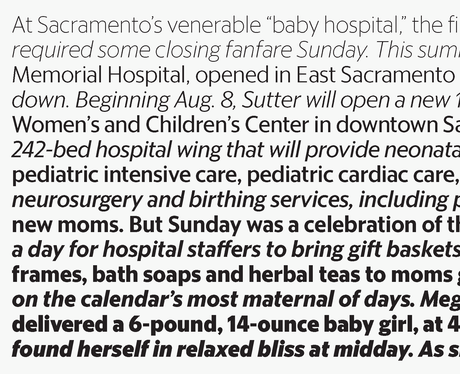
A key part of our work on this project was to help McClatchy's talented designers from across the country develop a visual identity that could work for all 29 of their titles. We began by reviewing McClatchy's rich history, from Walt Disney's drawing of "Scoopy the Bee" as the mascot for the California papers to the enormous headlines used for war and peace. We combined that with other visual best practices to make each product easy to read, easy to use, and attractive, such as the use of strongly defined swathes of white space and selective application of color to emphasize certain elements. The result is a set of guidelines that allow each McClatchy title to have its own identity while allowing for increased efficiency through sharing common styles and resources.
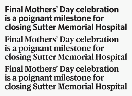
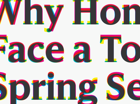
The most noteworthy part of the McClatchy visual system is that it includes a comprehensive set of typefaces developed by the renowned type foundry Commercial Type. Principal Christian Schwartz and his colleagues Greg Gazdowicz, Miguel Reyes, and Mark Record collaborated closely with us and the team at McClatchy to develop the headline faces McClatchy Serif, McClatchy Sans, and McClatchy Slab. These three families are "triplexed," sharing the same character widths, so they can be swapped for one another without changing the length of a headline. This will allow each McClatchy title to select its own primary and secondary headline typeface from our set, retaining its particular tone from classic to modern while retaining maximum efficiency for McClatchy's designers across the country.
Commercial Type has much more information on the McClatchy type system, including their work on the customized text face used in print, on their website.
TheMarioBlog post #1748
Please enable JavaScript to view the comments powered by Disqus.
comments powered by Disqus

