This is the last post for TheMarioBlog for 2012. Our next blog post will be published Monday, January 7, 2013
TAKEAWAY: These were projects we at García Media collaborated on and launched in 2012. Each project is unique, and we learned a great deal from each. Today we will share what we learned with you.
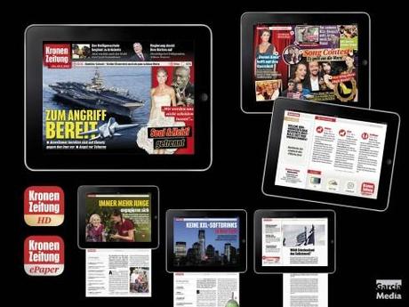
Kronen Zeitung tablet
Taking Austria’s leading and most popular newspaper, Kronen Zeitung, to the tablet was perhaps one of the most invigorating projects for us this year. Here you have a printed newspaper that keeps its traditional typographic roots intact (we are working on the print rethink for 2013!), but the tablet edition was new, with no legacy nor picture of the founding father on the wall. It was fun to work with a team that was incredibly talented and ready for the task. The result is a curated edition that stays close enough to the original KZ to be part of the family, but ventures out on its own for stories that are tablet-friendly. Vibrant is the word I would use to describe it.
Lesson learned: While the tablet edition of a newspaper needs to cling to the visual brand, it can do storytelling in a way that does justice to all that the tablet platform allows us to do.
The KZ tablet team: Robert Kuschela, Michael Eder, Paul Tikal, Peter Rathmayr
García Media Art Director: Constantin Eberle
For more details:
Kronen Zeitung of Austria: new iPad edition launches
Kronen Zeitung’s tablet: beyond the news, a special event app
Images from Kronen Zeitung tablet
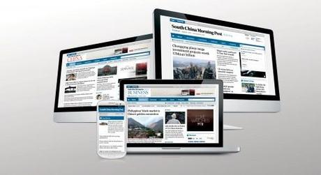
South China Morning Post
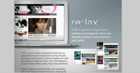
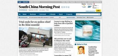
While we worked on a redesign of the print edition of the South China Morning Post, the work on the digital platforms waited till 2012, and it was executed successfully. Hong Kong is a highly competitive environment for the media. A place in transition, as the Chinese language becomes ever more important, English-language publications like the SCMP face a challenge.
Lesson learned: A highlight of this project across all platforms was the incredibly large role played by the marketing department, which worked closely with us in creating campaigns that reflected our intentions.
Art director / editor: Ben Abbotts, Etienne Maccario
García Media art director: Mario García Jr.
For more details:
South China Morning Post: new beginnings in a new Hong Kong, new China
Images from the SCMP website


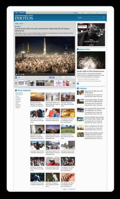
SCMP app images
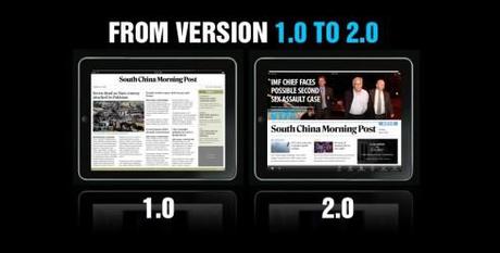
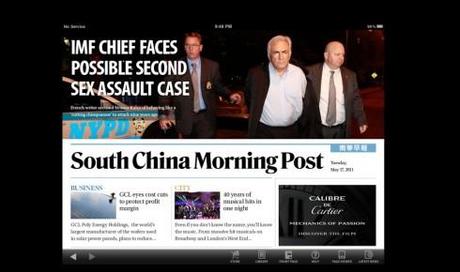
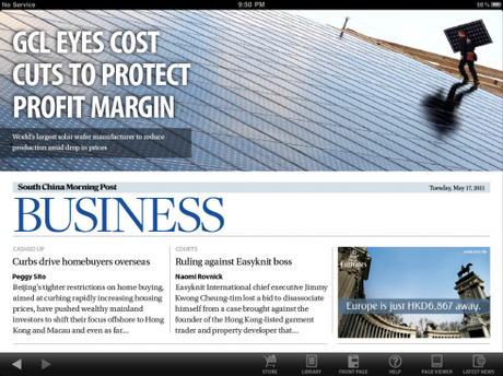
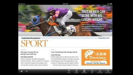
Comparing versions 1.0 and 2.0 for selected screens

BAMM.tv
BAMM.tv is a global content creation and distribution network that connects talented, emerging bands with audiences around the world through live HD video music performances. This is the type of app that we are not usually associated with, which made the process more challenging, energizing and demanding, for sure.
Lesson learned: As storytellers we should not limit our scope to traditional media apps. Our expertise in how to tell stories through a variety of ways is key to developing apps for almost every field. BAMM.tv showed us it could be so.
Who was who in the cast?
It takes a village to create an app and website for a company such as BAMM.tv, with expertise in a variety of fields. Project leader for García Media was Reed Reibstein, who had to deal with the entire “village”—led by Nick and Chris Hansen of BAMM.tv, Joe Zeff and Ed Gabel of Joe Zeff Design, GMD Three, and Jody Haneke of Haneke Design. Both Mario García Jr and I participated every step of the way.
For more details:
BAMM.tv: a new music app that rocks
Images from BAMM.tv
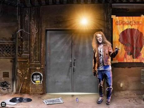
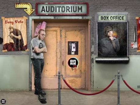
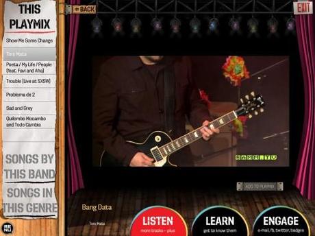
Watch a short video of the BAMM.tv app
De Telegraaf
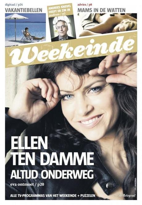
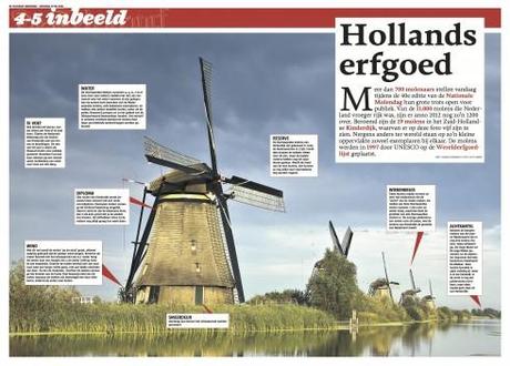
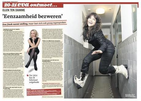
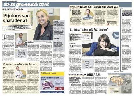
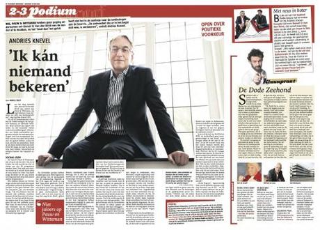
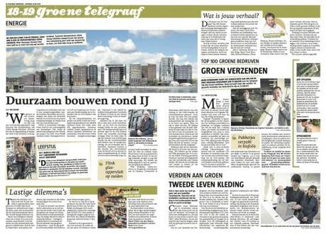
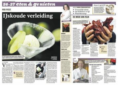
In 2012, the Netherland’s iconic De Telegraaf debuted its new weekend edition. The weekend edition is full of surprises, but they are not at all of the cosmetic kind, although you will see changes in that area too. We worked hard to rethink the entire approach to weekend content, and the edition is now full of useful, entertaining and appropriate content to make the reader’s life better, healthier and more fun. Content rhythm has also been studied and rethought, so that readers will get the most appropriate flow from section to section. Finally, we have a cleaned-up and updated logo for De Telegraaf.
Lesson learned: Even the most iconic newspaper titles in the world must take a good look in the mirror and ask the question: How best can we continue to be the favorite for our readers? The answer is not always easy to put into action, but it is worth it. De Telegraaf started the process with the weekend edition. In 2013 we will continue to look at other sections.
Art director: Hans Haasnoot
García Media Art Director: Christian Fortanet
For more details:
De Telegraaf’s weekend edition launch: We show you the process
Images from De Telegraaf
Goteborgs-Posten
Every year is a year of evolution for this Swedish regional daily, Goteborgs-Posten. It is one of my favorite projects just because of that. I say that Goteborg is a second home for me, since I first visited in 1994 and have grown fond of so many on the team and in the community of this beautiful, quaint city by the sea. The constant evolution of the GP occurs without much fanfare: little changes here, the rethinking of a single page or section there. This year, we undertook a major rethinking of the front page for the daily and an overhaul of the Sunday edition.
Lesson learned: The best newspapers carry out change constantly, perhaps without a lot of marketing fanfare, but with a firm focus on how to effect change effectively. The GP is a textbook case for that type of thinking.
Art director: Mats Widebrant
For more details:
In Sweden: refreshing changes for the Goteborgs-Posten
Images from Goteborgs-Posten
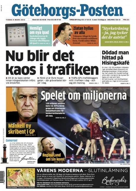
Here there is not a definitive photo for page one, so the “belt” concept groups various promos for inside stories.
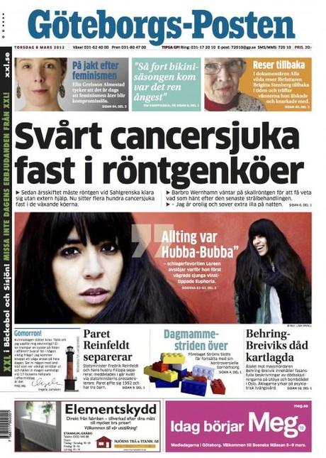
The belt in this case promotes a single story on the inside.
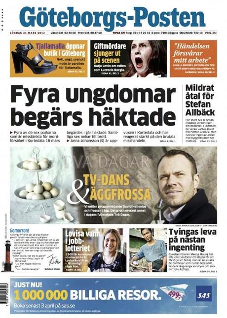
Here the belt promotes a cover story from the Weekend magazine, Tva Dagar
TradeWinds
TradeWinds is the international newspaper of the shipping industry, with a global circulation and printed on blue paper. Readers have seen many changes, including new typefaces, a new color palette and better story structures to create a more effective page hierarchy.
Lesson learned: Specialized print publications, such as TradeWinds, have the most loyal followings. While the online and tablet editions are also part of the process, those printed newspaper sent by mail to thousands of subscribers globally are dearly expected and well-received.
The team: Julian Bray, editor; chief sub, Roddy Craig
García Media Art Director: Robert Macli
More details:
TradeWiinds introduces a new, cleaner look
http://garciamedia.com/blog/articles/tradewinds_introduces_a_new_cleaner_look/
Image of TradeWinds
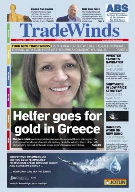
Here is how design of new TradeWinds front page looks
NewsAsset:
It was a new logo and overall branding for Greece’s Newsasset, a firm dedicated to providing end-to-end multimedia solutions for media companies. The assignment was clear: Create a logo that will take Newsasset into its next stage of growth and development. After about 40 sketches, we found the solution that pleased (almost) everyone!
Lesson learned: Creating a logo that fits into the various uses that a modern company must apply it to is not an easy task. But it is fun.
García Media Art Directors: Christian Fortanet and Constantin Eberle
More details:
Creating a new logo for NewsAsset
Images from NewsAsset

Garcia Media Latinamerica
Estrategia & Negocios
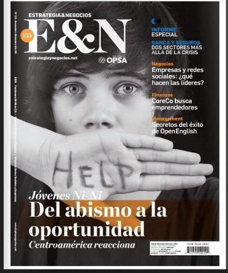
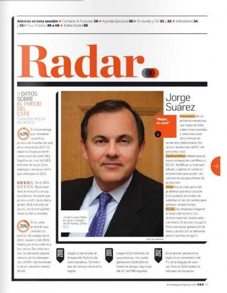
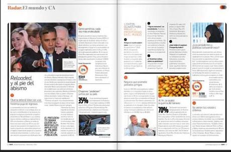
The magazine Estrategia & Negocios, based in El Salvador, has positioned itself in Central American and the Caribbean as a reference publication for news and features related to the world of finance. For Estrategia & Negocios, the key to success is how it has managed to focus on the world of finance in its specific region of the world, one where growth is usually the lead story. Garcia Media Latinamerica was engaged to make Estrategia & Negocios easier to navigate, easier to read, more pleasant to the eye. Mission accomplished, says Rodrigo Fino, who heads the Garcia Media Latinamerica operation in Buenos Aires. He, along with senior art director Paula Ripoll, managed this project.
Lesson learned: People seek and stay with quality content, especially for specialized publications like Estrategia & Negocios. In this type of publications, people also come knowing the story, so they are looking for more analysis and interpretation. Help me sort thru this, the reader is saying.
Open publication - Free publishing - More garcia media
For more details (in Spanish)
http://www.garcia-media.com.ar/blog/post/salto-de-calidad/204
Tabasco Hoy
Color is the protagonista for Tabasco Hoy. And color has been used smartly to link the digital platforms to the mothership print product. Just as color has been used in the printed newspaper to help identify sections, the same is true for our work with digital here. Rodrigo Fino, who heads the Garcia Media Latinamerica operation in Buenos Aires, was the chief art director for the project, working along with senior art director Paula Ripoll.
Lesson learned: Here we did the print redesign first, as the technology was not ready to do the digital part. In some cases it pays to do one platform at a time, but without losing sight of how the brand will extend across all platforms.
Open publication - Free publishing - More diarioFor more details (in Spanish):
http://www.garcia-media.com.ar/blog/post/tabasco-hoy-sigue-la-evolucion/203
The 1,000th post in TheMarioBlog:
This was the year we reached that landmark: 1,000 blog posts.
Read my take on that special day. It continues to be fun to chat with you, my readers, everyday. Some days are more interesting than others, but the idea is that we have this time together, and I hope to keep working towards the next 1000.
For more details:
Today is TheMarioBlog post #1,000—and a new digital book is born
iPad Design Lab: Storytelling in the Age of the Tablet
2012 was also the year when I wrote my first digital book, with the absolutely essential and wonderful assistance of my copilot, Reed Reibstein, who served as both editor and art director for the book. More importantly, Reed, at 23, had the perfect age to guide the much older author!
More details:
My new book, iPad Design Lab, is now in Apple’s hands
iPad Design Lab is now available on the iBookstore!
From print to digital: An author’s reinvention
Designing and editing iPad Design Lab
There is no paper trail behind a digital book
Take advantage of our iPad Design/Ad Lab workshops
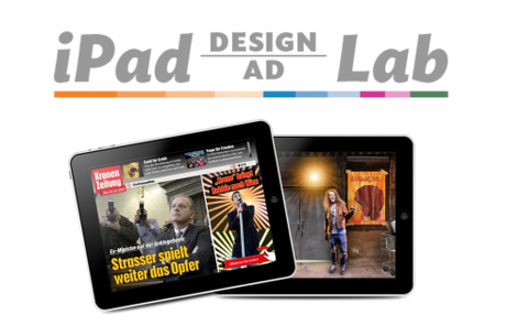
Do you want to take your brand to the next level by creating a tablet edition? Garcia Media can help. We now offer one- to two-day iPad Design Lab workshops on demand to jumpstart your presence on this exciting new platform. We also offer iPad Ad Lab workshops to develop engaging advertising models for your app. Contact us for more information.

Purchase the book on the iBookstore
The EPUB version of book is HERE:
Now available: The EPUB version of iPad Design Lab: Storytelling in the Age of the Tablet, ready for download via Amazon.com for Kindle:
http://tinyurl.com/8u99txw.
Take a video tour of iPad Design Lab
“iPad Design Lab” trailer on Vimeo.
Read the Society of Publication Designers’ review of The iPad Design Lab here:
http://www.spd.org/2012/10/must-read-ipad-design-lab.php

Keep up with Mario Garcia Jr.. via Garcia Interactive: helping transform online news since 1995.
www.garciainteractive.com
Here’s a gift you don’t have to wrap!

It’s official. The Christmas/holiday shopping season is here.
Here is a suggestion for someone on your list: my digital book iPad Design Lab: Storytelling in the Age of the Tablet. No need to stand in line nor buy wrapping paper. Just send it to someone you think might enjoy a book about this magnificent new platform we call the tablet and how to maximize its potential for storytelling.
Here is how you can get the book:
The original version of the book is the multitouch textbook version available on the iBookstore for iPad (iOS 5.0 and up): https://itunes.apple.com/book/ipad-design-lab/id565672822. This version includes video walkthroughs, audio introductions to each chapter, swipeable slideshows, a glossary and a sophisticated look and feel.
Apple only sells multitouch textbooks in certain countries at this time, unfortunately. Copies are available in at least the following countries: Australia, Austria, Belgium, Canada, Finland, France, Germany, Great Britain, Greece, Italy, Latvia, Luxembourg, The Netherlands, Poland, Portugal, Romania, Slovakia, Spain, and the United States.
For those in other countries and without an iPad, we have made the book available in a basic edition for other platforms. This basic edition includes the full text of the original, along with the images and captions, but lacks the other features such as audio and video. It is available on the following platforms in many countries:
Amazon Kindle: http://amzn.to/SlPzjZ
Google Books: http://bit.ly/TYKcew

