I sometimes forget that hallways are rooms too, and important ones at that. They carry us from one part of the house to another, acting as passageways to new attitudes. Think about it, you enter the hallway and instantly have to change your school of thought from “it’s time to cook” to “it’s time to sleep” or from “it’s time to study” to “its time to shower (or, you know, other things that happen in that room).” If you consider the mentality switch that occurs in hallways, you realize these literal and figurative passageways are kind of a big deal. So why oh why did it take me so long to give our hallway the attention it deserves? Despite being an area of the house we don’t spend much time in, hallways shouldn’t be an afterthought. When given some TLC, I figure they can become as beloved a space as any.
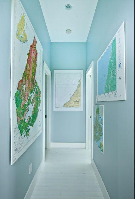
A blue hallway adorned with maps. Photo from The New York Times.
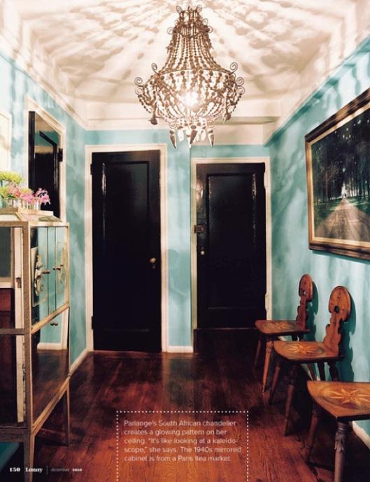
Black doors and dramatic lighting make this hallway a distinctive space in its own right. Photo from Pinterest.
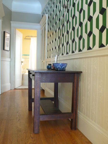
Geometric wall stenciling in bold patterns and a consul table make this part of the house sing. Photo from Apartment Therapy.
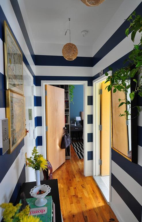
Big bold stripes from floor to ceiling contrast well with the light wood flooring. Photo from Pinterest.
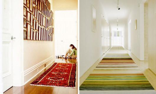
A gallery wall or a brightly colored rug give interest to long narrow spaces. Photo from Apartment Therapy.
I really wanted to emulate one or all of these ideas into our hall space, which is long, narrow and boring beige.
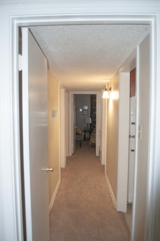
Lots of doors in and out, but not a lot to look at as you go from one room to another.
But because our hallway has a very low ceiling (an air conditioning duct was put there after the house was originally built), I didn’t want to do anything that would close the space in and make our guests feel claustrophobic. And because there is no overhead light, just a little wall sconce midway through, I didn’t want anything that would need a lot of light passing through it to look good.
I briefly considered painting the doors instead of the hallway, which I think can give a really cool effect, like this photo from housetohome.
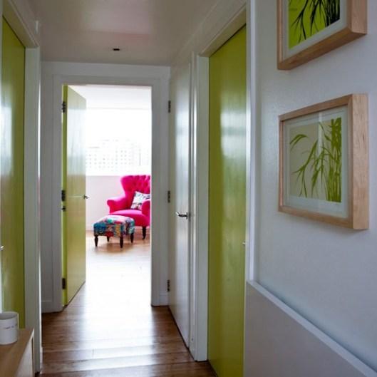
But that solution didn’t solve my boring beige dilemma. So I decided to do what I normally do…paint it turquoise! (Technically, the paint color is called Fiji, but hey, it’s close enough.)
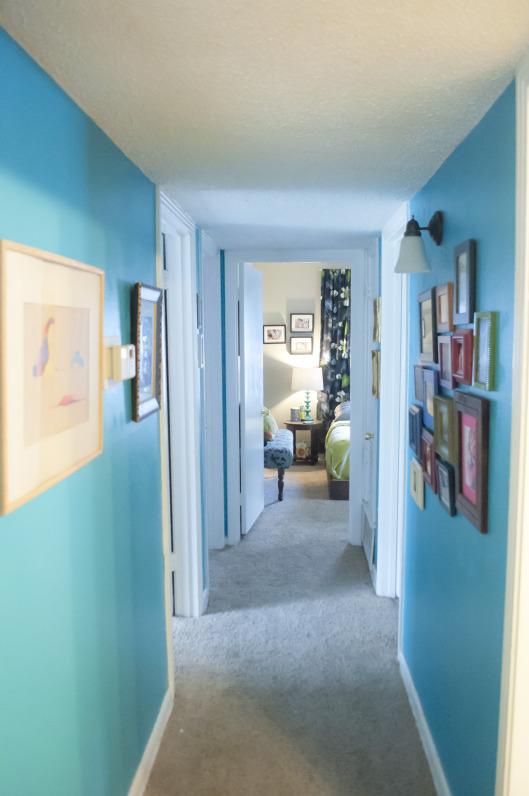
The hallway after
I love, love, love how it turned out. I actually don’t dread walking through that part of our house anymore.
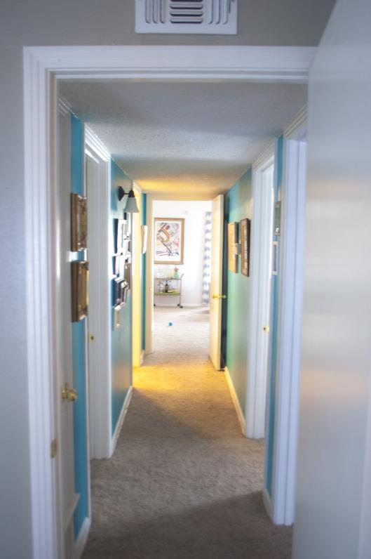
I’m also really loving how it looks as you glance through one room and get a peak at the new peacock-blue hallway that lays behind it. Check out how much better the hallway looks from the kitchen in these before and afters.
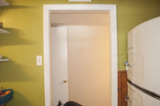
The hallway as seen from the kitchen before…
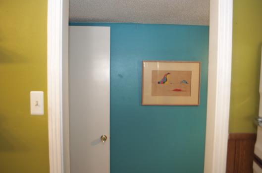
…And after. I love the lime green and turquoise color combination, so this feels very happy to me.
I also love how it makes our art and photos pop, something that was definitely lacking with the old beige.
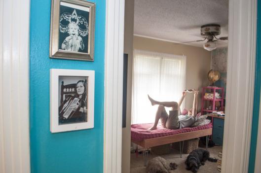
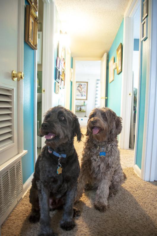
The black and white photos stand out against the vivid background. And check out those cuties hanging out in the office.
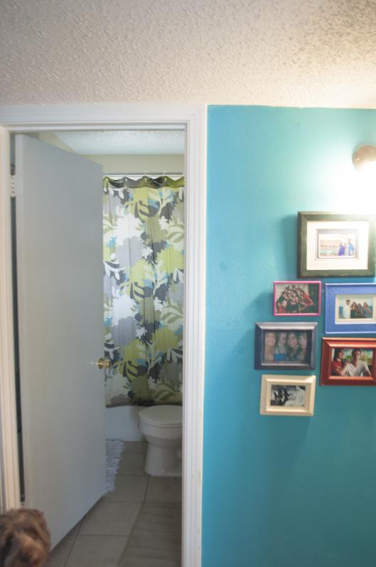
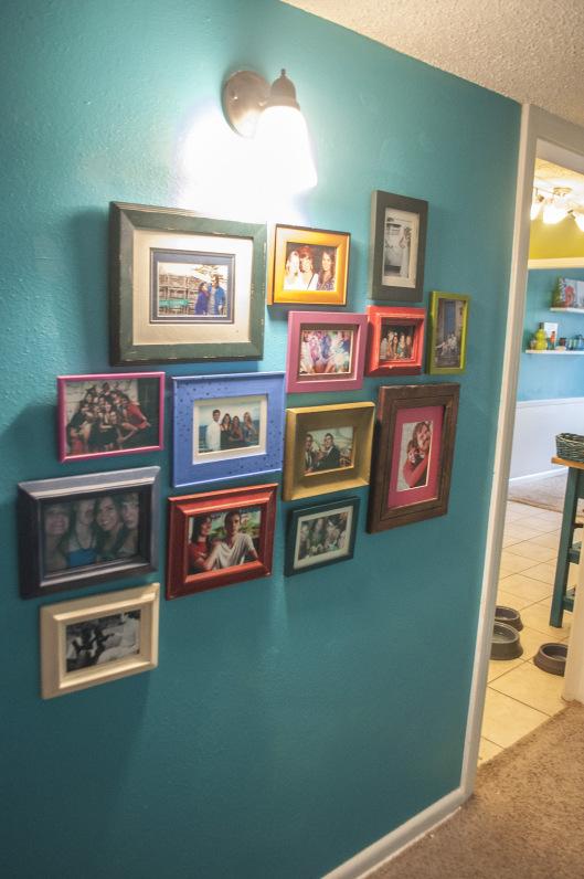
Because it’s not a huge space, taping the walls, patching the holes and slapping up the coat of paint was done in just a couple of hours on a Saturday afternoon. I still need to touch it up in a few places, but over all I’m really happy with our playful new corridor. Once we get some wood floors and change out the door hardware, this space is really going to shine.
