A few weeks ago, I completed one of my biggest assignments ever: a Valentine video for Coca-Cola Journey, which serves as the company’s brand newsroom and social media hub. It was posted on the Journey site, and also uploaded to the company’s YouTube Channel. Here it is:

I created the video on Kizoa, an online platform for creating slideshows and videos. I’m a subscriber. My Pro membership allows me to create videos in full HD (high-definition), and download them onto my computer in MP4 format.

The video consists of 82 separate slides (images). I uploaded them to Kizoa as a group, and put them in a photo album. Then I dragged and dropped them into position on a filmstrip.

I can adjust the display interval for each individual slide; i.e., how long that particular slide is visible “on screen.” The final slide in the video displays for a full 5 seconds. Some of the slides in the action sequences (e.g., the cliff dive) only display for 0.2 seconds.

Being a subscriber also gives me access to all the tracks in Kizoa’s music library, most of which are royalty-free for both personal and commercial use. That’s a very important point, since it means that neither I nor my clients have to worry about copyright issues,
or paying music royalties.

The rest was pure experimentation: adjusting the timing, deciding what music to use for the different sequences, etc. I lost track of all my trial runs. Suffice it to say, a video isn’t something you get right on your first try– not in my case, anyway… 😕


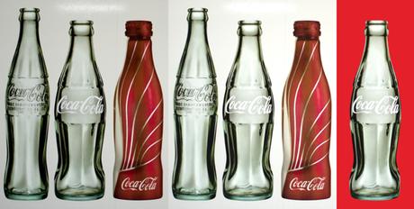
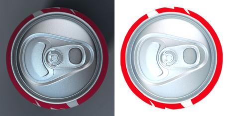
Coca-Cola wants its products to look as accurate as possible, so I extract what I need from photos. I use filters and color adjustments to enhance the images. Once I’ve extracted an item, I can paste it onto any background.



Here’s the before and after for the Coke can top.



The Coke pencil required a good deal of brightening and color enhancement. Then I rotated it and added the pencil tip on two separate layers.


The best bit of digital magic (in my humble opinion) was virtually invisible. It occurs in a single slide: the one where the Coke bottle pivots 90 degrees to the right, before walking off stage.


In actual fact, the bottle doesn’t rotate at all. To create the illusion, I switched from two feet facing front, to a single foot facing left– that was easy enough. But the “Coca-Cola” text on the bottle had to appear to rotate, too. Why was that a challenge?

Because the text and the bottle were part of a single image. If I selected the text and removed it– cut it out of the bottle, so to speak– I’d leave a physical hole in the green glass. I needed to lift off the “Coca-Cola” so I could rotate it, while somehow creating green glass where the text used to be.


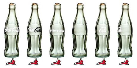
Here’s the basic sequence. I selected the “Cola” (below, highlighted in black for visibility), copied it, and saved it on a separate layer. (I didn’t need the “Coca,” because that part of the text would be invisible after the rotation.)

Then I used Pixelmator’s rather remarkable Repair tool to select what I wanted to get rid of. The Repair tool replaces the selection by cloning the pixels in the immediate vicinity. Below, the third bottle from the left shows the result after I used the Repair tool to select the top half of the “Coca-Cola.” After selecting the bottom half, I got the result shown in the fourth bottle. Digital magic indeed.


The rest was easy: paste in my saved “Cola” which now resided on a separate layer, position it just off the left side of the bottle, then compress and distort it slightly until it looked right.



Which brings me to the second half of the post title: Why It Pays To Keep Clients Informed.


It’s important for me to say this first: keeping clients informed isn’t just a nice thing to do. It’s a must-do. It’s a professional obligation. To surprise a client with finished work that doesn’t match their expectations is to invite disaster. Not only have you wasted time and effort, you’ve hurt your reputation.
You also keep clients informed because you need their feedback. Sometimes feedback makes all the difference. That’s exactly what happened here.


Jay Moye is the editor of Coca-Cola Journey. He gave me the assignment. I was on a tight deadline and sent Jay a status report every day.
I sent Jay snapshots showing the proposed color scheme for two of the video backdrops. Here’s what they looked like:

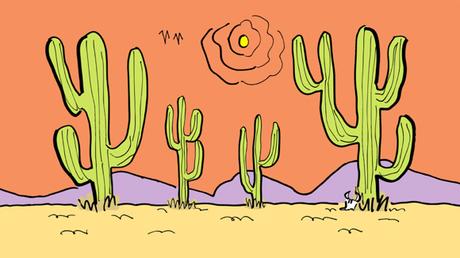
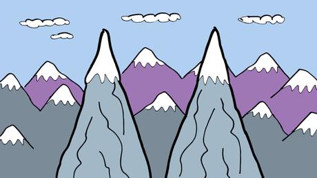

Jay sent back a single sentence reply, as follows:

Mark – I think these look nice but whenever possible, let’s really play up the Coke red (especially given the Valentine’s focus).
That one sentence determined the entire look of the video. I read it and had an immediate revelation: We were doing a video about a Coke bottle that comes to life and embarks on a journey. The idea was fantastic, surreal– why shouldn’t the landscape look the same way?? I saw the whole thing in an instant, and immediately revised the desert color scheme.

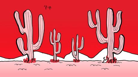

And as soon as I saw that flat Coke Red sky, I could see the familiar Coke can white stripe appearing across it– and I had a great running gag.

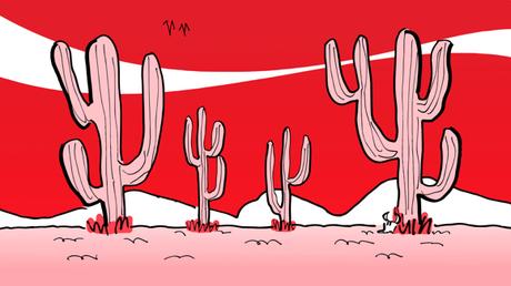


I sent Jay the revised snapshots and he came back with: I like!
One other point worth noting: it pays to be proactive. The video was my own idea. I pitched the idea to Jay by sending him a B&W rough cut.
The original rough cut ran 2:16. Too slow. I pared it down to 1:29. Here’s that faster version. As you’ll see, most of the key elements were already in place.


* * * * * * * * * * * * * * * *

Do you use video as part of your social media strategy?
Have you ever found a bottle with a message in it?
Have you ever seen a pink cactus? How about a pink elephant??
Hope you’ll leave a comment.

