Everytime I have a question or concern about type I reach out to my good friend Roger Black. Roger and I have worked together since 1983, when we teamed up to design the Mexican newspaper Novedades. That project sparked a life long friendship and a series of collaborations via projects and seminars, including Type Talk conferences at The Poynter Institute for Media Studies, where we both have taught for decades and now serve in the Institute's Foundation.
This week, as I decided to discuss type in TheMarioBlog, it was just normal procedure for me to tap into Roger's expertise, especially as we both prepare to work together on the upcoming Digital Design Challenge Conference at Columbia University (information below).
Roger Talks Type


What is happening with type today?
Typography is alive and well and growing. Once made of lead and confined to shops filled with machines, type is now everywhere: for example, on your phone.
Once bound to printing, type has now taken on all kinds of letterforms: the messages in your car, on your music player, on the sides of trucks, on the tops of buildings. The designers of movie titles, the programmers for the web, the artists who make menus, all use fonts in the same formats. The word “type” has come to mean lettering everywhere
Type and brand
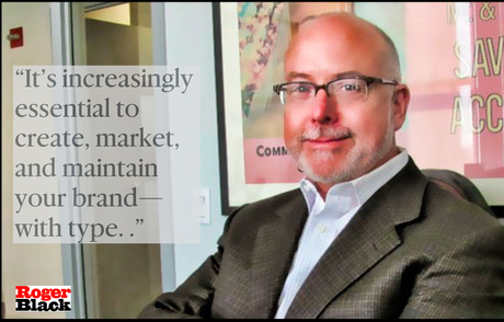
It’s increasingly essential to create, market, and maintain your brand—with type. In the 1960’s, branding became an integral part of any company’s sales effort. It made you stand out from the crowd. “Corporate identity” meant logos, marks and style guidelines. But contemporary branding means “what people think about you.” And your direct connection to customers is often through media, using words, conveyed with type
A driving force behind type branding is, the Internet of Things. Everything is connected and everything has fonts
Companies, countries, and individuals struggle to find a unique identity, they are quickly learning that the design of their typefaces, and the typography of their user interfaces, their content, and their messaging is an essential part of their voice and personality. Their brand.
What's the role of technology in type creation and development?
Growth would be impossible without the technology that has emerged in the last 30 years. The idea of digital type was novel in the ’70s. There was really only one company, URW in Hamburg, in the field. In the early ’80s Adobe brought out digital outline fonts for PCs and a page description language, Postscript, for laser printers. By 1981 the first digital type foundry was started—Bitstream. Desktop screens came to be populated with simple digital fonts. s. All of this was possible with digital design tools. The first type design app, Fontographer, came out in 1988. Soon smaller one-person type foundries appeared, like Emigre and The Font Bureau (which I helped start).
Quickly the tools became more robust. Type design was automated, and the product finishing was handled by software. As in many areas, the designers are now also coders. Font design can begin with a line of Python, just typography may start in the CSS codes of HTML.
Code communities have gathered around tools like Robofont, Fontlab and Glyphs. Working on the same platforms has enabled type designers to collaborate around the world, in a way that has not been seen since the standard “type height” of metal era.
Automation has enabled a single designer big type families with dozens of “weights,” “widths” and “sizes” in a matter of weeks instead of years. And teams can tackle the CKJ fonts (Chinese, Korean, Japanese) in a matter of months, not decades.
The code base for type is itself becoming global. As most devices use HTML for their displays, the implementation of web fonts and responsive design is leading to programs where the fonts can be made aware of the user’s environment and behavior. Adaptive, or responsive fonts are around the corner.
What's is the biggest change for type?
The essential change in the market for type, which you could call #Ubiquity. Now fonts running on all platform, use the same technical format: Open Type. OTF, as they say, is not just used for books, publications and advertising. It’s taken the place of the special lettering for the sides of trucks, the tops of buildings, the dials on aviation instruments, the titles of movies—are all done with the same fonts. Freeway signs, wedding invitations, the words “Police Line” on the tape strung around crime scenes—there all OTF now. This has expanded the need for new fonts, and new type designers. Who ever thought we wouldn’t have enough of them?
Digital Design Challenge Conference
Speaking of Roger Black, he and I will team up again to participate in a very special Digital Design Conference at Columbia University, New York City, Oct. 17-18.
For more information:
http://about.poynter.org/about-us/events/poynter-digital-design-challenge

