Mobile apps have become a vital part of consumers’ life. People prefer an eye-catchy and feature-rich app. The salient feature that is to be considered while developing a mobile application is its UI (User Interface). At the end of the day, it is the UI that heightens the credibility of a mobile app. A visually appealing and intuitive UI is one of the essential reasons for increasing conversions. As per a survey, first impressions are 94% design related.
The importance of creating an attractive UI is, therefore, growing rapidly. A good UI design is essential to deliver enhanced user experience, leading to the success of a mobile app. It focuses on improving user interaction through a simple and stylish design. To make a beautiful UI, there are many considerations. Let’s dive into the top 7 UI design tips that everyone needs to know for their mobile apps.
-
-
Responsive Design:
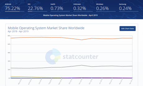
A mobile app should be compatible with a large number of devices, including iPhones, iPads, and Android devices, unless the company is targeting one set of users. It includes making changes in media queries, JavaScript, or CSS. You must, therefore, design an app keeping in mind 50/50 split. The below graph shows the percentage of mobile apps where Android dominates the global market share.
-
-
-
Color choices:
An alluring mobile UI is highly visual with a great color combination. By blending the right colors, you will be able to keep users engaged, encouraging them to use your app again to have an interactive experience.
Use the color elements with a clear purpose. Don’t make the colors too bright or contrasting to avoid hurting the eyes of the users. Also, remember to use common color associations for your buttons. For example, Red to cancel or for exit and Green to show continuity to avoid confusions.
It is better to choose color combinations that don’t have many colors for users to not get confused. A maximum of 3 is fine. Use colors for your app that have the same line and consistency with your logo and brand colors. This will help your mobile app look and feel like an extension to your brand.
Avoid using loud colors, which can disengage the users. By understanding the psychology of colors, you can use colors that are warm and provoke sensations of confidence or peace. You can even use colors that are somewhat contrasting to make the design and content clear.
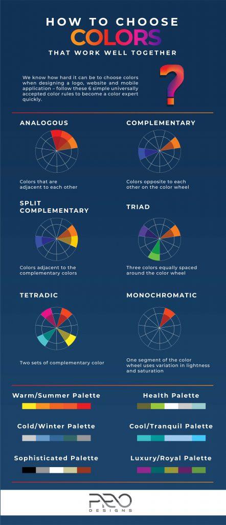
The below image shows how to choose colors that work well together:
-
Use of Buttons:
Buttons are an important part of a mobile app. Back button, for example, has to be designed properly as the number of screens and flows increase, to not hamper the flow of an app. In iOS, it is convenient to place the back button on the top-left corner.
Along with the flow, size of the button is equally essential, which should be limited to the size of a finger as most of the users make use of the thumb for accessing the interface. Also, everyone holds the phone in a different way. Some use one hand while some use two. The UI has to be user-friendly for people who are both left-handed and right-handed.
Along with that, developers have to design button size that enables users to touch the interface correctly. There should also be space between the buttons to avoid touch errors.
When you are designing a button for a particular functionality, you need to be consistent and use the same color and style to create reinforcement and give people an association with that button.
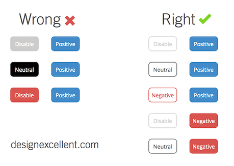
If button sizes, designs, and colors keep changing on every screen, it will be confusing for the users. They may click on a wrong button and get directed on a different screen, which can result in people uninstalling your app and your brand getting a negative association.
-
-
-
Simplicity:
Keep your mobile app simple not in terms of being minimalist, but users should be able to easily navigate through your app without having to go through the detailed guide. A simple design allows users to do multiple actions with only a few steps.
Source
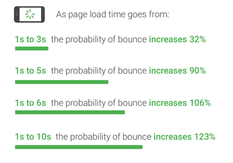
Don’t make your app complex as users are going to use it on a small device basically, and loading time will be more of the app. A simple design will lead to fast loading speed, keep the users focused, give a positive user experience, and enhance conversion rates.
-
Fonts:
It is to be noted that users won’t use your app if the font used in it is difficult to read. So, even if you are putting efforts into enhancing the visual aesthetics of your app, unreadable text can make it complex for readers to interact with the app’s UI. Here are a few tips to follow:
- Select the apt font and background colors. Use fonts that are pleasing to the eyes.
- Fonts should match the background color and the UI design.
- The contrast between your app’s font and the background should be appropriate not to drive away users.
- Devices are many times used outdoor. Contrast should be such that screen glare doesn’t make low contrast text difficult to read.
- Categorize the fonts into heading, body, etc. to make the display easier for users.
- Also adjust the letter spacing, font-size, and line height to give more appeal to the text.
- To distinguish one line from another, you can use pictures or page breaks or keep heading in a certain section and use regular capitalization rule below it. You can even underline text, bold text, change the font style, etc. to separate text.
- Fonts should neither be too large nor too small. They should preferably be more than 12pt, well balanced with other elements of the screen.
- There shouldn’t be empty spaces inside; the icons, along with the text, should form a whole.
- Limit the line length not to make users zoom while reading and avoid capitalization.
-
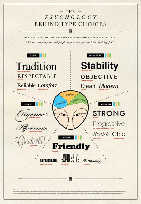
The below image shows the psychology behind fonts to enable you to use them properly to evoke the right emotion:
-
-
Following guidelines:
There are guidelines even for UI. For navigation and user interactions, you should adhere to the present guidelines. They will vary version to version on which your app will appear. Your apps will be scrutinized properly before they are live on major app stores like Google Play Store or Apple Store. It is vital to stick to the mentioned guidelines of these app stores for each operating system to get your app approved.
Before you start designing UI of your app, do some research on the apps that have been approved on the app stores.
-
Beta testing:
You can conduct user testing. Iterate UI to design intuitive apps for a specific demographic. Getting inputs from users can be really helpful in improving the UI of your app. Glitches can be removed in the early stage of the development. Some unforeseen issues can be eliminated before the app is already published on the app store. This will also reduce the costs and efforts involved in the development.
Updating design based on users’ feedback can ensure users are engaged, thus leading to increased installation of apps.
-
Final Note
The design world is evolving. Keeping up with the latest trends can make the companies implement new UI ideas in their app to reach new users and markets.
With app development continuing to grow, you need to have intuitive and engaging UI to give your app a competitive edge.
Hope this post has been able to give you the tips required to design a smooth UI that can deliver a superior user experience. Be creative, but don’t allow that to come in between the success of your app.
