The two easiest ways involve using the color wheel and choosing either complementary or analogous colors.When you search either term on Pinterest a vast collection of "over-produced" rooms appear (thank you LPC for that delightful term).
I am also including the split-complementary method that is a bit more sophisticated and my color plus neutral method. To avoid the "over-produced", it is advisable to add a healthy dose of neutrals so that the colors do not scream and to tint or tone the pure hue with white or gray.
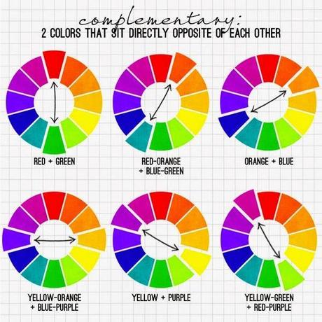
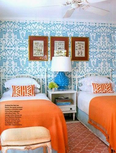
Complementary colors are opposite on the color wheel but that does not mean that red and green won't look Christmas-y. To use this method you need to tone the colors with added gray or tint with white. Think light blue paired with orange. Notice the amount of white added alongside the color.
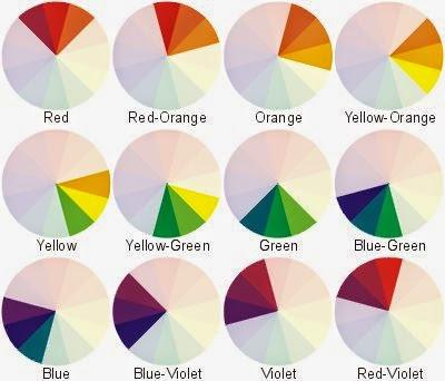
Analogous colors are next to one another on the wheel and the same toning or tinting are helpful.
I personally gravitate towards analogous color schemes in very pale or very dark tones. The mid-toned rooms are tempting to me though.
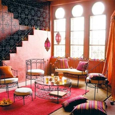
What on earth does a person do if they love both warm and cool shades but nothing in the combination of opposites is appealing?
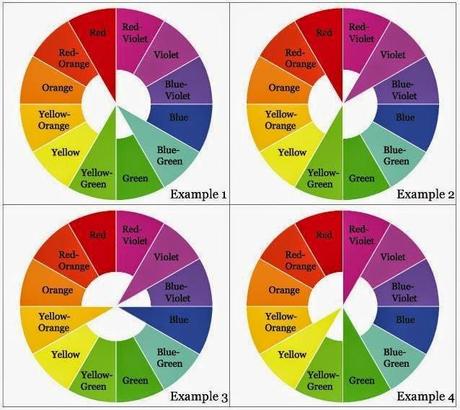
A split complementary scheme is one that the colors on either side of the complimentary are used.
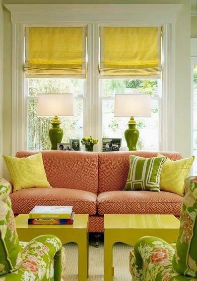
Here the coral is a tint (white added) of red-orange paired with tints of yellow and green.
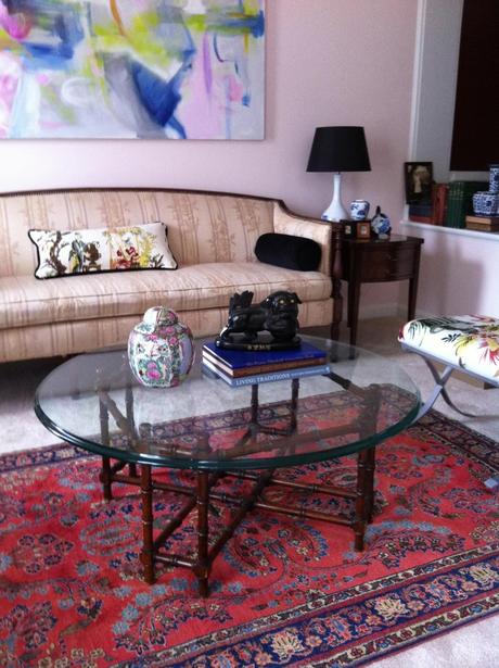
I must add that I do none of these most of the time. I think about what I have to use in the room, what direction I want the room to take, and what I can afford to buy to make it all come together. This generally involves a dominant color paired with a combination of neutrals and colorful accents. In my formal living room I used the ivory upholstered pieces that I had and chose a dusty, very pale coral on the walls. The art and accessories are varied colors in jewel tones and a bit of black that stands out.
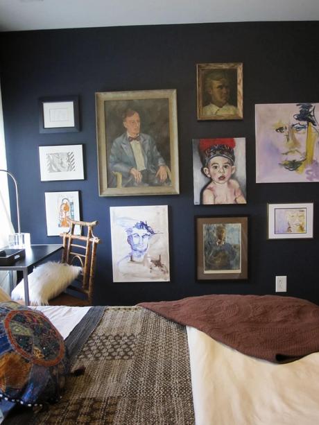
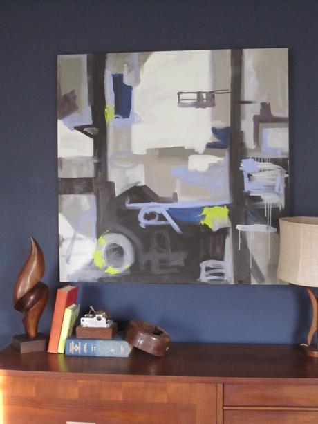
I used this method in my son's room and chose a navy wall and charcoal, brown and grays with a colorful gallery wall. It is quite a lot but 99% of the items are a variation of blue, gray or brown which keeps the look cohesive but interesting.
Which method do you prefer?
