2/5
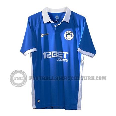
Wigan Athletic have finally unveiled their home shirts for this season. Overall it looks pretty plain and bland. l would argue that these look a good bit better than last years offering, although that is not really saying a lot. There is something about the look of the material that makes me think that these kit's are chep material wise. It looks kind of like one of those fake soccer jerseys you would see at a Flea Market. Maybe it is because I have never heard of the kit manufacturer and their products just may not be quality. Does Wigan have an official home color scheme? I mean just two years ago they were were full blue and white stripes and now they have a solid kit with no stripes to speak of? Maybe they should pick a scheme and stick with it. Overall the design is better than last year's but I can't get over the look of the material.
