5/5 Stars
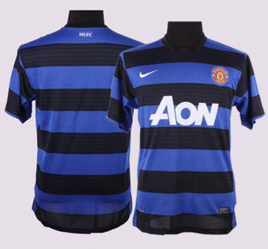
Color me a United fan, but I'm in love with this shirt. Manchester United has been known to go blue with their away and third kits in the past, most recently with the
2009 - 2011 blue chevron kit, the blue-out of 2008/09, and the blue and red 2005/06 Vodafones. In terms of style, this black and blue hooped away shirt trumps these three by far, and is a close second to my favorite blue United kit of all time: this 1992 Adidas shirt (a shirt I'm proud to have in my personal collection). This kit should pair with some solid black shorts nicely, and I'm particularly excited to see what kind of socks they use to complete the set (fingers crossed on some matching blue/black hoops). Bottom line, this may be my kit of choice when in Washington DC for the United/Barcelona summer tour friendly on July 30th.Newcastle Third Kit:

2.5/5
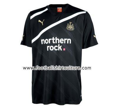
Puma is hit or miss with me. The home kit was leaked back in April to the plaudits of The Toast staff. This third shirt design is similar to what Puma did with a lot of their 2010 World Cup international shirts, examples shown here, here, and here. The most noticeable difference from these international strips are the two, thick diagonal stripes across the chest. The Puma logo has been moved from the center of the shirt to the left shoulder, presumably to accommodate the shirt sponsor. What confuses me about this kit is the color scheme: it's the exact same as the home shirt. I'm expecting a radical away kit for Newcastle for the upcoming campaign, or at the very least for them to retain the blue joints they wore on the road in 2010/11. It's a classy look, but I generally look for a little creativity in a third shirt.

Wait, what did I give their home shirts?
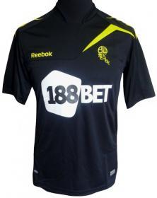
Whatever it was, add 0.5 to it. This is by no means an attractive kit, but anything trumps the atrocious clown costumes they'll be wearing at home. It would go a long way for the Wanderers to negotiate a new sponsorship deal. This is a relatively plain kit (I can handle the black/yellow color scheme and the sharp-angled shoulder cuts) that is completely undone by the behemoth, seemingly reflective 188Bet logo across the entire front panel. Attention Wanderers: are there any of you out there that would actually purchase and wear this shirt? Seriously.
As always, we'd love to hear from you. Share your opinions below.
