Manchester United's home kit has been officially released, and is confirmed as what we initially reported.
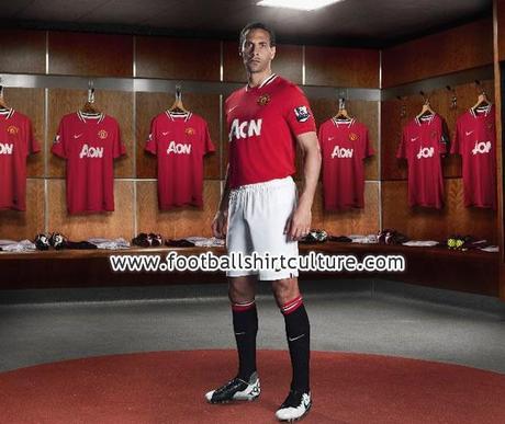
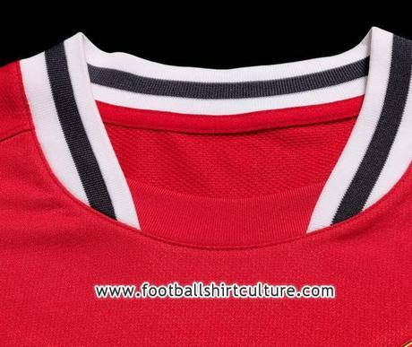 I stand by my original assessment. It's a nice, clean looking kit that will look excellent on the pitch. I love the shape and design of the collar, as well as the shorts/socks it will be paired with.
 Manchester City Away Kit:Look familiar?
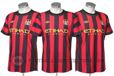
2/5 Stars
The main problem with this shirt? It just plain hurts my eyes. It's not altogether the worst looking kit I've ever seen, but it really is rather frustrating to look at. The gold sponsor and Umbro logo are a bit much. One detail I like that you don't necessarily see a lot of on other vertical-striped kits is the horizontal stripes on the sleeves. It's not unusual for City to go with the black and red color scheme on their away strips, and it's a continuous trend now in it's fourth year: 2008/09, 2010/11. The good news is we didn't see much of last year's away strip, as the first-choice baby blues and the alternate black shirt don't clash with rival opponents very often.
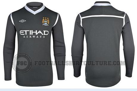
As far as I can remember, this is the first keeper shirt we've featured on The Toast, and I'll admit I'm absolutely in love with this one. The charcoal color is bold and modern, and the secondary coloring and club crest pair nicely with the darker base. Not that anyone buys keeper kits, but it will certainly look good on the pitch.Fulham Away Kit: The official Fulham away kit has been released, and it looks like they'll be back in black for 2011/12. 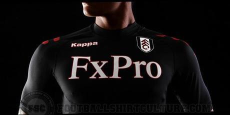
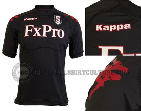
I was completely taken aback when I first saw this shirt. If it's as form fitting as the above picture indicates, it may not be the best purchase for fashion/fan wear. I personally prefer when Fulham uses the black strip when they're on the road to complement their white home shirts. The sponsor font may be a bit larger than most of us are used to, and they have it centered a little high, which is what I think turned me off the first place. However, the more I look at it the more it grows on me. It’s certainly not the worst-looking kit I’ve ever seen. Fulham Away Keeper Kit: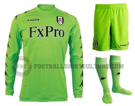
It’s hard to expect much from a keeper shirt, and perhaps City set the bar a tad high (featured above). The lime green is a pretty standard, bright color for keeper-wear. I’ve always thought the Kappa logo was different and interesting, and I certainly prefer it to be running down the sleeves than Adidas stripes. It's just ehh.
