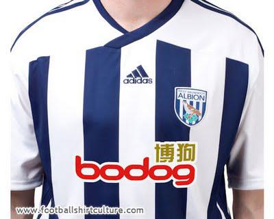
2011-12 West Brom Home Shirt:


 3.5/5 Stars
First, let me say that as far as jersey templates go, this Adidas one is a winner. Their design for this new West Brom shirt is equally winner-ish. I can actually narrow down what I like about this shirt to one relatively small feature: the framing of the vertical stripes in the back. The rest of the kit I can take or leave. The vertical stripes don't go all the way up to the shoulders in the front, and they clash a bit with the Adidas shoulder stripes. The shirt sponsor is.. interesting. It's not the worst sponsor I've seen, but the Chinese (I'm guessing) symbols add an unusual flair. The shorts/socks combination to match are very standard, and offset the busyness of the shirt well. Three of the shirt's three and a half stars are entirely due to the aforementioned back framing.
2011-12 West Brom Away Kit:


 1/5 Stars
The idea of this kit is solid, the execution is poor. The base color is loud, and the addition of the "subtle", shiny hoops makes it look tacky. I do appreciate bodog and West Brom being willing to change the color of the sponsor to fit the scheme of the kit, a practice in which most sponsors/clubs aren't willing to partake. The back of the shirt is plain, and it honestly looks better and more rich than the front. The best decision Adidas made was to use a dark navy for the shorts and socks. I'm usually a fan of the monochrome kit, but to have the same color shorts and socks would have been too much for this one. Still, not thrilled with the look overall.
