TAKEAWAY: Today I present one of the keynotes at WoodWing’s Xperience conference in Amsterdam. My topic: One year later: what we have learned creating news apps. Here they are!
Here is introductory image for my presentation today for WoodWing’s Xperience in Amsterdam
As I will be doing this presentation live this Wednesday morning at the WoodWing’s Xperience conference, I am only listing the 17 lesson headlines here. I will update this blog post after my presentation, to beef up each of the segments with a summary of what the lesson taught me. Stay tuned for that.
Lesson 1: The tablet is a platform that changes the game forever, and will continue to do so
Lesson 2: We must think in terms of a media quartet: mobile phone, online, print and tablet
Lesson 3: The tablet is a platform that must be conceptualized to accommodate its uniqueness
Lesson 4: A news app is not a replication of the print/online experience.
It goes beyond to create an immersive experience (remember the finger)
Lesson 5: Make the design of the news app sophisticatedly simple
Lesson 6: Allow for a curiously impatient finger—-and design accordingly!
Lesson 7: Start with a clear path to movement and navigation
Lesson 8: Show the functional side of your design
Lesson 9: Start with the basic building blocks of a grid
Lesson 10: Reflect the DNA of your publication visually in 10 seconds
Lesson 11: Emhasize uniqueness: not two news app experiences are alike
Lesson 12: E-readers can work, but with something extra
Lesson 13: Establish your news “update” plan from the start
Lesson 14: This is a platform for photography, make those photos king!
Lesson 15: Look at what others do, study, dissect, localize—inspiration is everywhere
Lesson 16: Be ready to experiment, to fantasize, to stretch your creative muscles
Lesson 17: It is all about four disciplines: storytelling, advertising, technology
and economics
Joe Zeff: “Reinvent Everything”
I have big shoes to fill today here at the WoodWing Xperience conference. My friend and colleague, Joe Zeff, got the audience thinking Tuesday with his provocative presentation titled:
“Reinvent Everything — Your Content, Your Business Model, Your Future,” .
Catch highlights of this presentation here:
http://joezeffdesign.com/reinventeverything/
TheMarioBlog post #780
Newsweek: Editor Tina Brown Making a Difference
TAKEAWAY: Call it perhaps the quickest noticeable improvement ever when a new editor takes charge: I like what I see and what I read in the Newsweek under the very obvious editorship of Tina Brown.

The most visible and palpable change of a printed product following the appointment of a new editor: Newsweek
I am not just flipping through the pages of Newsweek, I am stopping at almost every turn as I am seduced by the content. Tina Brown manages to fulfill the promise she sent in a message to readers in the first issue of the newsweekly that she was assigned to revive: a newsmagazine must be seductive and serious. As you may recall, Tina Brown was brought in to save Newsweek from what many in the industry considered its imminent demise.
In one of
our blog posts in February, we wrote that if anyone could revive Newsweek it was Tina Brown.
The May 23-30 edition feels more like the piñata of goodies that a 4-year-old loves to hit with his baseball bat. The confetti and the goodies are all over, as is Tina’s imprint .
The cover story is titled Not So Lonely Planet, an extended travel extravagance showing that the world is a neighborhood that extends from the ruins of Machu Picchu to modern Mongolia.
In between, the Taliban after Bin Laden and a take on the Arnold Schwarzenegger and Maria Shriver separation—-treated not as a celebrity gossip story, but as a lifestyle trends piece on sex after 60 and why older couples are calling quits and returning to adolescence.
Indeed, the Newsweek is seductive and serious , and, I may add, entertaining, enlightening and fun to read. It also apparently attracts more advertising, feels fuller than those anorexic issues in the pre-Tina Brown era, and shows that the genre of the newsweekly is not necessarily a goner.
The iPad and kitties
For the cat who has everything, but still sits on the edge of the window looking discontent?
Now Friskies has the obvious remedy to kill cat boredom: an iPad app that allows the kitties to play as they fantasize about the fish in that virtual fish tank.
See the video here:
http://pinchzoom.com/posts/friskies-creates-ipad-apps-for-cats/?utm_source=twitterfeed&utm_medium=twitter
Today’s pop up moment

Following the aftermath of the Dominique Strauss-Kahn (DSK) affair, today’s Bild Zeitung’s pop up moment asks the question: Why are all the French politicians so horny?
TheMarioBlog post #779
Gulf News launches its first iPad app edition
TAKEAWAY: The Gulf News of Dubai has launched its first iPad app, pioneering in the concept of the tablet “editions” with two updates daily. We present a case study of our Garcia Media experience creating and developing this news app with the GN team.
Gulf News: pioneering with editioning concept for tablet
Gulf News Tablet door screen
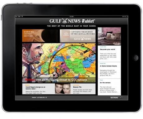
Here is a Morning Coffee edition landing screen
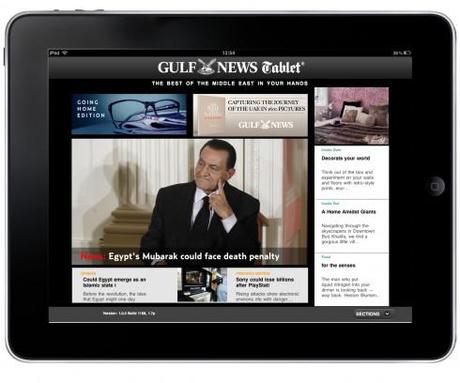
Going Home edition: updating the days news, introducing features
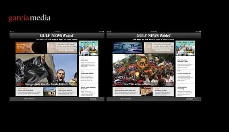
Two editions side by side: Morning Coffee, Going Home
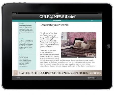
A reading text screen
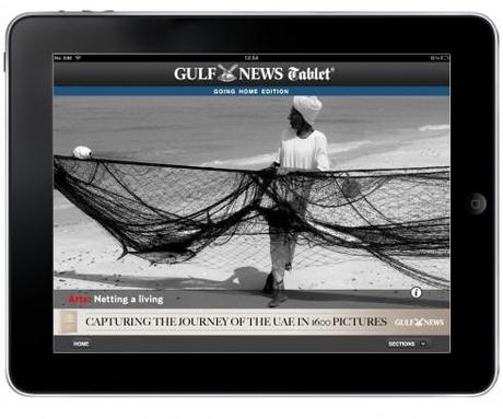
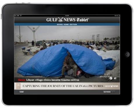
Photo display screens
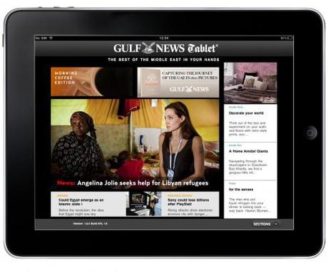
Morning Coffee edition: newsy presentation
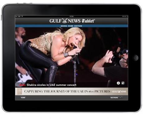
Going Home edition highlights an entertainment story
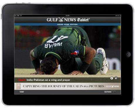
When sports becomes the lead item on any edition
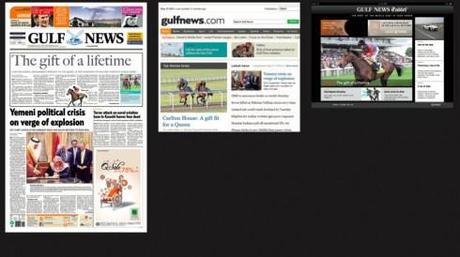
Gulf News trio of platforms: Monday’s print, online, tablet editions
The Gulf News, published in Dubai, is the definitive authority when it comes to coverage of the UAE and the gulf region. I first visited the Gulf News
newsroom in 2003 to conduct the first major redesign of the broadsheet newspaper. This is perhaps one of the most dramatic visual and content overhauls of my career, and it involved a team of about 10 from Garcia Media.
Since then, I have been retained to work with various Gulf News projects, both print and digital, and including all of the many magazines and special
publications it produces.
I have watched with great pride as the Gulf News design and graphic team has amassed dozens of awards at international competitions. The Gulf News
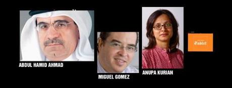
thrives and evolves under the strong leadership of editor in chief Abdul Hamid Ahmad, a man who understands and respects the role of good design and
packaging in a publication, and design director Miguel Gomez, one of the most talented I have worked with, and who has great rapport with his editor colleagues, because he understands that his role as a designer is to enhance content.
Creating the Tablet
So it was a great challenge and opportunity when Abdul Hamid informed Miguel and me that our next project would be to create the Guld News’ first tablet
edition.
It was April 2010 and the iPad had just appeared in the market. In act, we were hosting one of the first iPad related conferences at the
Poynter Institute for Media Studies. As director of the conference, I was in the midst of
assembling the team of global speakers for the program, not to mention creating a series of discussions centered around a format that we knew next to
nothing about.
However, we did know that the tablet platform would offer better opportunities for storytelling and that our stories could grow longer legs on this new medium.
I suggested that Miguel attend the conference, and it was clear in my mind, that this new platform required is own dedicated editor.
Abdul Hamid, Miguel and I knew that perhaps an ideal candidate would be the smart and talented Anupa Kurian, Editor of the Reader Interactivity and Community Journalism Desk. Anupa has a thorough background in journalism and storytelling, but also great interest in the digital media as well as a commitment to the idea of
the readers’ community interacting with the newspaper, a key area for those editing tablet editions.
Anupa joined Miguel in attending the Poynter Institute conference on tablets, and it was during our
meetings there that we decided to start sketching the Gulf News Tablet with the concept of editioning as a basic guideline.
The planning and conceptualizing
At the beginning, Abdul Hamid set the stage when he said:
“Gulf News is driving the change in the media in the region. The iPad or more generically the Tablet is the newest platform that any progressive newspaper should accept and utilise. We do not believe in sitting back and playing catch-up. Our Tablet application shows that we are the market leader. We have ensured that readers can experience a designed application that has unique content in its two daily editions, created especially for the iPad, not just a web-based feed of newsbreaks. The Gulf News Tablet is more featurish and less newsy. The content is relevant and gives readers a taste of the flavour of our print edition.”
From here, Miguel and I proceed to create those first sketches.
Miguel and I sat side by side in what has been a totally collaborative effort. I was intrigued by my early work on a tablet edition, at El Tiempo,
of Colombia, where the concept of editioning was introduced. I remember as a young journalist working in the then thriving afternoon daily, The Miami News, we used to produce up to three editions a day, including the so called FINAL, devoted to news that people needed to consume on the way home.
I maintain that the tablet is less of a breaking news platform——leave that to mobile phones and online editions——and more of a
“catch me up but let me relax” medium.
So, working with Miguel, we started thinking Morning Coffee and Going Home. At that time we were even contemplating a lunch time edition, and, who
knows if it may still happen as the Gulf News Tabletevolves and develops further. Here is how Miguel describes the idea in its early stages:
“The idea of the editions was interesting and we tried to reflect it not only in terms of content but visually, the morning edition is meant to be newsy and with emphasis on reading, on the other hand, the plan for the evening edition was to create a space to showcase big pictures and make them to tell the story.“
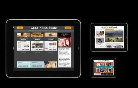
These are early sketches when Miguel and I were conceptualizing the Tablet as having three daily editions: Morning Coffee, Lunch Break, Going Home
In terms of design, Miguel and I knew from the start that the key to a successful news app is that it is easy to use. Too many gimmicks, too many
Disneyland moments and the whole project collapses under its own weight.
So we went for wireframes that allowed for hierarchy: main display of the story of the day; then vertical scrolling columns with other features as
well as a horizontal navigator for secondary stories of the day.
Getting the Tablet edition off the ground
When the Tablet edition launched last week, it was preceded by a six-month effort and some delays from the original timeline. It is a good idea for any organization planning a new tablet edition to build in extra time, and get away from tight timelines.
This is a new medium that requires fresh thinking, experimental approaches, and where the technology plays a key role.
The Gulf News team chose WoodWing to provide the technical know how and its content solutions software. Once Miguel and I had finalized sketches that reflected the concept both visually and journalistically, we then submitted them to the WoodWing team for its evaluation.
For this particular project, we worked closely with the WoodWing operation in Mexico. Every step of the way required firm and clear communication as we had three companies involved: the Gulf News team working closely with me providing the concept, another team doing the templates and another developing the platform.
“This created a good amount of stress at several points,“ Miguel says.
But, as I often repeat, this is a medium in its infancy, where trial and error are at the top of the list of experiences.
The journalistic side
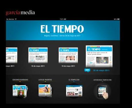
To my knowledge, El Tiempo, Colombia’s national newspaper, was the first to experiment with the concept of editions for its iPad tablet
At the same time, we were working just as hard on storytelling, what the stories would be and how they would be presented.
Anupa Kurian sat by our side as we sketches, and the discussion led to: what would be the main story for Morning Coffee from today’s Gulf News print
/online editions?
From the start we knew that Anupa would choose the one story she thought would carry well to a global audience.
The DNA of the Gulf News, what people would come to its tablet for, are UAE news, gulf region news and the Middle East. That is what guides Anupa’s
choice of stories.
Some days, she leads with fashion, other days with sports (as in cricket), and, of course, with news that fall within the DNA of the newspaper.
It is a learning process, so I have asked Anupa, who as one of the first dedicated tablet editors in the world can have a thing or two to share with
those contemplating the same path, to give us her views, and tips:
The Gulf News Tablet’s first editor shares her experiences
Mario : As the editor of this edition, what is your greatest challenge each day?
Working on the iPad edition is exciting … it gives you the
satisfaction of a print edition and the interactive functionality of a
digital platform, offers an editor so much more opportunity for greater
storytelling. And that is also the core of a Tablet edition - good content.
The greatest challenge each day is ensuring the tablet team rides the
highwire of news relevance, alternative in-depth storytelling and
high-impact visual journalism skillfully. One misstep and you’ve lost your
reader - they will and can easily move to another App. I think of us
competing with Angry Birds for time.
Mario: What advice would you have for potential editors of iPad editions in
other publications: what would be the one TIP you would offer them
immediately, before they even start?
Be aware, be excited, be ready for an adventure. A month on an iPad
is equivalent to the learning curve of six months in print because there is
so little known of Tablet reader behaviour. And have your product out there
as soon as you can. Design, pictures, intuitive navigation and interesting
storytelling that brings it all together is vital. Decide if you want a web
feed or a multi-alayered application, as internet connectivity around the
world is not the same - this is a decision tied in with the identity of your
product and how the world will consume it.
The one tip for all iPad editors, is something I tell my team every day -
have fun, experiment, discover and the readers will follow.

