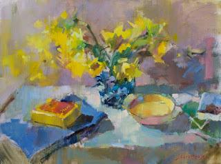
Arrangement in Yellow
30 x40
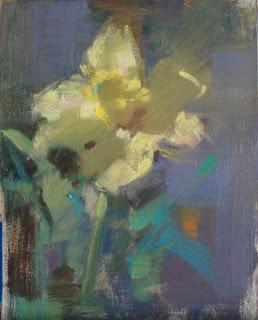
Daffodil #1
10 x 8
Then I placed the biggest, simplest local color notes that I could on top of it, focusing on large, unified shapes. The background bluish-purple is also a distinct color statement and its mid value means that it can interact with other colours on the board, boosting the liveliness of the flower's cool yellow.
My medium in this was a bit of oil, but mostly just straight paint on big brushes.
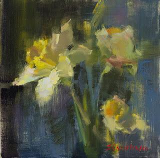
Daffodils #2
12 x 12
This has a strong sense of form - something that a full value range is good at creating. The medium I used was stand oil and OMS, which gives a thick, juicy, and transparent flavor to the background
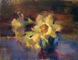
Daffodils #3
8 x 10
Daffodils #3 was started with a color I seldom use anymore: transparent red iron oxide. It's a rich, transparent, warm dark that was the pigment I always started with at one time, until I got heartily sick of it. Then I felt like I was seeing it far too prominently in every painting - not to mention the paintings of a lot of other painters. It was very popular.
Different from the greenish umber start, this one has a powerful TRO presence till the end. It's invasive in a painting and doesn't want to be shut up, so I tend to let it have its head and run throughout the whole work. If you can't beat 'em...
Stand and OMS was, again, my medium and the board was toned a warm, earthy color.
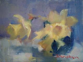
Daffodils #4
6 X 8
#4 was done without underpainting. I premixed average colours for each element: flower, vase, background, and table, and placed them in the first pass. Then I added a second, more accurate layer, but only in a few spots: the daffodil ruffle, a couple of petals, and the table. I had 20 minutes for this one, so fussing wasn't an option, and I wanted to try something different from the other starts. I used straight paint for this so that I would have a robust paint layer in the first pass.
I quite like this little one. There's a simplicity to just putting one accurate color next to another on a white support. The white ensures maximum freshness in the color since there's nothing to try to cover up. A drawback is that the painting lacks depth and complexity for the same reason: there's nothing under the image except a white canvas.

Arrangement in Yellow
30 x 40
I also knew, after some more precise rendering of the flowers, that I didn't want to belabour the specific structure of the blooms. I'd find a recognizable daffodil color range, and trust that a few, minimal details would let the viewer know what they were looking at. I'd also let them know that it didn't really matter what the flowers were; it was the color that was key.
Flowers are, for me, the trickiest subject of all - probably because I struggle with knowing what level of detail appeals to me, and, when you can't visualize the finish, it's hard to move ahead. The little studies that I did for this larger work were really useful in showing me possible outcomes without having to commit to a large canvas. And, they allowed me to ignore the snow outside the studio and just think "spring"!
Happy painting!

