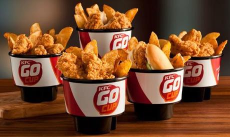
(as originally published in Food & Drink International, 12/6/2013)
Hey. How about those KFC Go Cups. Lower and wider than drinking cups, nestling nicely into your car’s cupholders to hold the chicken and French fries you just drove away with—an easy, basic brilliance that took a long time to arrive, it seems to me.

Go Cups have me thinking about QSR packaging. It’s such an opportunity, and so often wasted (not to say wasteful).
Yes, it’s probably easiest to contact the supplier and just arrange to have a basic logo printed on at least one side of whatever you’re sending out into the world (make sure you use the brand standard guide that was issued to you).
But please note: Your logo is not your brand. Your brand is the emotional attachment people feel to you, and is the result of every little thing you do—intentionally or unintentionally—every time a customer comes across you.
So. What if you tried to do more with your packaging?
What if you tried to actually send your brand out the drive-thru window, into the world, as a representative of who you are, and how people should think of you?
Those cups may sit in the minivan cupholders long after the memories of the experience of dining with you has been filed in your customers’ hippocampusi or (if you really got to them and created an emotional moment, good or bad) their amygdalae.
What should yours say? What should it do?
I guess it depends on who you are.
For the sake of simplicity, let’s say you’re fast food, or at least the sort of place that has a drive through cut into the wall for somebody to cuckoo-bird out sacks of food to customers who (often mistakenly) thought they’d save time by staying in the car.
What can you do to stay with them a little longer than it takes to get to the bottom of the sack, slurp their last cola and responsibly find a trash can? Here’s some of my favorite what-they-dids:
1. Taco Bell’s Rich Heritage of Weird Sauce Packet Humor.
Those funny sauce packets that Taco Bell has unnecessarily been entertaining its customers with for years are often plain old absurd. My favorite, quoted from memory and therefore possibly imprecisely, says, “I’m scared. It’s dark and I can hear laughing.” The demographic that takes a handful of sauce packets to flavor up an 89-cent burrito loves that unnecessary humor.
I think for years these felt “below the radar.” It seemed like someone was in charge of doing whatever they felt like with them—that’s the sense you get reading them.
Unfortunately, I feel like they’ve been detected by higher-ups in the marketing department, and they’re now being asked to do a little cross-promo, a little upsell, a little shilling for the latest promo. And they’re not as weird as they used to be.
Humans—for whatever reason—crave a little dose of weirdness here and there. Please, higher-ups: let these sauce packets remain right-brain odd. That’s my Taco Bell Prayer.
2. The Simple But Impressive Whataburger Ketchup Dipping Cup.
We were in focus groups in Dallas trying to get people to talk about great burgers, and all any of the moms would talk about (I exaggerate only slightly) was the ketchup packaging. It’s not a new item—it reminds one of to-go syrup containers, or an enlarged tabletop jelly container—but its use as a practically mess-free option to give ketchup to carseat-bound kids was a conversation topic we couldn’t get the groups to drop.
What a thoughtful company Whataburger appears to be, thanks to that ketchup package design.
3. Various Burger King “Have It Your Way” soliloquies from a few years back.
(as originally published in Food & Drink International, 12/6/2013)
A lot of fast food restaurants have tried to write well and engagingly on their sacks and the sides of their cups, and it seems like even more of them have been trying ever since Burger King attempted to revive its “Have It Your Way” concept as an over-arching conceit for the entire store to obey.
Nobody does it better than BK did it. Yes, they gave up on HIYW as an organizing principle, and these manifestos disappeared. But they were wonderful while they were here: “Have it your way,” they suggested on a cup. “Maybe you want a lot of ice. Maybe you want no ice. Maybe you want your top securely fastened, or maybe you want to go topless. Hmmm?” Again, we’re veering into Taco Bell territory, but it’s so personable, and engaging. “Maybe you want to let your cup runneth over (we wish you wouldn’t).”
I love to peek inside a restaurant’s marketing, and glimpse a real person peeking back at me, telling me interesting things in a venue normally reserved for a logo and tagline.
If it’s being printed, the ink might as well be arranged in a meaningful way. And as the Go Cups show, you might as well make the actual shape and form of the packaging useful and interesting, too. Makes your company look like it’s thinking. Like it’s awake.
Like it’s ready for an emotional relationship of some kind; in other words, like it’s ready to communicate your brand.
