TAKEAWAY: It was a extraordinary project for me and for Garcia Media, the type that you simply can’t refuse. Our assignment: to design the first ever magazine for the luxury Shangri La Hotels, with emphasis on Chinese language. As the magazine had never existed before, we had, at the start, carte blanche to create a product that guests would be proud not just to find in their rooms, but that they would want to take home. And so Shang was born. PLUS: Headed for Istanbul and the yearly +1T Newspaper Days conference
Luxury feel on every page
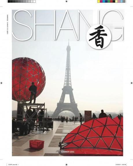
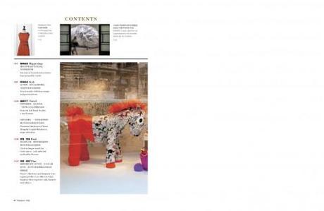
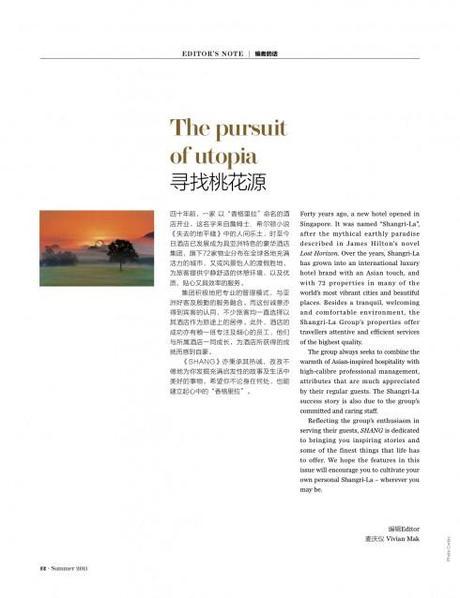
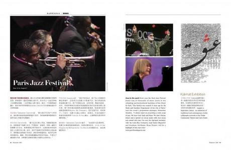
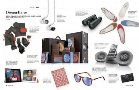
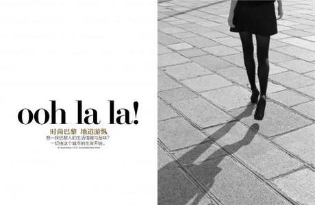
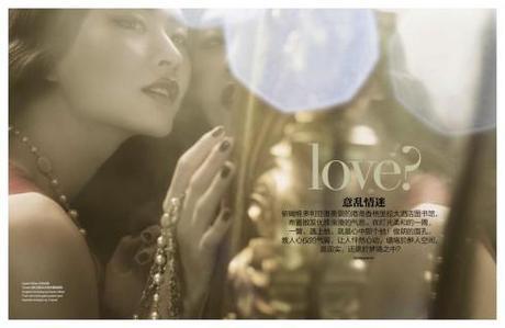

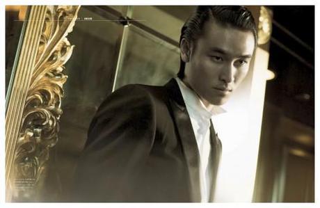
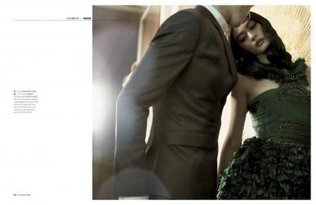
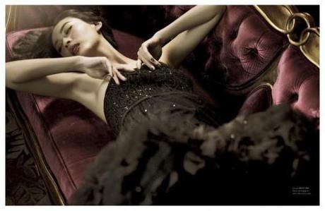
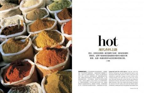
As soon as I knew about our assignment to create the Shangri La Hotels‘ first ever magazine, in which Chinese language would be the primary one (with English as secondary), my first step was to engage that talented designer and art director, Nai Lee Lum, to accompany me on the project. Nai brings with her a distinguished 25-year career with Fortune, among other publications, and, as a native of Hong Kong, wonderful knowledge of Chinese and the intricacies of selecting the right typography.
For Nai and me it was a marvelous start when we met in New York City, which is home to Nai, and had a mini workshop to brainstorm. We covered a table in front of us with everything you can imagine related to luxury brands, five-star hotel magazines, plus publications that we both liked, all in glossy paper, with spectacular photos and a look and feel that inspired readers of a casual publication not just to look, but to read as well.
AS a result of this workshop, our first sample pages emerged, with Nai carefully selecting Chinese language fonts that would reflect the elegance and uniqueness that the Shangri La Hotel management wanted to bring to its first ever magazine. Although the Shangri La Hotels are turning 40 this year (with this celebratory first issue), it had never published a guest magazine before.
I must admit that we had little to go on in the way of a briefing other than the simple: make it luxurious, tempt the readers to take the magazine home, provide an environment that approximates what the Shangri La Hotels are all about: an oasis of peace, tranquility. After all, the hotels take their name from a fictional place described in the 1933 novel Lost Horizon by British author James Hilton. As a frequent guest of the Shangri La Hotels myself, especially in Hong Kong, I know first hand that each night guests find more than a chocolate on their pillow. In addition, there is always a book mark with a passage from the novel Lost Horizon, always inspiring meditation.
The magazine, we were told, must capture the spirit of the hotels.
Minimalist approach
For Nai and me, the first challenge was the accommodating of the two languages: Chinese and English.
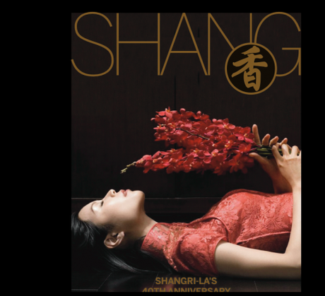
The moment I saw the first sample pages (shown below) and the beauty of the Chinese calligraphy, I was fascinated by the character of each letter—- art, for sure. Nai would play with color and type as well, going for solid gold in some letters, and explaining to me that in Chinese, one character says a lot about what the words mean, from sadness to happiness, for example. We soon decided that white space would be our companion on this interesting journey.
A magazine that will be read by guests at luxury hotels and spas worldwide should not overwhelm with visuals. As I walk through the large rooms and hallways of Shangri La Hotels, I always get the feeling of openness, that oasis that Shangri La, as in the novel, is all about. We tried to bring that spirit to the pages of Shang.
Our early prototypes
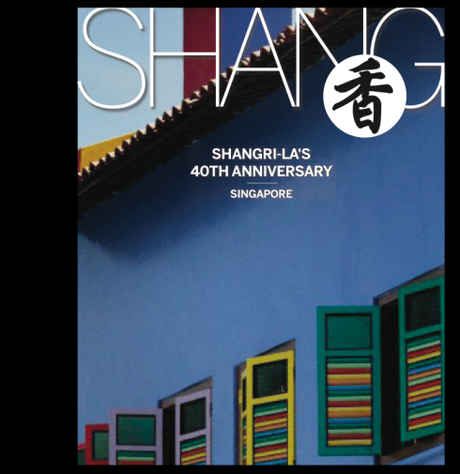
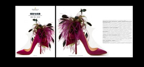
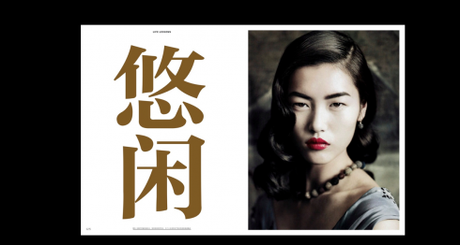
Note: I am travelling today between Oslo and Istanbul. This case study will continue with more illustrations and text as I get more information throughout the day today .

I am preparing my presentations as I participate, for the second consecutive year, in a well organized and interesting seminar in Istanbul.
The +1T Newspaper Design Days is sponsored by Turkey’s daily newspaper, Zaman. This will be the sixth edition of the +1T Newspaper Days program.
According to Fevzi Yazici, design director of Zaman, this program is especially designed for design students, to attract them to the world of visual journalism. However, professional journalists and designers also participate in the event.
“Our +1T Newspaper Days program is based on the idea that art (design) students and journalim students have to come together to get best newspaper design. So Zaman’s design staff organized this event to give future newspaper students an opportunity to accomplish this mission.“
This year program includes presentations by well known Turkish journalists. In addition: photographers Reza, George Georgiou, Vanessa Winship; Infographics artist ,Jeff Goertzen, of the Denver Post.
The seminar runs for 8 days June 21-
The seminar takes place at the Zaman’s hearquarters in Istanbul.
The title of my presentations are:
For print: Survival in the times of the iPad and Beyond
iPad :Creating that news app that is uniquely special
For more information:
http://www.arti1t.com/

