I was brought up in a household with books. Often to the amazement of my school friends - there were shelves and shelves of them. There were new paperbacks and old embossed hardbacks. There were novels and guidebooks and history books and natural history collections and everything in between. Growing up in such an environment, there are certain rules which go without saying:
- Never turn down a corner to mark a page - use a bookmark!
- Never write in a book, unless to write your name neatly on a flyleaf.
- Never, ever write on the pages of a book.
- Do not draw, or colour on the pages of a book.
The experience of studying for three degrees and almost 30 years as a Pastor has relaxed some of those rules. I often pencil notes in a theological book which I can then 'hoover up' afterwards to summarise its contents. I have owned a string of increasingly messy Bibles - and encourage others to mark them with notes, underlinings and dates. That said, to take coloured pencils and colour in a Bible is a new thing entirely.
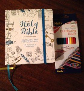
With some degree of unease, I bought a box of coloured pencils and set to work:

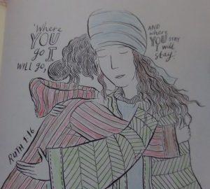
With a children's talk to give on Ruth, I decided to start with an illustration of her story, and was quickly absorbed in the task.

In some ways, the absorption is the point. Ever since artist Johanna Basford was asked in 2001 to switch her talents from designing wine labels to designing colouring books for adults a right-brain revolution has started. Colouring books for adults are a huge marketing opportunity, so maybe it was only a matter of time before somebody brought out a Bible which could be coloured.
The Hodder Bible has 32 plates which can be coloured, and its ivory pages have wide margins to allow for notes, annotations, or even doodles on the pages where the text itself is printed. Whilst this necessitates a very small 7.25pt font, the text is clear - and I suspect that most people who own this Bible will have access to others anyway if they wish to study the text.
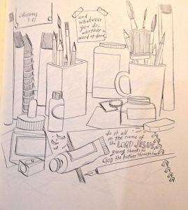
This is not a Bible to study, though. Rather, it is a Bible with which we are encouraged to interact. Those wide margins are just crying out to be written upon, and Stu McLellan's illustrations have enough charm to intrigue with dictating how they should be completed. His illustration for Colossians 3 v.17, seen below, is typical. Where else would an artist think about bringing glory to God but...on a desk cluttered with art materials?

Much of the emphasis in contemporary communication is on speed. Those who can provide the quickest transfer of information and those who can accelerate the speed of downloading it are winning the communications game. As a man who spends his life encouraging others to absorb what God has to say to them, I have been looking for the handbrake! This Bible will encourage all who use it to go a little slower, absorb a little more and think a little more deeply - which can only be a good thing.
