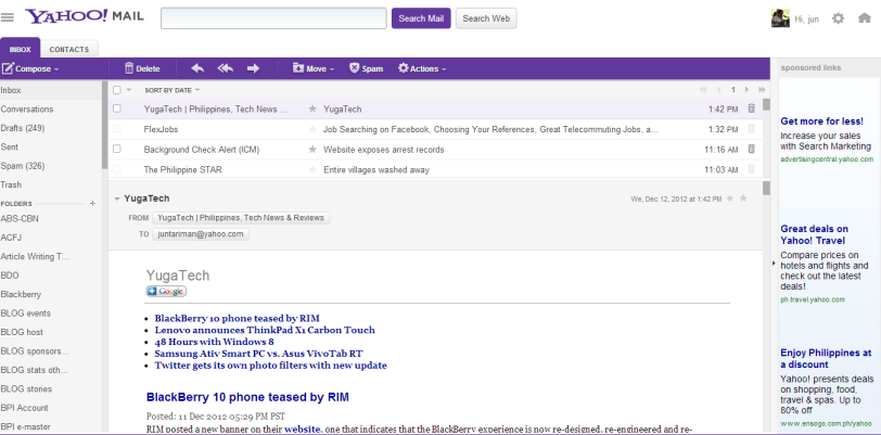
I am greeted today with a new-look of the YahooMail when i opened it early morning. Previously, i choose purple as my YM’s theme color. However, today’s YM’s theme looks more vibrant.
The interface is now clean and the subject lines for each email appeared clean. The Reply and Forward buttons are replaced with just symbols. However, hovering the mouse over it will pop-out the text for Reply, Reply All and Forward.
The Setting and Home buttons are now at the right top corner of the screen. Deleting an email is one-click with its “trash bin” icon located at the far right end of each email.
One thing more, it’s now very fast!
