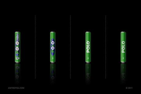
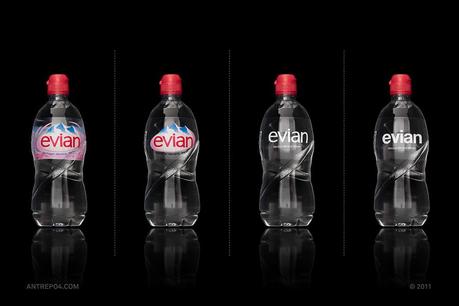
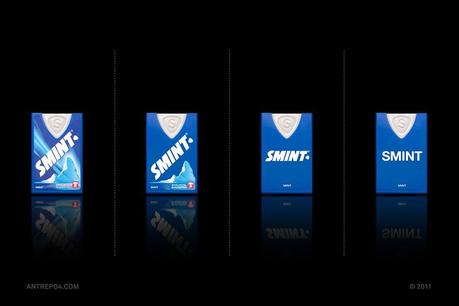
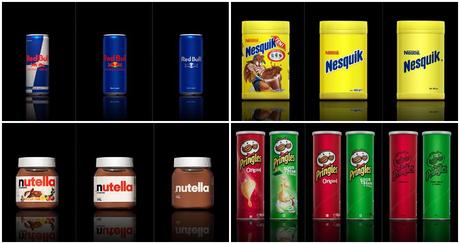
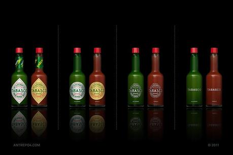
According to The New York Times, The average person sees up to 5,000 ads a day. All the ads are full of colors, product labels are slammed in our faces in magazine, online, billboards… Imagine if all packaging toned it down a bit focusing on clean lines and minimalist design. Creative agency Astrepo created a photo series depicting just that: the most minimal version of all our favorite foods and drinks.
