I’ve never managed to capture all the preparatory work towards a collagraph before, but this time I’m going to try.
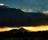
The print will be of Roseberry Topping, a rocky outcrop on the edge of the North Yorkshire Moors. According to Wikipedia the hill is formed from sandstone laid down between 208 and 165 million years ago. Its distinctive conical shape is the result of the hill's hard sandstone cap protecting the underlying shale and clay from erosion by the effects of ice, wind and rain.
I’ve known the hill almost all my life. it is clearly visible from many miles around. I grew up on Tyneside but had family on Teeside and in North Yorkshire. I spent many summers in Helmsley, just to the south of the North Yorkshire Moors and you can see the hill as you come into the village over the moors or if you come in from the west, (having first climbed the dramatic Sutton Bank, with its 1 in 4 incline and hairpin bends - likely to be the subject of another print.)


The print I’m working on, like much of my work is based as much on memory of landscape as anything else. I had some photographs of my own and from the web, but I didn’t want the print to be a transcription of a single view. It was the shape and its setting in the open landscape surrounding I remembered and this was what I wanted to capture.
Below on the left is one of the very early sketches trying to block in the shapes. Looking at the first one I felt I needed a vertical format. The 'wide angle' view in this sketch seemed to lose the feel for how the hill dominates the landscape around. The next four are variations on this vertical format. I did lots of these in various levels of detail, each on about 1/3 of an A4 page in my sketch book, sometimes on tracing where I wanted to transfer elements from one sketch to another. The first three here looked to my mind too much like Japanese woodblocks, at least in composition. The fourth one looked at how I might add tone and texture. The final one is the more or less final version, with some color notes. There’s a small variation at the top.


Finally I took another outline of the final version, gridded it up and transferred it to the mount board to begin work on the plate proper. This time I remembered to reverse the image before I started work…

Another post will look at work on the plate. It is difficult however to capture the texture on a collagraph plate until it has been used, since until then it is pretty much monochrome, or the colours will be arbitrary, reflecting only the color of the materials used.