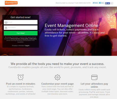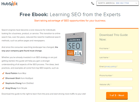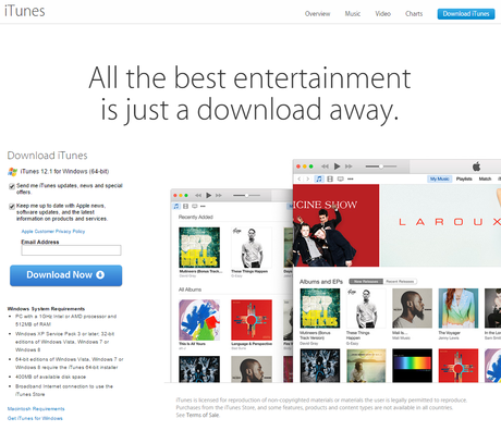
Landing Pages are a tool I often talk about during SEO Training sessions or when talking to groups who have the fundamentals of SEO (such as meta tag, image and content optimisation) pretty much spot on. But I haven’t really talked about them in a blog post, and given they are a key part of your website today I want to change that.
Define: Landing Page
A landing page is the location of arrival of a visitor (where they “land”) this can be from any external source, though typically are aimed at search engine and social media traffic. In its most basic form, a landing page should cause the user to perform a certain action, for example sign up to a newsletter or click to read more about a given subject. Landing Pages are Lead Generation tools.
Typically a landing page is a mixture of the fundamentals of SEO. It’s a mix of content marketing, technical seo magic and conversion rate optimisation (cro). A landing page is NOT your homepage, it is a page dedicated to receiving traffic on a given subject, for example a specific product or service.
Examples of Great Landing Pages


5 Reasons Your Website Must Have Landing Pages
1 – More Leads, Less Effort
Landing Pages offer a way for you to easily generate new leads, usually at a lower cost than via other means. A well formatted landing page, such as those above, will likely have a higher conversion rate than a simple store layout for the same products. The reason for this is that a landing page is highly targeted to that topic/item and that audience – other pages are likely to be a “catch all” but landing pages can be as specific as you want. It’s also a great way of capturing leads in distinct segments such that you can market to them later.
2. Cutting the Cost of Advertising
The nature of landing pages being highly targeted means that you can then be more specific in your marketing, for example on Google or Facebook advertising. By doing this you will reduce your ad spend for the same number of clicks, and are likely to see yet higher conversion rates. Obviously this then has a clear impact on your overall profitability.
3. Easy to Test With
A great reason for landing pages on your site could be as simple as allowing you to have a testing/experiment area for your conversion rates work. Landing Pages allow you to collect better metrics about your visitors and to test on the same segment again and again to increase your conversion rate. You can then rinse and repeat this with another audience segment, eventually your whole target market will be targeted with your specific landing pages, hugely increasing your conversions and leads.
4. Testing = Insight
With the testing above, you can then roll out results across the website if you find commonality in results. For example if you find that users respond best to a certain tone of text or size of image, rolling this out across your site could greatly impact on your lead generation ability – without the need for a full website overhaul! Landing pages ultimately are a way to increase conversions across your website, and reduce the cost of conversions.
Key Factors of Landing Pages
There are a number of sections/areas to any landing page, but the one rule that must be followed is simplicity is king.
This means the simpler you make the landing page the more conversions you will get.
1. Remove The Junk
Remove any clutter you can from a landing page. Have your logo and a small nav (if really needed, try to avoid this) and keep the page “right and airy”. A clean contact form, with information / content about the product/service – that is all you really need.
2. Headline is Key
Your headline is the key to success, get it right and conversions galore, get it wrong and you may suffer with zero conversions. Keep it simple and sell the feature or benefit (for example FREE Book: An introduction to SEO). If you need more detail have a subheading, but do not over complicate this – it is your call to action.
3. Keep Your Content Simple
Whether you are creating a suitable image or considering writing a ton of text, consider that this page should have someone convert in seconds (not 5 minutes after reading a ton of useless info). A Landing page should be simple and draw a conversion from the user, simplicity is king!
4. A Simple Lead Capture Form
The most critical factor of any landing page is the conversion form, and like everything keep it simple. This means don’t ask 500 questions you don’t need the answer too – if you are giving away a PDF a bit of info is great but asking for the age of someone is usually pointless. So keep it simple and to a minimum, no one wants to answer 15 questions before they can get a 10 page PDF!
Going Beyond The Norm…
A landing page should be proceeded with a Thank You page, simply it confirm the action a user has taken – but importantly gives you the chance to provide something extra and special.
For example if you were to give away a PDF, you may then want to give a special offer on a book you sell or invite the user to share the resource via social media. Either way, again keep it light and fun – make the user smile.
It should be in the same tone as your landing page AND your confirmation email you send. Changing language tone and voice will likely upset the flow of a user.
The next step is to simply offer more than your landing page does, go for the surprise element. A number of resources from SEOAndy come with a 7 email series with extra information to give another helping hand – but its about keeping in touch and ensuring that “customer” becomes loyal to the brand.
Original SEO Content by SEOAndy @ Why Landing Pages Are Awesome

