Your Colour Palette and Your Style
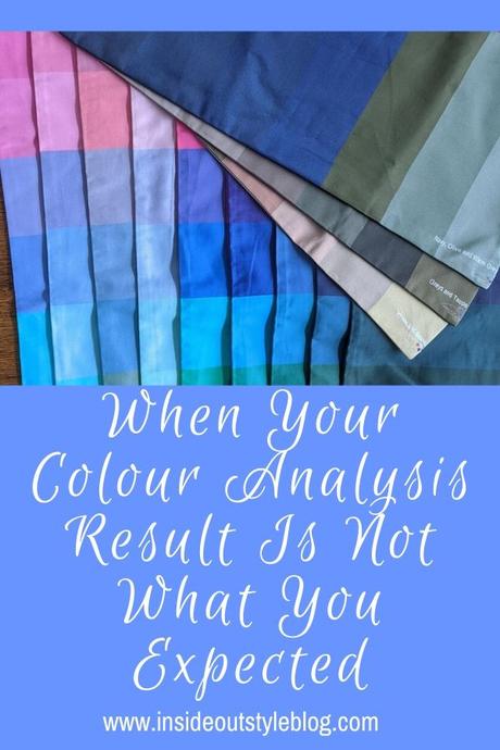
Have you had a personal colour analysis and you're not sure about the colours - or they are so different from what you expected? Maybe the colours are not as bright as the ones you've been wearing? Maybe they are lighter or they are the opposite undertone. Or there are just some colours you love and look really great and others that you are more meh about...
Watch this video where I explain a few reasons and share tips on what to do.
You get a totally different colour palette from what you were told in the past
So you had your colours done some time back and now you've been told that you are an opposite undertone...
This can happen when the system you were analysed with was lacking (and many of the old seasonal systems were lacking in options). Maybe what you've been working with up until now wasn't optimal for you.
In my experience, a lot of women with warm light muted colouring were diagnosed as Summer's because there was no warm option of that palette. In the same way as most women with very dark brown or brown-black hair were all diagnosed as Winter palettes. Again, because there wasn't the option that really worked for them in the seasonal system.
Now we have more options and this means a much more nuanced set of palette options to select from.
But if you've suddenly been given a completely different palette from what you were expecting - it an make your head spin. It takes time to adjust to the idea of a different palette, and that's totally fine!
The colours are more muted and seem dull and boring
This is one of the common feelings as colours change with age and so palettes change along with you.
As I've written about before - how colours change with ageing - as hair greys so skin changes and becomes less clear and eyes lose pigment as well (damn you mother nature!). Remember that the aim of colour analysis is to make you the star. To make your innate beauty shine.
When the colours you're wearing are too bright for you, they take over and pull focus (creating a body focus). Versus when they are muted, they create a feeling of balance and wholeness. You become the total package, not a head floating on a body of colour.
These colours make you look more vibrant and alive.
You become more youthful and glowing - even when the colours are more muted. You become bright and shine!
Or you suit bright energetic colours yet you prefer more subtle colours as you are drawn to them because of your softer personality. But these muted colours look drab, dull and ageing on you.
You can make the colours that flatter you look brighter or softer, depending on how you mix them with other colours, and also it's not just about the colour, the fabric, construction and style all come into this equation
Check out this post on how to make soft colours work with a dramatic personal style as some quick inspiration!
What to do when you've got a new colour palette
To start with, don't just buy anything because it's in your new palette. If the garment doesn't' meet your style recipe or figure flattery guidelines, just because it's a colour in your palette doesn't make it a great purchase.
If you do buy because it's a colour in your palette and the garment is not flattering on you, it's very easy to blame the colour (rather than something else about the garment being off for you). In fact, this may make you start to hate the colour - when it's not the fault of the colour!
You want to be careful about your choices, and keep running your shopping criteria by any new clothes in the recruitment phase!
If you don't love the new palette as a whole, but do like some of the colours, start first with those. Look for items in the colours you do like, ignoring those you're really not keen on!
Make sure that you love the style of the clothes as well, and also that the contrast works for you as well.
Start with a lipstick and blush, particularly if you've been wearing the wrong undertone ones (though interestingly, I've frequently found that my clients who had thought they were the opposite undertone were wearing their actual undertone in blush and lippie, so they innately knew all along). You'll find the right makeup colours really blend and look natural with your skin, while the wrong ones will sit on your skin and appear much more obvious.
Even if you love your palette some colours will be better on you than others
This is because you're human and an individual and a colour palette is a generic tool that helps you find the right kinds of colours for you.
This is why your signature colours are different from the next person who has the same palette.
One of the things I notice when selecting signature colours for clients, is that sometimes, even if they have warm colouring, I choose zero that's nought, none, zip, zilch, of some colours - say orange or yellow or green or blue etc. That's because they are not signatures for that client. They are not their ideal colours.
So do check out what colours have been chosen for you as signatures - this may explain why you thought - for example - that you were cool - because you don't look good in orange - and even though you may now have a warm palette - orange may not be your best colour! It' totally OK to steer well clear of some colours.
It could be because they don't feel right to you - Jill Chivers and I discussed how she never wears purples - even though there are a bunch in her palette. Just because it's in there - doesn't mean you have to wear it!
I never wear yellow - even though there is yellow in my palette.
Your Contrast Matters
It's important to remember that your colour and value contrast still matter. A signature colour may not look amazing on you when it's not balanced in the right contrasts for you!
This is often one of the reasons I notice people dismiss their palettes - as if the whole thing is wrong, rather than remembering that they have to select clothing that not only works for their colouring but also in the best contrasts for them.
For most of us, we look at our best when we mix colours in some version of contrast - check out these celebrity examples and where they go right and wrong.
Finding prints in the right contrast for you can make it much easier to look great without having to combine lots of garments to get the best combination.
Your Ideal Value Matters
Again, just like contrast, your ideal value (that is colours that are of a similar value to your hair) need to be a significant portion of your outfit (find out more about that concept here). There will be lighter and darker colours in your palette that aren't quite as fabulous for you because they are not related to your ideal value.
Your Colour Palette is a Tool
This is the most important thing to remember - that your colour palette is a tool, it's some guidelines that help you find the huge range of colours that you can select from. It's not a definitive rule book that only the very specific set of colours in the palette being the ones you can wear.
Check out this post and video on how to select colours to work with your palette.
Take Outfit Photos
Outfit photos are the best tool to help you see more objectively what is and isn't working. When you line them up side by side you start to see which outfits and colours and contrast really work well for you and which are not as successful. A photo can give you a more objective viewpoint than looking in the mirror. It's hard to see yourself in the mirror the way we see others - our brains are not wired to look at ourselves that way.
Try pulling out the clothes in your wardrobe that work with your palette and photographing yourself in them. Then get the ones that are are not at all related to your palette and again photograph yourself in them.
Put them side-by-side and you should start to see how you wear the clothes - in your best colours. While the clothes wear you - in the unrelated colours.
Just because you love a colour that you can't wear well doesn't mean you can't have it in your life
I had a client once who loved orange. Really, really loved it. In fact, he had 20 orange ties that he wore all the time. The sad thing was, he was cool and orange really didn't love him back. Why did he love it so much? After some probing questions, I discovered that his childhood bedroom was painted orange and he had many happy memories of his childhood. Orange to him meant freedom and no responsibilities and lots of fun, Of course, he loved it and wanted to be near it! And you can't get closer to a colour than when it' on your body!
What to do? Keep wearing the orange that was making him look ill but that he loved so much? No. Instead, he bought himself a beautiful sunset painting that had many orange tones through it and put it on the wall in his lounge room so he could look at, and drink in that colour he loved so much. He could still get the feeling orange gave him without wearing it!
The moral is that you can still have colours you love in your life that don't make you shine - decorate in them, buy a car in that colour, get a phone case in it ... the list goes on!
9 Ways Knowing Your Best Colours Will Change Your Life as Well as Your Wardrobe
How to Wear Your Ideal Colours through the Seasons
What to Do When You Don't Like Some of the Colours in Your Palette?
5 Colour Concept Essentials You Need to Understand To Create Harmonious Outfits


