Thanks to a multitude of web design innovations in the past few years, websites have become more and more interesting with unconventional website features primarily aimed to serve content to its users.
And with these cool functions aboard, a lot of website owners adapt every trend that comes their way. There's always a new trend in an event one dies down, and there's no saying in what's the next big thing when it comes to website design.
However, have you browsed through different sites lately? Most of the sites right now adhere to new trends, but many fail to execute their designs properly. Have you checked a website with infinite scrolling but without any function go back to the top, unless you scroll endlessly upwards again? Some website features break the site; you may experience slow loading pages, missing or hidden navigation menus, illegible texts, and even pushy CTAs that bug you endlessly to subscribe to their newsletter.
To be cool, or Not to be cool
Think of web features and designs as movies; stunning visual effects can only get you a meager distance. If things get way out of hand, it's no less than garbage with all your money wasted. If you really want to give your users a good experience in your site, consider the following points:
- What works and what doesn't work. There are a lot of gimmicks to get your users down the marketing funnel, but not all gimmicks are plausible enough to implement in your own website.
- Your niche and target audience. There's no need for flashy popups if you're running a minimalist website. Consider your target audience too; if you recently published changes in your theme, how's your audience coping with it? Check your Analytics and look for Bounce Rates and Exit Pages ¾ these can predict whether your user are having trouble navigating through your site.
- Reviews. We grew up in a world that told us not to mind what other people say; but it's different on this perspective. Check other websites that implement your desired function; if it sucks on the first try, then it definitely sucks on the next. Test what it really does, and check out reviews that reflect on those functionalities you want to try. Oftentimes web designers and developers themselves comment on trending user interactions in the web; read on their feedback and ponder if it's really worth adding to your design.
Leave the Bandwagon
Stop joining the hype! Here are some examples of website features that you need to stop following:
Carousels

Say goodbye to Carousels. It used to be a good slideshow effect if you're showing a lot of images. Homepage sliders trended in showing images, but it's a love-hate relationship with Carousels. Sometimes it's too slow, sometimes images are flashed and scrolled before you even finish reading the content. Overall, these slideshows may or may not be effective in getting your content across your readers. It can be a distraction most of the time. There are some Carousel sliders that do not have any controls that can be used by the user to navigate through the featured content.
Alternative: Use complex grids to display info. It's similar to our social media news feeds, and also to newspaper columns. Content is displayed readily, with options on highlighting big news and making space for smaller news.
Scrolljacking
Scrolljacking is a much debated function that really does break or make your site. While it is true that this website feature delivers stunning effects as written and image content merge seamlessly, you really need a good designer to work on this as this feature can break your site in many ways.
Try scrolljacking for yourself on these sites:
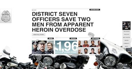
Milwaukee Police NewsBrowse through Milwaukee Police News and you'll notice how groovy for a police force to have this site. Aside from that, you need to be precise in scrolling through the site; the scroll movement is sensitive. Although they compensate it for the navigation buttons on the right side, the scroll speed through the content can use a little bit more tweaking.

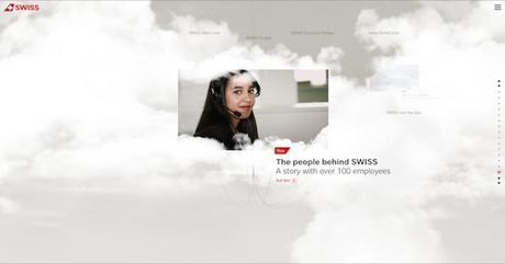
SWISS has been cited in many articles on website features ¾ arguments about the ingenuity of the design has been always noted. Some counter argue that you can't navigate properly through the site because investments were focused more on the features rather than the content.

LifeCell is a busy website. Content is delivered right at you right away, but the website has too many information presented to you at a glance. Because there are many elements on the site, website loading speed is also affected.

These websites have tried to wow its audience, at the expense of user experience. These websites are also poor in terms of accessibility; our handicapped viewers cannot enjoy these type of medium. On the other hand, jerking movements can cause dizziness and possibly trigger seizures for those who are severely sensitive to these types of triggers.
One Page Design

It has been proven that everyone in the Internet has the habit of scrolling down; but we're still uncertain with this trend.
One page designs rely on how the elements above the fold attracts people to engage and then proceed to scroll down. But, what if the message above the fold does not invite the user further? What if they have assumed that the content that they can only see is the only content that's available?
That's why Spotify is a great example on how to fix one-page design problems.

Spotify has added a call to action phrase, "Learn About Spotify" that is clickable to direct you below the content that will explain what and how Spotify can enrich your music experience. There's also an arrow pointing downward that serves as a signal to the users that there's more content below.
Final Thoughts on Web Design
The success of any website ultimately hinges on its users. Without visitors a website will be unable to produce value for its owners. As a result, users should be the focal point of web development and design efforts. To avoid making too much tweaks on your web design and development efforts, you should check your website for usability and user experience. Conducting tests and analyzing the data you've gathered will tremendously help in planning what changes should be applied and what features should go away.
Trends are nothing but instances and things that come and go. There will always be something new to replace what we have now, and especially in web design, this is something you'll see occasionally.
Do you have any website design and development trends that we should ignore? Share it with us on Facebook and Twitter!
This article is brought to us by Kenneth Sytian, a web designer from the Philippines and founder of Sytian Productions.