I began this new abstract painting on paper with the same primary colors I used in the last one: red, yellow and blue. But I also added a cadmium orange and a turquoise.
I applied the colors with a palette knife in broad strokes, keeping the design minimal. Then I painted the background in parchment, letting it mix with bits of the other colors as I brushed it on.
Next I added some lines in the same colors: red, yellow, blue, orange and turquoise. The last step was to paint two half-moons around the central blue shape with a light gray.
None of this was planned ahead of time. Each step came out of what I did before.
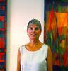
 Paper Painting #11, 24" x 18" acrylic on archival watercolor paper.