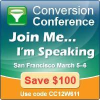
 Check out this graphic widget that I just got from the 2012 Conversion Conference organizers.
If you’re working on attracting and converting prospects into clients, you’ll want to take note of the 3 things they did right with this graphic:
- Bright colors
- Easy to read words
- Clear next steps
Notice the title tag that I used when I posted it on this blog? Just hover over the image and you’ll see it. I changed it from the name of the image to title=”Click HERE to Get your Chris Brown speaker discount to the 2012 Conversion Conference in San Francisco.”
I think that this will help people know what the next step is.
Does this give you an idea about how to use a graphic like this on your website or blog? Do your potential clients know what the next step is?

