 A lot of changes have been happening on Twitter lately. Last month they introduced the ability to tag your friends as well as add multiple photos in a single tweet. This month Twitter announced it’s rolling out a new look for profile pages. What’s interesting about this: Twitter is looking a whole lot more like Facebook.
The New Layout
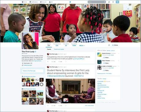
The biggest change in the new design is the cover photo, which is much bigger in size than the old layout. It has also been moved from the center, to the left side of the page. Your bio will still appear directly below your profile picture. No formal dimensions were released as of yet, as the changes are being rolled out gradually to a small subset of users. I’m waiting for the new layout myself. We’ll update this article once we get a good look and a chance to test drive the new design ourselves.

Highlighting of Tweets
Aside from the changes in appearance, Twitter is also tweaking the way tweets are viewed. Here are some of the new features they are highlighting:
- Best Tweets: Tweets that have received significant engagement will appear slightly larger so your best content is easy to find.
- Pinned Tweet: You’ll be able to pin one of your Tweets to the top of your page to make it easy to highlight specific content (another Facebook-style move).
- Filtered Tweets: You can choose the types of tweets to view when checking out other people’s profiles including all tweets, tweets with photos/videos, or tweets and replies.
What The Changes Mean For Users and Marketers
In terms of the cosmetic changes, it’s obvious that Twitter’s goal is to make everything visually more appealing. The larger, more prominent cover photo is likely to help brands tell a better story and/or make a better impression. It will also help regular users paint a better visual picture of who they are. As the new profiles roll out, it will be important to be ready to take advantage of the larger cover photo.
In terms of tweets, the most popular Tweets will appear larger and more prominent in your feed, based on the amount of engagement received. Hmmmm. There’s that “engagement” thing. Essentially, Twitter will be rewarding you for content that’s more engaging and all that push messaging that both brands and people do – that’ll get significantly less attention. All the more reason to pay attention to your Twitter feed and actually, you know, make an effort there. This will be a stretch for a lot of people, but I think it’s an important signal of what to expect in the future from Twitter. Less broadcasting, more engagement. And “rewards” for creating and sharing engaging content and participating in the online conversation.
The option to pin a tweets to the top of your feed will be particularly helpful to brands who want to promote a particular post and this makes it possible for your content to not get quite as lost in the stream as it does now. Our question is related to how (or if) these features will be available through third party apps – like Hootsuite, Tweetdeck and other dashboards and companies use to manage their Twitter and other social media presence.
One additional change is relative to the follower/following page. Instead of appearing as a list, with this change it will appear as a grid, making it easier to scan profiles and read bios more quickly before deciding who to follow back. That will be very helpful for community managers, for sure. If you’ve not paid any attention to crafting a great bio for yourself on Twitter, there’s no time like the present to remedy that.
New users will automatically get the new profile and Twitter reports that existing users will be updated soon. As we await the rollout of this new layout, use this time to plan for the new profile elements, including the larger cover photo, design and copy on your Twitter profile page so that you’ll be ready once this is accessible to you. Do you already have the new profile? How do you like it? Is there a significant difference in terms of engagement on your tweets? Let us know we want to know.
photo credit: mkhmarketing via photopin cc
Twitter Profiles Revamped: What That Means For The Future is a post from: V3 Kansas City Integrated Marketing and Social Media Agency

