From Watts Up With That:
The greenhouse gasses keep the Earth 30° C warmer than it would otherwise be without them in the atmosphere, so instead of the average surface temperature being -15° C, it is 15° C. Carbon dioxide contributes 10% of the effect so that is 3° C. The pre-industrial level of carbon dioxide in the atmosphere was 280 ppm.
So roughly, if the heating effect was a linear relationship, each 100 ppm contributes 1° C. With the atmospheric concentration rising by 2 ppm annually, it would go up by 100 ppm every 50 years and we would all fry as per the IPCC predictions.
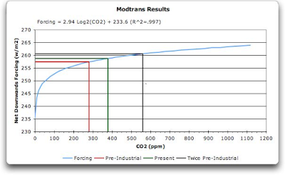
But the relationship isn’t linear, it is logarithmic. In 2006, Willis Eschenbach posted this graph on Climate Audit showing the logarithmic heating effect of carbon dioxide relative to atmospheric concentration:

The y-axis goes from 230 to 270.
-----------------------------------------------------------------
We can assume that w/m2 are related to temperatures. As a guide, from Wiki: When 1361 W/m2 is arriving above the atmosphere (when the sun is at the zenith in a cloudless sky), direct sun is about 1050 W/m2, and global radiation on a horizontal surface at ground level is about 1120 W/m2.
-----------------------------------------------------------------
From Skeptical Science:
After publishing my experiences talking to science 'dismissives' (or 'skeptics', or whatever you'd like to call them) and then participating in the excellent Denial101x course, I was invited to join the volunteer team at SkepticalScience last year.
But before all that, one of the dismissives drew my attention to a climate science paradox... Scientists agree that the greenhouse effect is approximately logarithmic — which means that as we add more CO2 to the atmosphere, the effect of extra CO2 decreases.
In the last million years, CO2 levels have cycled between about 180 and 280 ppm during cycles about 100,000 years long. Because this happened in the steep part of the curve, a change of only 100 ppm (together with the Milankovich cycles) was enough to move the world in and out of the ice ages. Even though humans have increased the CO2 concentration by 130 ppm already, this extra 130 ppm has a smaller effect than the 100 ppm that was added naturally before.
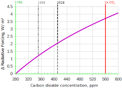
But let's zoom in on the part that we actually care about: the modern era:

After zooming in, the logarithm doesn't make such a big difference: it's not far from a straight line. 560ppm will probably take us well beyond the Paris target of 1.5°C, so the 280-560 range is key; we would be unwise to let our civilization go beyond 560.
-------------------------------------------------------------
Sure, looked at close up, any part of any curve looks like a straight-ish line. But look at the y-axis, it goes from 0 to 4.5. The increment of 4.5 agrees to the first chart, which shows that it goes from 257 to 261. But the scale is a tad misleading, to say the least.
They are also (deliberately?) confusing units. Fag packet says 4.5 additional w/m2 = temperature increase (if CO2 levels doubled from pre-industrial levels) no more than 1C.
Fag packet: surface temperature 288K ÷ 1,120 W/m2 (when sun directly overhead in a cloudless sky) x 3.7 W/m2 = 0.95K or 0.95C.
