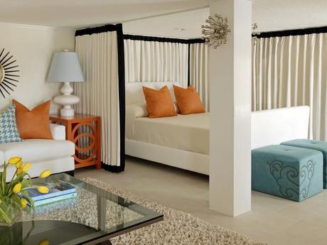
This is a perfect example of how you can take a room with neutral colors and simply add pops of color. I'm sure this didn't take much out of your budget either. The bright orange and soft blue are colors that are opposite on the color spectrum, which what makes them go so perfectly together. I also love the yellow tulips on the table.
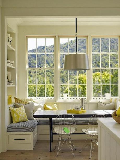
Let's take a moment to look out these windows are the gorgeous view... Ok, now that we're done being mesmerized, let's come back inside. The metal chairs and light fixture adds a modern twist to the traditional window and cabinet. The yellow of this breakfast nook is stunning! It really let's the sunshine come into the house. Yellow is always a great color in the kitchen. Feng Shui tip: Add yellow flowers in the kitchen to bring you wealth.
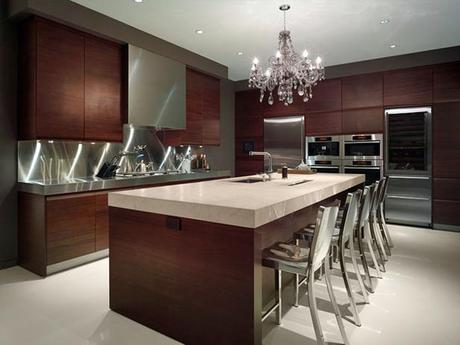
Chandelier. Need I say more?!
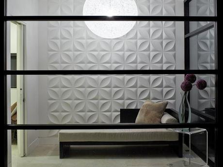
This is the look of now. What's the first thing you notice about this room? The wall texture? The modern light fixture overhead? This is a great way to keep a small room simple. If you have a small room in your house, stay away from clutter. It only makes the room feel smaller.
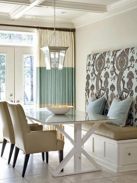
Gorgeous breakfast nook. Love this light-earthy color scheme. The light fixture, again, brings the outdoors inside. My favorite part of this image is the headboard on the seating. Great pattern. Great color. I would never get up!
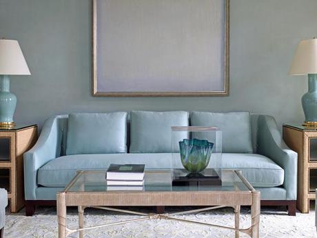
Have you ever heard the say "sometimes less is more"? Perfect example right here! No throw pillows, no patterns; only texture and color tones. Ahhhh... refreshing, right?
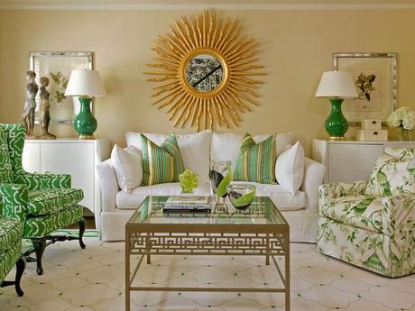
Green with envy for this room? I sure am. Notice how many patterns are incorporated: chairs, pillows, floor. I love how they kept to a specific color scheme. Many different shades of greens and golds. Another example of incorporating the outdoors. Green earthy tones and mirror based on the sun- beautiful.
