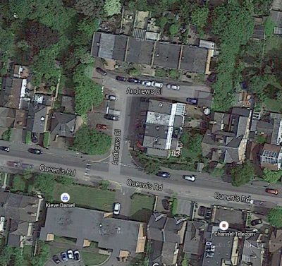
Forty or fifty years ago, two or three large gardens near where we live were amalgamated into one new development and a new side road was created (St Andrew's Close: "Oh no he isn't!" shouts the crowd). The back row of houses is the sensible way round, parallel to the main street (Queens Road), but the front four are sideways on. From Google Maps:

As a result of this quirk:
1. People across the main street and at the end of St Andrew's Close have to look at the solid brick walls at the side of the ends of the front four houses; those in the back gardens of the front four have to stare at the solid brick wall of the house immediately to the right.
2. Those at the top right hand side get less sunshine in the day time.
3. They fitted in only four houses along the front, rather than five or six had they made St Andrew's Close an L-shape (turned 90 degrees clockwise) rather than a T-shape.
4. It spoils the look of the street a bit (all the other houses face the front).
5. When the sun is setting in the west (left hand side), the best time for sitting in the garden, the back gardens of the front four houses in the shadow - as a quid pro quo they get more sunshine in the early afternoon, but that is usually wasted because you are at work.
Can anybody think of any good reason for doing it like this? The only one I can think of is that the back gardens of the houses along the front might have ended up a few feet shorter, but at least they would have been more 'open'.
