Top Ten Tuesday is a meme created over at Broke and the Bookish where every Tuesday, Top Ten things of anything are listed. Todays Top Ten things are:
Top Ten Things I Like/Dislike In Cover Trends
No since I don’t think I could think of ten of either of these, I have decided to list 5 things I like and 5 things I don’t like. The things I don’t like can be done well, but I am talking about the general or things I am getting tired of seeing.
Things I Like
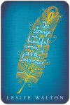
1. Use Of Colour. I just love it when covers actually use colours other than black. If they contrast two its just a bonus.


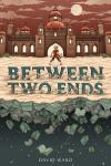
2. Illustrated Covers. I find that these are generally more interesting to me and actually have something to do with the story.


3. Interesting Text Use. Its just so much more interesting if they put effort into it rather than slapping it on there.


4. Old Style Covers. I not only love the front of these, but they also have stunning spines.


5. Simple Covers. They don’t need to be over the top to be pretty.


Things I Don’t Like
1. Plain, Huge Faces. I like it when body parts or humans have a twist to their pictures on covers, but when its just the faces it really annoys me.


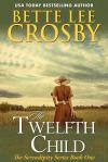
2. Girls In Dresses. I didn’t mind it at first, but there are too many now. It annoys me most when the girl being in the dress actually has nothing to do with the story in the book.


3. Twilight Inspired Covers. Since twilight did well it seems like publishers think that if the covers all look like those books their books will do well too. I am really just sick of black covers in general too.

4. Half Naked Covers. Its not that I have anything against them, I can generally still read things like this on the bus and not care, I just think they are so ugly.


5. Personal Just Slapped on Cover. I just hate any part of any person on the cover generally. It needs more!


So yes, there we have it. As always I want to see your lists too, so make sure you link me!

Till Next Time…

