
Top 10 Badly Placed Signs and Adverts
Each and every year marketing departments all over the world will spend billions of pounds advertising their product. I don’t know what other people think, but I find some of them clever, creative and eye-catching, and some I find pointless and a waste of money. Often it is not so much a case of “what” you are advertising, but more “where”…
Top 10 Badly Placed Signs and Adverts
..

Click Here
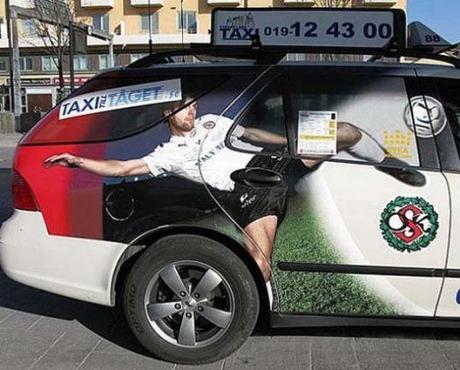
Badly placed football advert
10 – “NO! You open the door.”
Football adverts are all over the place, in most European countries as well as lots of other countries. But this advert that was sadly placed on hundreds of taxis has a rather unfortunate location for the door handle. If the car door is a little “stiff” in the winter, just remember to pull it harder.

Badly placed adverts when together
9 – We should break up and not see each other again.
Normal an advert for a juicer, and an advert for a fitness center go arm in arm, hand in hand. But not when placed in this billboard, at the same time, and in this order. The odds of this are amazing, but seeming as the images went viral, it was also an unexpected win for the marketing firms of each business.
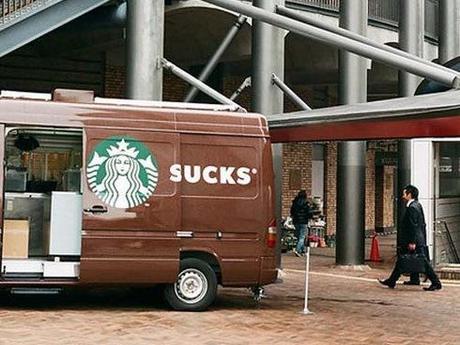
Badly placed Starbucks decals
8 – Starsucks?
Over in Seattle Starbucks thought it would be a good idea to try out some mobile Starbucks coffee vans to the local business districts with an outstanding success. But not so outstanding is their placement of the vans decals because when the door of the mobile coffee van was open read “Sucks.” Sadly for Starbucks there is hundreds of these images.
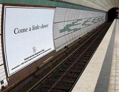
Badly placed sign for opticians
7 – Sight for dead eyes
Seen in a German subway station, is this advert for a local opticians. It turns out that they had paid for a placement of the large advert in the subway, but they got “upgraded” to this premium position because another advertiser pulled out. Talk about bad timing, or good timing, as this image very soon went viral. (then got taken down.)

Sumo advert on bus with unfortunate woman stood behind it
6 – Stand by your man!
Sadly this the poor woman on the bus Japan does a lot of advertising for the up and coming sumo fights. It is simply a case of wrong person, wrong time. Bless her.

Badly placed advert on bus
5 – Bus or bust!
Place a ad on a bus is normally a good alternative to billboard placement as the advert is constantly moving around! But it is more important to make sure WHERE on the bus it is going to be located as seen in this advert taken out by a jewellery firm.
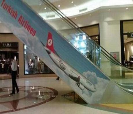
Plane advert flying into the ground on escalator
4 – Crash Landing
Sadly for the Turkish Airline marketing team someone was most probably fired for this one. Sure the idea is sound, provided it was on the other side of the escalator! Adverts for air plane company’s are hard enough without people not doing their research on where they are going to be located.

Poster of woman licking bin
3 – Just one Binnetto,: give it to me!
Sadly for the marketers over in Nestle, this poster style can be seen all over the web in some rather unfortunate places. Some with people naked “pointing” to the woman, and others with things placed in front of it for the woman to lick. Bins, skips and even some compost piles! They might have thought it looked like a good advert at the time, but sadly people misused it with some rather amusing results.
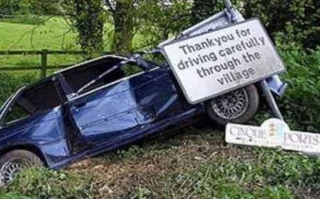
Car crashed into drive careful sign
2 – Read closer!
Now I am sure that this was just good (or bad, depending on how you look at it) timing but whosoever car this is, or maybe looking at the police tape going around it, the car was stolen. Whenever the reason I have to wonder if it is the car or the sign that is in the wrong place here.
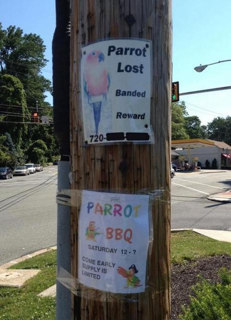
Badly places poster for lost parrot
1 – Polly?
I am sure that this is someone’s idea of comedy. Or maybe I am being too cynical! Either way it does bring a smile to the face, and I can only hope that the parrot poster was in on the joke. Or maybe this really is a case of the worst placement of a local community poster ever seen!

