VSUAL takes a look at the art and science behind title sequences. We journey through the ages and try to understand the evolution of title sequence design. From Georges Méliès, Un Voyage Dans La Lune to present day Kyle Cooper, we showcase 5 significant designers and their work. But first more about this particular title sequence that was designed by Jurjen Versteeg as an experimental project.
Designed as a possible title sequence for a fictitious documentary, this film shows a history of the title sequence in a nutshell. The sequence includes all the names of title designers who had a revolutionary impact on the history and evolution of the title sequence. The names of the title designers all refer to specific characteristics of the revolutionary titles that they designed.
This film refers to elements such as the cut and shifted characters of Saul Bass’ Psycho title, the colored circles of Maurice Binder’s design for Dr. No and the contemporary designs of Kyle Cooper and Danny Yount.
This title sequence refers to the following designers and their titles:
Georges Méliès - Un Voyage Dans La Lune, Saul Bass - Psycho, Maurice Binder - Dr. No, Stephen Frankfurt - To Kill A Mockingbird, Pablo Ferro - Dr. Strangelove, Richard Greenberg - Alien, Kyle Cooper - Seven, Danny Yount - Kiss Kiss Bang Bang / Sherlock Holmes.
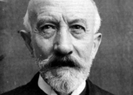
GEORGES MÉLIÈS

Méliès’ principle contribution to cinema was the combination of traditional theatrical elements to motion pictures - he sought to present spectacles of a kind not possible in live theatre.
In the Autumn of 1896, an event occurred which has since passed into film folklore and changed the way Méliès looked at filmmaking. Whilst filming a simple street scene, Méliès camera jammed and it took him a few seconds to rectify the problem. Thinking no more about the incident, Méliès processed the film and was struck by the effect such a incident had on the scene - objects suddenly appeared, disappeared or were transformed into other objects.
Méliès discovered from this incident that cinema had the capacity for manipulating and distorting time and space. He expanded upon his initial ideas and devised some complex special effects. He pioneered the first double exposure (La caverne Maudite, 1898), the first split screen with performers acting opposite themselves (Un Homme de tete, 1898), and the first dissolve (Cendrillon, 1899).
Georges Méliès died in 1938 after making over five hundred films in total - financing, directing, photographing and starring in nearly every one.
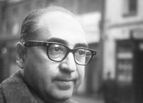
SAUL BASS

In Bass’ own words: “My initial thoughts about what a title can do was to set mood and the prime underlying core of the film’s story, to express the story in some metaphorical way. I saw the title as a way of conditioning the audience, so that when the film actually began, viewers would already have an emotional resonance with it.”
Bass created some of the best title sequences ever for some of the best directors who ever lived (Billy Wilder, Alfred Hitchcock, Otto Preminger, Stanley Kubrick, Martin Scorsese) and some of the best films ever made (Vertigo, North by northwest, Anatomy of a murder, Spartacus, Goodfellas).
STEPHEN FRANKFURT

Because of Stephen’s advertising background, he approached the movies much differently than his counterparts based at the Hollywood studios. Creating with a sense of emotion and storytelling as his agencies did when producing commercials for advertisers like Eastern Airlines (“The wings of man”), Excedrin (“the Excedrin headache”), Lay’s potato chips (“Bet you can’t eat just one”) and the New York Urban League (“Give a damn”). When marrying movies and marketing, “the most important thing is to think with your heart, not with your head,” Mr. Frankfurt said, “be heavily emotional versus practical.”
His strategy for promoting “Alien” (1979) for 20th Century Fox was similar. Rather than today’s “overkill,” Mr. Frankfurt said, “when they tell you everything in the trailer,” the idea was to take a minimalist tack that would pique the curiosity of potential moviegoers, as summarized by the campaign’s theme: “In space no one can hear you scream.”
Mr. Frankfurt also took that approach for what may be his most famous work, the titles for “To Kill a Mockingbird,” which show a cigar box filled with children’s toys and other trinkets, while on the soundtrack a child is heard talking over the haunting theme music written by Elmer Bernstein.
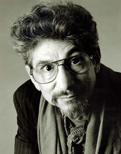
PABLO FERRO

In 1963, Ferro was invited by Stanley Kubrick to create the sequence that would reverberate throughout the industry: the titles for Dr. Strangelove. Ferro was working on the trailer for the film when he and Kubrick began talking. ”He asked me a question about human beings at one point,“ says Ferro, ”and I told him, ‘Everything we do is always very sexual.’ A B-52 refueling in midair? Of course! It’s sexual.“ Ferro reports that one of the surprising results of his first title sequence was not merely international acclaim but the opportunity to work on other provocative sequences. ”They said if I could make planes sexual, I could make anything sexual,“ he laughs.
Inspiration for the motion and rhythm that make Ferro’s work so remarkable sometimes came from unlikely sources. In describing the notorious polo scene in Norman Jewison’s The Thomas Crown Affair (1968), Ferro cites popular styles of design in print as his model. ”I was very influenced by magazines at that time,“ he explains. ”I’d look at magazines and see a bunch of pictures on a page, and I thought, ‘That’s beautiful. If I could ever get that into a movie, it would be amazing.’ But it’s impossible. You have a few minutes to look at a page, but in a movie you only have a few seconds to look at something.“ Despite his reservations, Ferro began experimenting. ”What I did was try to design the images so that your eye would go in a certain direction the whole time. I wasn’t just making multiple pictures, but leading your eye through the pictures.“
Ferro still produces, directs and designs, sometimes working with his son Allen Ferro, and he also continues to consult with other directors on tricky scenes and sequences. He has been recognized widely for his contributions to film and design, receiving the Chrysler Design Award, the Art Directors Club Hall of Fame Award and now the AIGA Medal, and he is the subject of a forthcoming documentary directed by Richard Goldgewicht, which will chronicle Ferro’s remarkable career.
Asked how he retains his edge through several decades, Ferro laughs and says, ”I never show my tricks. I try not to show how something was done, to make it seem as if it came naturally or that it wasn’t worked on.“ And, of course, he lives by his other key motto: ”Keep it moving.“
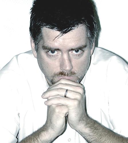
KYLE COOPER

Kyle Cooper is a director of film titles; making over 150 different ones. He has been credited with “almost single-handedly revitalizing the main-title sequence as an art form”. He founded two companies, Imaginary Forces and Prologue Films. He is a member of the Alliance Graphique Internationale and holds the honorary title of Royal Designer for Industry from the Royal Society of Arts in London. He was influenced by Stephen Frankfurt’s opening titles to “To Kill a Mocking Bird”.
Cooper studied graphic design under Paul Rand at Yale University. Early in his professional career, Cooper worked as a creative director at R/GA - an advertising agency with offices in New York and Los Angeles. During this period, Cooper created the title sequence for the 1995 American crime film Se7en, a seminal work which received critical acclaim and inspired a number of younger designers. According to Cooper, at the time he made the title sequence for Seven, main title sequences were behind of what was happening in print, music videos and commercials. He wanted to create main titles that were raising the bar creatively.
In 1996, he co-founded Imaginary Forces - a creative agency that came out of the West Coast division of R/GA. “We have spent a long time building and refining a brilliant creative and production team … Keeping this group together as our own company is truly exciting,” commented Cooper about the name change. Too involved by the business-side of running a design company the size of Imaginary Forces, Cooper decided it was time for him to focus more on his creative work. He left Imaginary Forces. In 2003, Cooper founded the creative agency Prologue.

