What are the colours you can expect to start popping up this year in fashion? According to Pantone's Spring 2018 colour forecast, they include some colours we've been seeing for a while that will hang around, and a bunch of new colours may start to also filter through (though honestly, I don't always think that the fashion world actually follows this forecast, though you do see more of it in the interior design space).
Colours That You'll Keep Seeing

Coral Pink - named Rapture Rose
Sunny Yellow - now in Meadowlark
Warm Red - aptly named Cherry Tomato
Off White - now as Coconut Milk
Light Grey - in the form of Harbor Mist
Warm Navy - as Sailor Blue
Camel - now called Warm Sand
These colours have been around for the past 2 seasons and continue to be popular. Of course, many of the other colours from the past two seasons are still available in stores (so if you want more khaki, it's time to get it now before it goes!).
Colours That Are Starting to Appear
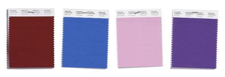
I've started seeing these tones appear back in stores, so if they suit and you like them, keep your eyes out for them!
Warm Burgundy Brown - now called Spiced Apple
Bright Mid Blue - named Palace Blue
Cool Lilac Pink - in the form of Pink Lavender
Bold Purple - known as Ultra Violet
Now let's get down to which are warm and which are cool.
Pantone Spring 2018 Cool Colours

The obviously cool colours from the ranges include:
Harbor Mist - a light cool grey
Pink Lavender - which I think we'll see as a range of light cool pinks into lavender colours.
Almost Mauve - again, like Pink Lavender, it will be a light pinkish white in a cool tone.
Ultra Violet - This is a bold and darker purple in a cool blue-based violet that Pantone has declared it to be the Pantone Colour of 2018.
Pantone Spring 2018 Warm Colours

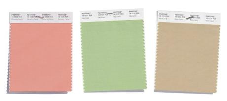
This season there are plenty of warmer colours to choose from, some brighter and some more muted and smoky.
Lime Punch - a bright warm yellow based green
Nile Green - a soft light green with a yellow undertone. Interestingly Greenery (the colour of 2017) wasn't as popular in fashion as it was in interior decorating. This Nile Green is a much more wearable shade than the brighter Greenery.
Spiced Apple - a brown with a red/burgundy undertone (riffing off Marsala from a few seasons ago) and I expect we'll start to see a few other brown shades as well on offer.
Warm Sand - a light and softer camel, toning down the brighter and warmer camels that have been in stores the past few seasons.
Cherry Tomato - a punchy bright yellow based red that's not to be ignored
Blooming Dahlia - a soft light peachy pink - this has been around for a while and I'm sure will continue to be popular
Rapture Rose - a warm brighter pink with a slight coral undertone.
Meadowlark - a bold lively yellow that will also be seen in more mustard shades of yellow that have also been in fashion for the past year or so.
Pantone Spring 2018 Crossover or Universal Colours
How about those colours that will be more cross-over - the more universal colours for the coming seasons?

My pick from what I can see already is that these colours will be ones that are either truly universal, or we'll see both warm and cool versions of these colours in the upcoming fashion offerings.
Sailor Blue - it's a darker version of the marine navy we've been seeing for the past few seasons. A great addition to any business wardrobe when you want to get away from black and grey and be taken seriously. There are some great tips on choosing a good navy and what to wear it with here.
Coconut Milk - a slightly off-white - soft and off-whites have been much more common than the cooler bright whites and that's great as they suit way more people.
Palace Blue - with a hint of warmth this blue is likely to be seen in both more cool blue-violet tones as well as warmer more turquoise shades.
Ash Rose - in its current incarnation it's cooler, but as it's so toned I think that it'll be one of those colours that ends up with a slight yellow undertone and warmer because of the coral and peach pinks that already abound, as well as the more red undertone of the cooler pink version.
And a word on Rapture Rose - in the forecast it's a warmer coral pink, but I've also been seeing cooler hot pinks becoming available and would expect that this trend will continue.
What to Wear?
Well, that depends on your personal colouring. You can see that there are both brighter and bolder colours which suit those who have colour palettes that are at the clear end of the spectrum, plus lots of softer more smoky colours for those of you who need a toned down version to flatter.
My advice always is not to make a decision about a colour until you've actually walked right up to it. My experience is that when you walk past a store and see a colour - say red - inside you can't distinguish so well if it's warm or cool, and it's not until you get up close, and if you have a colour swatch, make a comparison to see if it's the right or wrong kind for you. Many stores will also carry a range, warmer and cooler reds, some brighter, some softer. So when a colour is one that is not obviously warm or cool (not a lime green, orange, coral pink or mustard yellow), always take a walk closer to compare and see what it really is.
The beauty of a colour swatch is that it makes it really easy to quickly distinguish which colours suit you and work together, creating a wardrobe that is easily mixed and matched.
For example, here is a lovely colour combination which would suit the Intriguing palette from this set of Pantone colours.
And here is a lovely bold and Zesty palette combination.

If you'd like to find out which of my 18 colour palettes suits you (and knowing this will make choosing colours easier) you can get this as part of my 7 Steps to Style program - a personal colour analysis is just one of the 7 Steps (yes, there is so much more inside). Find out more here.
What are the colours you can expect to start popping up this year in fashion? According to Pantone's Spring 2018 colour forecast, they include some colours we've been seeing for a while that will hang around, and a bunch of new colours may start to also filter through (though honestly, I don't always think that the fashion world actually follows this forecast, though you do see more of it in the interior design space).
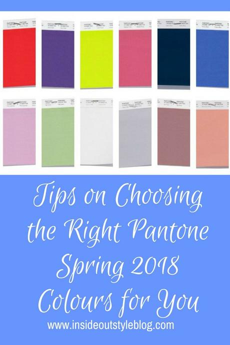
Colours That You'll Keep Seeing
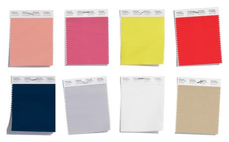
Coral Pink - named Rapture Rose
Sunny Yellow - now in Meadowlark
Warm Red - aptly named Cherry Tomato
Off White - now as Coconut Milk
Light Grey - in the form of Harbor Mist
Warm Navy - as Sailor Blue
Camel - now called Warm Sand
These colours have been around for the past 2 seasons and continue to be popular. Of course, many of the other colours from the past two seasons are still available in stores (so if you want more khaki, it's time to get it now before it goes!).
Colours That Are Starting to Appear

I've started seeing these tones appear back in stores, so if they suit and you like them, keep your eyes out for them!
Warm Burgundy Brown - now called Spiced Apple
Bright Mid Blue - named Palace Blue
Cool Lilac Pink - in the form of Pink Lavender
Bold Purple - known as Ultra Violet
Now let's get down to which are warm and which are cool.
Pantone Spring 2018 Cool Colours

The obviously cool colours from the ranges include:
Harbor Mist - a light cool grey
Pink Lavender - which I think we'll see as a range of light cool pinks into lavender colours.
Almost Mauve - again, like Pink Lavender, it will be a light pinkish white in a cool tone.
Ultra Violet - This is a bold and darker purple in a cool blue-based violet that Pantone has declared it to be the Pantone Colour of 2018.
Pantone Spring 2018 Warm Colours
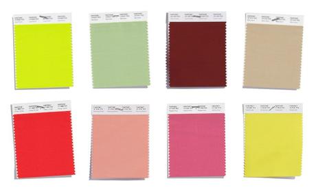
This season there are plenty of warmer colours to choose from, some brighter and some more muted and smoky.
Lime Punch - a bright warm yellow based green
Nile Green - a soft light green with a yellow undertone. Interestingly Greenery (the colour of 2017) wasn't as popular in fashion as it was in interior decorating. This Nile Green is a much more wearable shade than the brighter Greenery.
Spiced Apple - a brown with a red/burgundy undertone (riffing off Marsala from a few seasons ago) and I expect we'll start to see a few other brown shades as well on offer.
Warm Sand - a light and softer camel, toning down the brighter and warmer camels that have been in stores the past few seasons.
Cherry Tomato - a punchy bright yellow based red that's not to be ignored
Blooming Dahlia - a soft light peachy pink - this has been around for a while and I'm sure will continue to be popular
Rapture Rose - a warm brighter pink with a slight coral undertone.
Meadowlark - a bold lively yellow that will also be seen in more mustard shades of yellow that have also been in fashion for the past year or so.
Pantone Spring 2018 Crossover or Universal Colours
How about those colours that will be more cross-over - the more universal colours for the coming seasons?

My pick from what I can see already is that these colours will be ones that are either truly universal, or we'll see both warm and cool versions of these colours in the upcoming fashion offerings.
Sailor Blue - it's a darker version of the marine navy we've been seeing for the past few seasons. A great addition to any business wardrobe when you want to get away from black and grey and be taken seriously. There are some great tips on choosing a good navy and what to wear it with here.
Coconut Milk - a slightly off-white - soft and off-whites have been much more common than the cooler bright whites and that's great as they suit way more people.
Palace Blue - with a hint of warmth this blue is likely to be seen in both more cool blue-violet tones as well as warmer more turquoise shades.
Ash Rose - in its current incarnation it's cooler, but as it's so toned I think that it'll be one of those colours that ends up with a slight yellow undertone and warmer because of the coral and peach pinks that already abound, as well as the more red undertone of the cooler pink version.
And a word on Rapture Rose - in the forecast it's a warmer coral pink, but I've also been seeing cooler hot pinks becoming available and would expect that this trend will continue.
What to Wear?
Well, that depends on your personal colouring. You can see that there are both brighter and bolder colours which suit those who have colour palettes that are at the clear end of the spectrum, plus lots of softer more smoky colours for those of you who need a toned down version to flatter.
My advice always is not to make a decision about a colour until you've actually walked right up to it. My experience is that when you walk past a store and see a colour - say red - inside you can't distinguish so well if it's warm or cool, and it's not until you get up close, and if you have a colour swatch, make a comparison to see if it's the right or wrong kind for you. Many stores will also carry a range, warmer and cooler reds, some brighter, some softer. So when a colour is one that is not obviously warm or cool (not a lime green, orange, coral pink or mustard yellow), always take a walk closer to compare and see what it really is.
The beauty of a colour swatch is that it makes it really easy to quickly distinguish which colours suit you and work together, creating a wardrobe that is easily mixed and matched.
For example, here is a lovely colour combination which would suit the Intriguing palette from this set of Pantone colours.

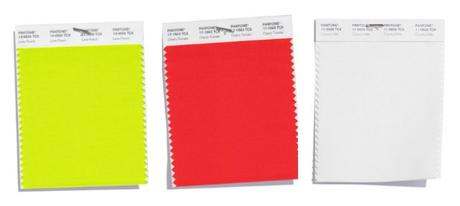
And here is a lovely bold and Zesty palette combination.
If you'd like to find out which of my 18 colour palettes suits you (and knowing this will make choosing colours easier) you can get this as part of my 7 Steps to Style program - a personal colour analysis is just one of the 7 Steps (yes, there is so much more inside). Find out more here.


