Making a website font choice for your site can be tricky business. There's a couple of things you need to know before diving in and selecting a font out of the blue for your website. In fact, a font is tied to many different characteristics of your business; you may not even realise. It's such a small detail that makes a large impact in the digital world of marketing and brand management.
Take a look at the top 5 things we'll go over to help you make a perfect website font choice.
Know your brand
Your Target Audience
Brand Coloring
Pairing fonts for your site
1. Know your brand

Each brand is different, and highlighting those differences is what's going to set you apart from other brands. So maybe you're a tech startup or an advertising agency. Think of all the tech startups and advertising agencies there are. Knowing what your company has that others in your industry don't, is the easiest way to .
We all have those friends that don't know where to go out and eat but don't like any of the options you give. It's bouncing around the topic instead of hitting it on the nose. Rather than them stating which restaurant they want to eat at, they just name all the restaurants they don't want to go to.
This takes much more time and energy and ultimately is most inefficient. If you don't know your brand and its unique brand features, it's just like that friend having difficulty choosing a restaurant, and therefore makes your website font choice that much harder.
2. Your target audience
What's arguably more important than knowing your brand, is knowing who your brand is catered for. Target audience is key because it dictates the decisions you make in regards to your brand, like fonts!
Think about it like this: you're not going to send an beer fest invitation to a child. The same is applied to fonts. If you're looking to cater to a certain group of people, your should reflect those people when choosing a font for your site.
Looking for modern, sophisticated 24 year olds? Try Lato. Catering to the wise and trustworthy financial advisors? Baskerville might be a good choice.
3. Brand Coloring

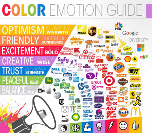
The Logo Company Similar to fonts, brand coloring can really affect the image of your company. Certain colors evoke specific emotions and ideas that can further push home the message you're trying to send to your audience.
Think about the colors you see most with spas. They're soothing colors like green, lavender, or pale blue. Look at a spa's logo the next time you pass a sign, and I'm sure it will have one of those colors incorporated. Search for a feeling you want your branding to evoke, and work from there.
4. Selecting the right size
Just like all good things in life, too much of a good thing doesn't always end well. Think about this in terms of font sizes when choosing a font for your site. If you used a header font size across your whole website, your content would look like it's shouting to its users.
Twelve point fonts are a safe bet for paragraph font sizes. For headings, use your visual judgement. A heading should not take up the whole page, and should only direct users to read that information first, and then guide them to the paragraph text. If your font sizes aren't doing this, it might be time to reevaluation your size choices.
5. Pairing fonts for your site.


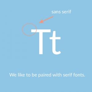
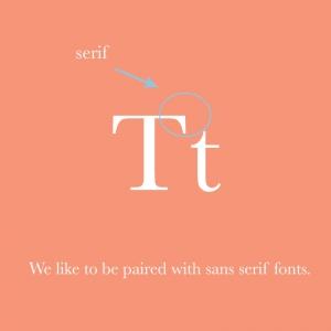
After you've found your chosen font, it's time to find it's matching pair. Of course, this is easier said than done.
To sum it up in a few sentences, serif fonts and sans serif fonts usually pair very well together. If you're not sure where to start then, that's a good place. If you'd like to dodge the challenge and take a faster route, we have a font combination tool by Bold Web Design Adelaide for you that does the trick.
Conclusion: perfecting your website font choice
Your website font choice isn't about understanding the hundreds of thousands of fonts out there, but rather understanding your brand and how you want to convey it.
Author BioThere are only a few fonts that embody the unique characteristics your site brings next to its competitors. It's just a matter of finding a font that has all that. Then, matching it with its best compatible buddy.
A creative jack of all trades, Kelsey Woodbridge from Bold Web Design brings tasteful wit to each article she writes. With experience in the world of design, she understands the struggles of choosing fine details, like fonts, that put the cherry on top.
