Movies posters can be a work of art on their own. Some surprise us, some intrigue us and others downright amaze us. The promotional images for movies like The Girl With the Dragon Tattoo, Ides of March, Lord of War and others become sought after posters for workplaces and homes. Even if you don’t want to set a new standard for movie advertising then there’s plenty of generic designs to fall back on. Then sometimes people just fail at their job. Like these people.
Santa Clause 2/Fred Claus
It was pretty tricky choosing only one of these posters to round out the list since they both manage to take the warm cheer of the Christmas season and turn it into the stuff of nightmares. The first one is especially guilty since it was aiming to capture the essence of the famous Christmas icon rather than some twit stalking us through a tiny door. If the Santa Claus from the first image turns up in my living room I’ll hit him with a shovel.


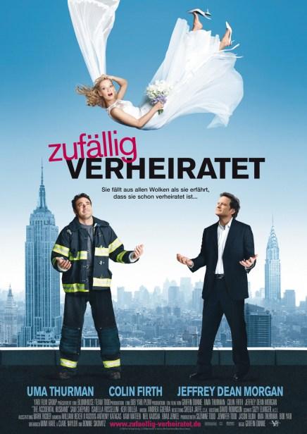
The Accidental Husband
No matter how long I study this image I couldn’t tell you what this movie is supposed to be about. Uma Thurman is dressed like a bride and falling from the sky…there could be a story in that. But then you’ve got these two guys trying to catch her and this is where things get confusing. The automatic assumption is that they are competing over her, but neither of them look as though they give a shit. In fact, neither of them are positioned to actually catch her.
Doom
Yeah, we’ve all played the game and we know what they’re getting at with this picture, but it still looks like a piece of crap.

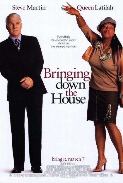
Bringing Down the House
It’s funny because he’s white and she’s black! And that makes him uncomfortable! Actually they both look uncomfortable in this photoshoot. Sure they’ve got a job to do but deep down they both know that they are doing race relations a disservice just by standing there.
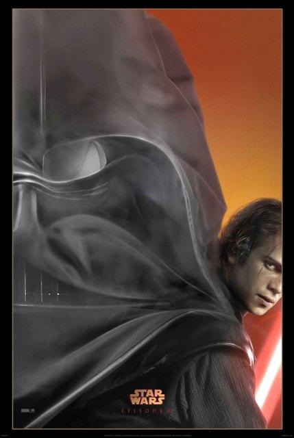
Revenge of the Sith
Oh, this came from deviantart, right? What, it was an official poster? Oh dear…
This is bad. What they set out to achieve – a visual representation of Anakin Skywalker flowing into Darth Vader – isn’t bad for a concept but this is crummy execution. It’s like that scene in Game of Thrones when Melisandre gives birth to a smoke monster, except he’s giving birth out of his ear.
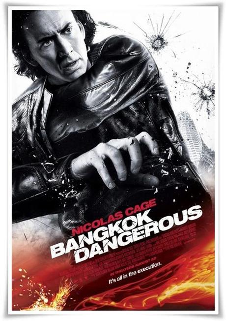
Bangkok Dangerous
Nic…oh, Nic…you could’ve done this list all by yourself. This infamous number is the standout for it’s blatant disregard for logic and rushed photoshop work. Where is his right arm going? There’s clearly nothing under his jacket. There’s something distinctly odd about his left arm as well, like it isn’t attached right. Plus I’m pretty sure he’s supposed to be holding a gun that’s been edited out. Also, what has been hit by the bullets?
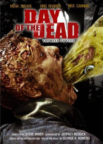
Day of the Dead
Really, that’s what you went with? A zombie projectile vomiting? Who designed this? Who took the photo? Who approved it? So many people who should have looked at it and said ‘nope…not using that’. The eyeball and the ear don’t do anything to help either.
Sex and the City 2
It’s…a cheap sci-fi film? Sarah Jessica Parker and friends drew some unwanted attention for these posters because of the ridiculous amount of airbrushing they received. Someone went to such extreme measure to wipe out their wrinkles with the blur tool they all wound up in the uncanny valley. What little semblance of humanity they once had has been washed out by the harsh backlight, stupid outfit and two inch thick layer of make-up.

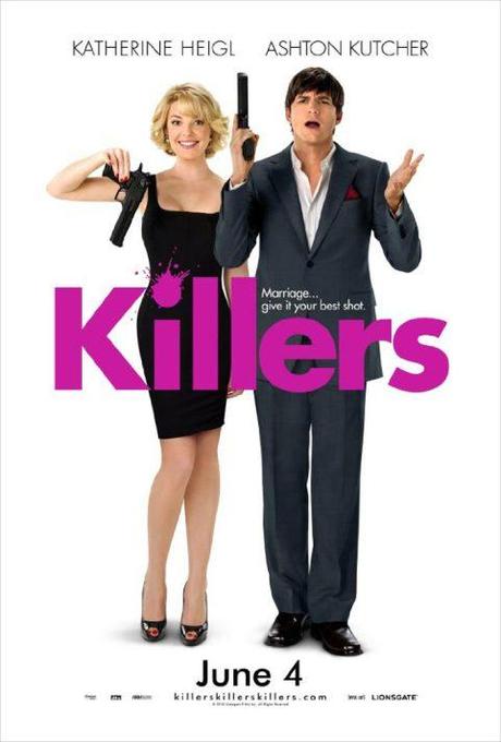
Killers
I’m lucky I didn’t get banned from all the local cinemas while this one was doing the rounds. Every time I saw it I tried to punch the two actors in their mouths. Can you blame me? Putting aside the fact that there’s no indication as to what the movie is about (something about marriage and killing each other?) they could not have chosen worse photos of people – any person. It’s difficult to say who is the worst of the two…Kutcher is going for wacky and clueless buffoon who has never seen a gun before and Heigl has blown a fuse somewhere in her skull. Clearly everyone involved felt that the sheer charisma and star power of the two would be enough. Just seeing it again makes me so…so…
Great, now my screen is broken.
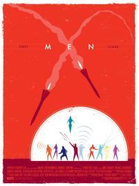
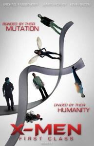
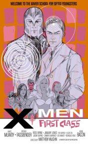
X-Men: First Class
What. The fuck. Is this.
Everyone, everyone, thought that these were the product of fan art when they surfaced on the internet. Imagine our surprise when they started turning up in cinemas and on billboards and it dawned on us that they were the real, professionally created advertising for a multi-million dollar franchise reboot. Obviously this was given to an intern at 5pm on Friday. How it got past the PR department is a mystery, as no-one in their right mind would OK this stupid posters. A pair of cartoony silhouettes with a blurry face floating in their crotch. No.
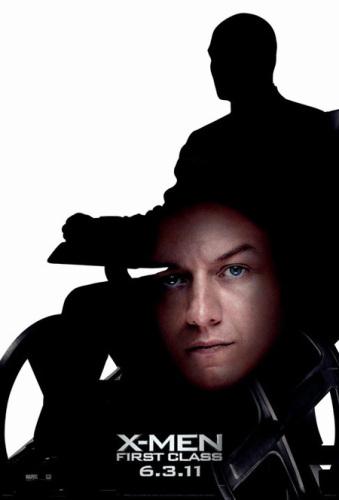
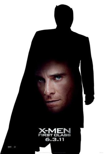
Not only do these look like fan art, but they look like terrible fan art. Next time they’d be better off using the actual fan art. Here’s some cool examples they might’ve gone with instead of floating crotch face:
