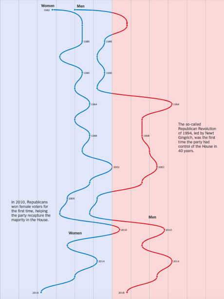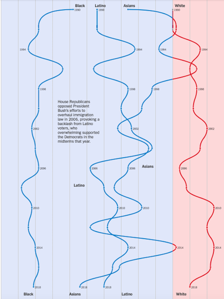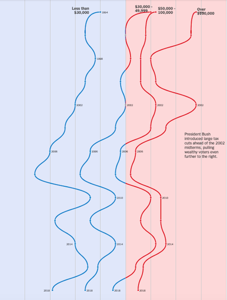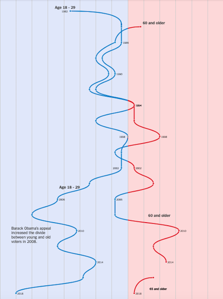


I found these four charts interesting, and thought you might. The charts (from The New York Times) show how different groups of voters have swung between the parties over the years in different elections. The first chart shows the gender swing. The second shows the race/ethnicity swing. The third shows the swing of income groups. And the last shows how young voters versus senior voters have swung.
As a Democrat, these charts give me a lot of hope for the future.

