Destructive Climate Change Has Begun. What Comes Next?
GR: Global average temperature has risen a little more than .8 degrees Celsius since the late 1800’s. Most countries have agreed to hold temperature rise below two degrees. However, the current scientific consensus is that the CO2 and other greenhouse gasses already in the atmosphere will take the global average above 2 degrees. Climate scientists believe that without immediate major cutbacks, global average temperature will rise by 4 degrees, creating what some are calling “hell on earth.” They further warn that with the proposed gradual cutbacks agreed to by most countries, global average temperature will rise by at least 6 degrees this century. No longer just hell on earth, by 2100, 83 years from now, much of the planet will simply be uninhabitable. Between now and then, extreme heatwaves, increased sea level, and massive storms will force hundreds of millions of people to flee their homes. Half of all wildlife species will disappear. Wars over food and water will spread around the world. The first symptoms of what’s coming have already begun appearing.
We can hope that climate scientists are wrong, but what if they aren’t. They base their projections on evidence from weather-station records, annual growth rings in trees, layering in ice cores, and more. Even if the predicted climate changes sound extreme, the predictions are from such reputable sources that prudence requires that we take them seriously. We must take steps to insure we never see hell on earth. We need to make immediate drastic cutbacks in greenhouse gas emissions.
Explaining Climate Change Risks
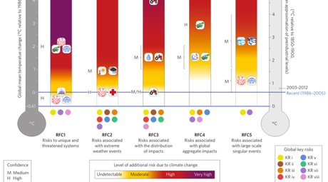
How best to explain climate change. This story will give you ideas on how to use the chart.
“The risks of climate change are not easy to communicate clearly. Since the atmosphere affects everything, everything will be affected by its warming — there’s no single risk, but a wide and varied array of risks, of different severities and scales, affecting different systems, unfolding on different timelines. It’s difficult to convey to a layperson, at least without droning on and on.

In short, panic
“There’s a lot to glean from this graph, but here’s the takeaway: We’ve already crossed over into moderate risk on the first three RFCS. Pushing temperatures up 2 degrees Celsius over preindustrial levels — the target at which the world claims to want to stop warming — puts us at high risk on the first three and moderate risk on the last two. That is the best-case scenario.
“Three degrees over preindustrial levels, where we are very likely headed this century, puts us at high risk across the board, very high for those uniquely threatened systems. Five degrees, which is entirely possible, puts basically every human and ecological system at high to very high risk.
“We are already in danger, there’s more danger to come, and the best we can hope for is to slow and stop the process before the dangers are catastrophic. That’s the shape of things.” –David Roberts (Continue reading: All the risks of climate change, in a single graph – Vox.)

