Coordinating the colors of your in a way that is flattering is an essential part of style. Wearing clothes that are well coordinated will make you look fresh, crisp and extremely fashionable. In order to create color combinations that work, there are a few rules you need to keep in mind.
In order to make sense of color coordination, one does need to become familiar with the color wheel.
The color wheel is a circular structure on which the colors of the rainbow are placed, ranging from warm (red, green, orange, etc.) to cold (blue, green, purple, etc.).
Color coordination is based on understanding the color wheel and knowing how to work with it.
In this sense, one can make a series of color combinations based on a few types of color schemes.
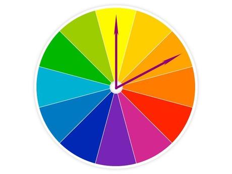
An analog color combination is a mix of colors that lie closely to each other on the color wheel. This type of combination is often found in nature and looks very subtle and elegant. Examples of analog color combinations are red and orange or green and blue. Many people consider that colors that are very close to each other should not be matched. While this may not be correct, there is some truth to it, in that, when you make an analog color combination, for best results, it is important to make sure that the two colors are clearly defined and won't blend too much in each other. For example, a clear orange should be mixed with a clear red.
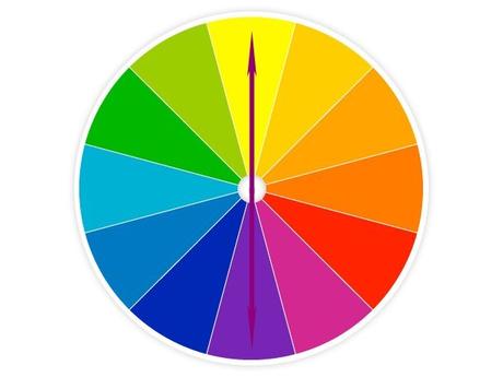
A complementary color mix is based on putting together two colors that are diametrically opposed on the color wheel. This type of color combination is very youthful and dynamic. Wearing something like a purple shirt with a yellow jacket is definitely a bold statement that won't go unnoticed. This type of combination works best during the day and for more unconventional or casual events, it is not very recommended for a more formal setting.

A split complementary color combination features three colors: two analog colors and the complementary color of the color situated between the two. It may sound complicated, but it is quite simple once you get the hang of it. Simply choose two analog colors, then look at the one between them and pick the opposite of that. In case you are using a color wheel that features many shades and colors, pick the one that is right down the middle between the two colors you chose for the analog relation.
Creating a look based on such a combination will send out an impactful, yet toned down vibe and looks really great if you want to make an impression without going to cookie.
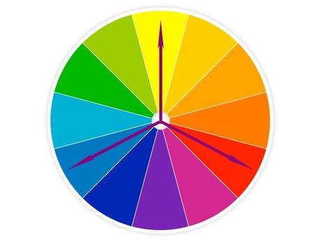
A triad color combination is described by choosing three colors that lie on opposite sides of the color spectrum. Start from a color you want, and then go 120 degrees (1/3 of a circle) and then another 120 from that one. Basically, you can use a Mercedes Benz sign and rotate it on the color wheel: whichever three colors the three arrows indicate will work well together.
This type of combo is suited for parties and other events where you want to stand out and make a loud statement.

A monotone chromatic combination is based on just one color, in different shades. This kind of look is quite hard to pull off, as you need to have a trained eye or a good instinct for shades. Wearing just one color, but in different shades is a very hard thing to pull off, as you need to work only with shades that look good together. If you want contrast, you can go for contrasting shades, but if you mix several shades and want balance, you can choose shades that have the same degree of separation between each other. You can also work just with, say, light shades of that color and place just one accent in a darker color. Once you practice these combinations enough and get good at it, the results will be amazing.
Such a combination basically works almost everywhere.

A monotone achromatic combination is the same as a monotone chromatic combination, just that it is based on neutrals. In fashion, neutral colors are a series of colors that go with anything else. Gray, black, white, brown, khaki, ivory, etc.; all fall in the neutrals category. When creating such a combination, the same rules as in the case of a monotone chromatic mix apply.
This kind of combination is risky, as it may look boring, but, if you have great pieces that feature strong design choices and clear cuts and that fit well, they can look downright amazing.
Colors and skin tone
What is also important to know when combining colors is that not all colors look the same on every skin tone. Often, your hair color matters as well as far as the way a color will look on you; this is the seasons system. Briefly, people with very light skin and dark hair will look best in deep colors such as purple, while people with dark skin and dark hair will be suited by colors like orange or emerald green. Those who have a light hue and light hair will also be complimented by chalky colors like yellow, gray or pale blue, but your undertones often play a big factor as well.
It is always important to try things on and see whether they make you look more "up" or more "down" - it may take a while to get used to the difference, but practice makes perfect.
Getting to mix colors like a pro is not very hard, but it does require some attention and practice. Understanding the basics of color combination and using it for your outfits will make you look better, which will result in you not only looking good, but also feeling great and having a strong attitude, which is what real style is all about.
Fraquoh and Franchomme
Further reading:
Color combinations of clothes that work for any skin tone, hair and eye color Choosing the colors of your clothes according to your skin tone Discovering what colors to wear according to your natural features Choosing the best color of clothes for dark skin tones The complete guide to mixing patterns and printsP.S. We want to hear from you! Which color scheme do you most often go for? Why? Do you change the type of color scheme you do for different settings? Share your feedback, questions or thoughts in the comments below! For more articles on style, fashion tips and cultural insights, you can subscribe to Attire Club via e-mail or follow us on Facebook, Twitter or Instagram!

