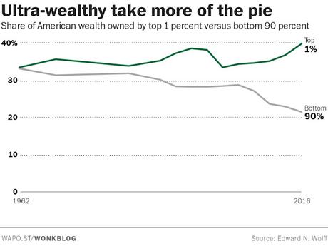
All of these charts are from The Washington Post's Wonkblog. As the top chart shows, the 1% of richest Americans have more wealth than the bottom 90% of Americans. That's an outrageous inequality, and is more than at any time in the last 50 years.
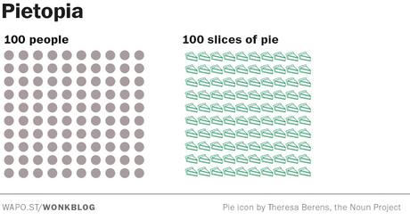
They illustrated the wealth inequality with a series of pie charts. Assuming the U.S. had 100 people and 100 slices of pie, a perfect equality would look like the chart below (with each person having a slice of pie. But we don't live in a perfectly equal country, and most of us wouldn't really want to.
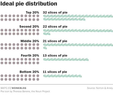
So what is an acceptable distribution of the pie? About 5,500 people were surveyed in 2010, and the distribution they thought was best is the chart below. The richest people would get the most pie, but every quintile would get at least some pie.
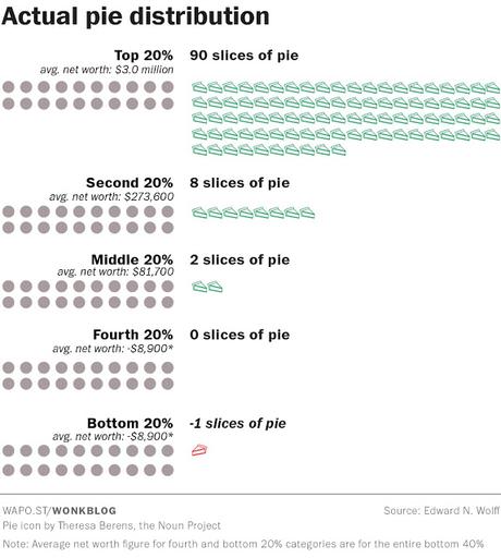
But the reality is far different from what most people would think is fair. As the chart below shows, the top 20% actually gets 90 slices of pie, the second 20% gets 8 slices, the third 20% gets 2 slices, the fourth 20% gets nothing, and the bottom 20% is actually in pie debt (owing a slice of pie).
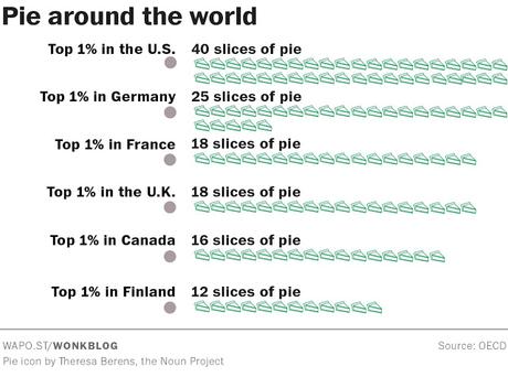
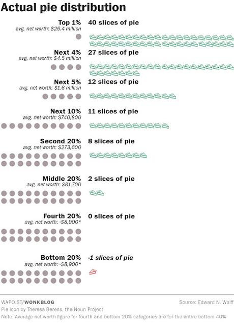
The chart below breaks it down further -- showing the top 1% gets 40 slices of pie, while 67 slices goes to the top 5%, and 79 slices goes to the top 10%. This is not a fair distribution, and sadly, pie is still being redistributed to the richest Americans -- making the inequality worse.
The Republican tax plan would shift even more of those slices of pie to the rich -- making wealth inequality even worse.
Now some might think this is just the way it is in capitalist countries, and to an extent, that is true. But as the chart below shows, the inequality in the United States is worse than that of other Western capitalist countries.
