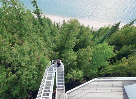
Located on the shore of Lake Michigan, the 1973 Douglas House was one of architect Richard Meier’s first residential commissions. Defined by its verticality, the house features an exterior stepped walkway that extends over the trees, connecting the levels.
Image courtesy of © Dean Kaufman 2011 ALL RIGHTS RESERVED. Project The Douglas House Architect Richard MeierIt took nine months before Michael McCarthy and Marcia Myers fully realized what they’d actually purchased in Harbor Springs, Michigan. “We saw this white house listed on the Internet with a lot of glass looking out at the lake,” says Myers, who, along with her husband, had searched for years for a waterfront property. They scouted lake houses and talked about beachfront property in New Jersey and Delaware. “But we kept going back to the Harbor Springs house,” she recalls. “The price kept going down when prices everywhere else were going up.” So they traveled to Lake Michigan to see it in person.
They knew about the basics of architecture and modernism, but they were only vaguely aware of Richard Meier. All they really knew was how deeply they wanted the house. At 3,200 square feet, it was set among the trees on the steep side of a cliff, commanding views over a turquoise lake and 970 feet of private beach. The 1973 home had issues, but McCarthy, an engineer by training, cataloged them all and used the information to negotiate a lower price. The house had been renovated once before, in 1988, but it was structurally sound. Looking for yet more information before they bought the house, McCarthy decided to contact the three previous owners. That was when he began to discern the home’s pedigree.
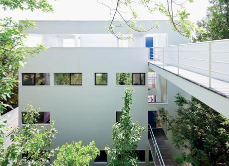
Nestled into the hillside and largely concealed from view, the Douglas House is accessed via a footbridge that leads to the house’s uppermost level. Upon entering, the visitor descends to the lower floors via a winding staircase.
Image courtesy of © Dean Kaufman 2011 ALL RIGHTS RESERVED. Friends started to rave about their purchase. Architects and professors began knocking on their door, requesting tours. “That’s when we realized that what we’d gotten was an American masterpiece,” Myers says. The structure, known as the Douglas House, was conceived in the late 1960s when Jim and Jean Douglas of Grand Rapids reached out to Meier after seeing his 1967 Smith House on a magazine cover. “I wanted a Bauhaus sort of a house, very open,” Jim Douglas recalls. “We didn’t put any parameters on him because architects do their best work when they do it the way they want.”The house was originally planned for a different site located in a development. But when they discussed exterior paint with a homeowners’ association, white was rejected as a color. That didn’t sit well with Meier, or with the Douglases. “[The homeowners’ association] wanted it to be beige,” Douglas recalls. “I got angry.” Client and architect decided against the site. Then the Douglases found a waterfront lot with three sides facing Lake Michigan. “It was very private and completely covered in trees—from the road you could see the lake. No one else could figure out how to build there,” Richard Meier recalls. “It took me quite a while to do it.”
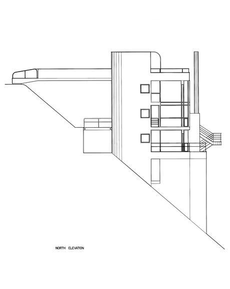
An original plan illustrates the extreme slope of the site.
He began by calling for a series of 16-inch round pilings, telephone poles really, to be pounded deep into sand and shale and fly in succession up the cliff to support the house. Where the entry to the Smith House had been at ground level, here it was via a bridge from road to rooftop. The Smith House is experienced as an ascent; Douglas is about a cascade down. It’s largely experienced inside, where the glass facade meets water views. “The parti is to close down the entry side and open up the water side,” Meier explains. “The whole experience is about opacity to transparency.”It’s a notion explored earlier by the modern masters. “In my generation, everyone was influenced by Aalto and Wright and Corbusier,” Meier says. “[The Douglas House] has a separation of skin and structure, and uses the rooftop as an entranceway, and those things are all Corbusier. I think our work on the Douglas House relates back to modernism—it’s not isolated, but it is part of the continuum. Our work is not created in a vacuum.”
“In the 1960s and 1970s, to almost everyone at Princeton and Cornell [Meier’s alma mater], Le Corbusier was almost the Apostle Paul,” says North Carolina–based architect Frank Harmon, who worked in Meier’s office at the time the Douglas House was constructed. Tod Williams, who was Meier’s project architect for Douglas, agrees: “Richard saw himself as interpreting Le Corbusier. He was making his own mark by looking back at Le Corbusier’s work.”
“It’s about the way you walk in and what you see in a cinematic way,” says architect Henry Smith-Miller, a former Meier employee. “At one moment, it puts you out into the lake, cantilevered out via this great leap of faith. I think because of this that Douglas is probably Richard Meier’s best house.”
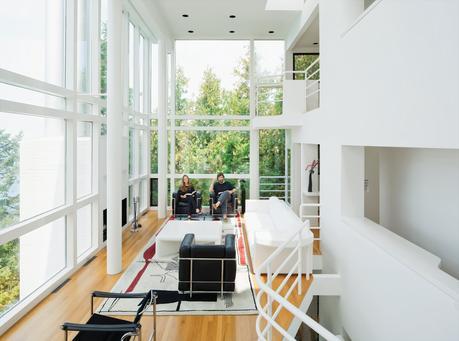
Michael McCarthy and Marcia Myers spent years rehabilitating the Douglas House. The double-height living room features a custom sofa and low table of Meier’s design, and an Edward Fields rug based on a sketch Le Corbusier created in 1956 for a Tokyo theater.
Image courtesy of © Dean Kaufman 2011 ALL RIGHTS RESERVED. But when its newest owners visited it in 2007, they hardly shared Smith-Miller’s impression. “It was obvious that the property had been on the market for years,” McCarthy says. “There were dead bugs, a musty smell, a collapsing ceiling in the kitchen, fogged glass, and a sagging bridge. The steel windows were rusted; the floors had water damage and some buckling.” But the couple was undeterred.Once they’d bought it, they called Meier’s office in New York. The architect suggested that if they intended to modify the building they might consider hiring his firm. “But he said if we were going to restore it, we’d be better off using local engineers,” says McCarthy, who did a bit of both by assembling a team to move forward while at the same time striking up an informal relationship with then Meier employee and Michigan native Michael Trudeau.
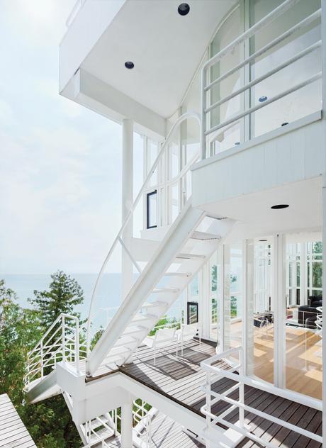
The Douglas House is a clear nod to Les Terrasses, a 1928 residence created by Le Corbusier in Garches, France. Shared elements include curved walls, spatial ambiguities, and the series of ladders and cantilevered staircases that join the levels and encourage a cascading architectural promenade.
Image courtesy of © Dean Kaufman 2011 ALL RIGHTS RESERVED. If the couple had questions, they’d call Trudeau, who’d get answers from Meier. “They’re impeccably cognizant of keeping the original design,” Trudeau says. This went on for four years. The team removed the original steel awning windows, sandblasted and powder-coated each one, then reinstalled them with thermal glass and hardware from the original supplier. They replaced and painted the redwood siding its original “Meier White,” then added a steel backbone to the bridge. HVAC systems were replaced with energy-efficient equipment. They even reupholstered a Meier-designed sofa for the living room.With the renovation now mostly complete, the couple has reached out to state and national preservation organizations about the home’s future. “We had no idea what we were getting into—but this is a keeper,” McCarthy says. “Our role is to restore it and maintain it for America.”
Forty years after its creation, the Douglas House has returned to its original intent—an architectural experience that moves the visitor through an exploration of inside and outside spaces. “The same is true in the Farnsworth House and Fallingwater,” says Meier. “The idea was there from the beginning—it’s about the making of space and how to articulate it.”
For more images of the project, view the slideshow.
Don't miss a word of Dwell! Download our FREE app from iTunes, friend us on Facebook, or follow us on Twitter!
- Log in or register to post comments
