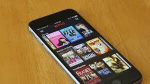
A streaming service differentiates itself from its rivals by offering more than just high-quality material. Enhancing the user experience is a crucial component of the effort to lower churn. The Netflix iPhone app received changes on Monday that included a redesigned user experience with a new billboard layout, card transitions, animation for the opening and profile screens, and more. Here’s we tell The iPhone app from Netflix has been updated with a fluid look.
Netflix For IOS:

“We just improved the graphics, interactions, and motion design in the Netflix iOS app. A Netflix spokesman told TechCrunch that this most recent worldwide update includes features including a new design for advertising what to watch. themed backgrounds for your favorite episodes and movies, new profile animations, and more.
Netflix feels more fluid:
Janum Trivedi, a former product designer for Netflix, tweeted about the upgrade and included a link to a video showcasing the updated app. The app should “feel more fluid, engaging, and refined,” according to Trivedi.
When iPhone users use the Netflix app, a big card of a film or TV show will take up the majority of the screen. This billboard design is used to advertise a suggested movie that is streaming on the site. The parallax effect, which occurs when the wallpaper moves or changes slightly as an iPhone user tilts the device back and forth, is what makes the update exciting. Additionally, a colorful border now encircles the title cards; this color serves as the focal point of the film/TV artwork.
Read more: Review about the Optimal Fitbit Smart Watches
Card transition:
Additionally, it looks that the “Info” tab at the card’s base has been deleted. Users may just click the card to access a different page by doing this.
Previously, the app’s card transition was less seamless. The information part would just slide up when a title was chosen. The new card transition causes the card to enlarge before the content expands to fill the entire screen.
The animation on the profile screen is another intriguing improvement. Users will notice that the profile symbol grows huge as it jumps to the centre, then shrinks to its regular size and bounces to the top-right corner of the page instead of the traditional side-sliding movement that took place when a user switched profiles in the previous app.
The updated Netflix iPhone app should appeal to users since the navigation is more enjoyable and dynamic.
