When analyzing the history of fashion and art, one will discover that each period of time had a specific color palette that was strongly tied to the events of those times and, of course, to the mentalities those events created.
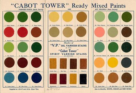
The 1930s were in many ways a decade marked by troubled spirits and agitation, as the great depression took its toll on the lives of many and political disaster started to make their way throughout Europe. The rise of fascism and the American dark blizzards all shaped the way people thought, created and dressed. And, while it can be for sure said that every color was present in every decade of history, there were a few colors, and even more nuanced, shades, that defined the entire visual landscape of the 30s, from clothing to postcards and posters and from buildings to plates and napkins.
The 1930s were marked by color palette that was muted, soft and, above all, dusty. Most of the colors that can be seen in this decade were misty and chalky. Gentle hues of mauve and lavender, as well as shades like seafoam or cornflower were some of the defining visual cues of these times.
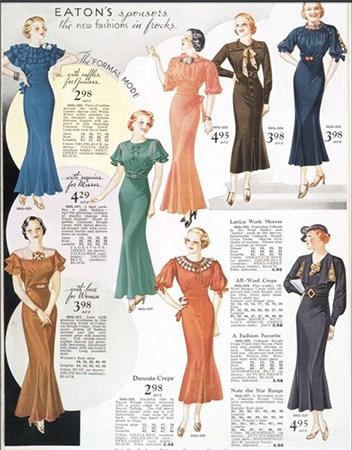
The most popular color of the entire era was purple, with a wide variety of shades being used in clothing and graphic design. From shades like amethyst to orchid and from lilac to eggplant, purple was everywhere.
The fact that these colors were dusty and muted definitely came as a reflection of the atmosphere of the time, which was one of worry and intense seriousness. The colors themselves, which are highly calming colors, were a reaction to everything that was going on. People in those times were looking for peace and tranquility and tried to find it wherever they could. Travel posters in particular featured highly calming colors, with serene shades of purple, teal and orange.
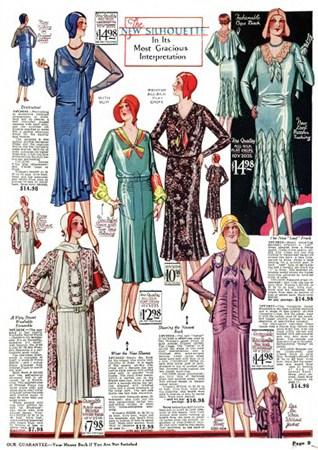
In fashion, this gentle palette was at home especially in women's fashion, of course. Besides purple, seafoam was another widely used color, which sometimes appeared in highly saturated tones, while at other times in very light ones. Unlike purple though, seafoam was very much used in household items, such as curtains or wall paint. The combination of purple and seafoam was also often met, and it can be said that it is a signature combination of the decade.
The 1930s saw a return to extreme femininity (when it came to women's clothing), so it is of no surprise that pink was also a widely spread color. Now, unlike in other decades, pinks were not very much worn by men who stuck with browns and the dark greens that are so characteristic of these times. It was the 30s when "Schiaparelli pink" appeared, which today is simply called "hot pink". This color was used mostly for high fashion garments and only towards the end of the decade it started to gain more popular traction.
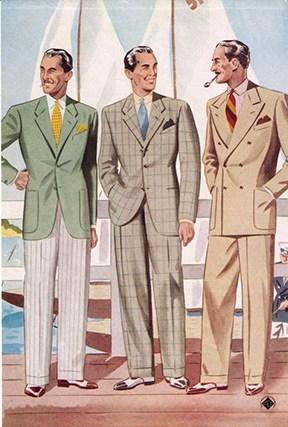
And, speaking of pink, a popular combination that went throughout the 30s was composed of pink and seafoam, but not the strong, fresh, bold, highly saturated pink and seafoam shades we see in the 1950s, but rather in calming tones that were, again, very muted and dusty.
Another popular color combination of the 30s was between gold and bronze. While the 1920s were full of silver, the 1930s were dominated by gold and bronze. This combination was most popular in architecture, but it was also present in elegant clothes and accessories and enjoyed by many. This opulent color mix was continued in shades of pearl, which was both rich and calming and was adopted by those who wanted something softer than bold metallic tones. Blue was also used quite often, but it was a powdered blue, which almost read as gray. Blue was also paired with the other key colors of the decade, but also with beige, which was frequently featured in shades such as flaxen, maize, ecru or even in a honey hue.
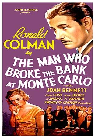
Interestingly enough, during the 30s, many advertisements, especially for children's toys or projects and games were highly saturated and featured really bold colors such as red and yellow. However, the biggest presence in terms of bold colors was orange, especially when it was teamed with white or cream. Orange paired with seafoam, lilac or beige gives out a vibe that is uniquely 30s in style.
The spread of Technicolor brought towards the end of the decade a shift in the color scheme, as emerald became a key player. From the city of Oz to green dresses in cinema, in 1939 green was the new big thing. 1939 also saw the beginning of a new palette consisting of strong blues and pops of red, which would develop over the course of the next decade.
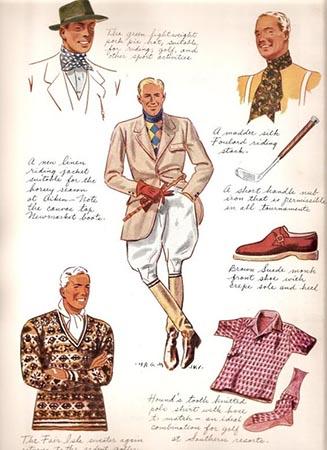
The 1930s were a time of a new propriety. Rules were back and people were keen on them in the hope that playing by the book would lead them out of the troubles of the day. Unlike the 1920s, the 30s were more "classic" and a lot more covered up. Despite this, we owe tanning becoming trendy to the 1930s, as well as palazzo pants (back then known as pajama pants) and cruise collections, which appeared due to those who would travel to the French Riviera during the cold season). The 30s were also the start of the craze of animal prints, as Africa became a strong visual theme and many wore cheetah and other prints.
The designs of the 30s are reinterpreted by many designers even today, who rely on the aesthetic of long, thin shiny dresses, puffy men's pants, subtle prints and color combinations that were characteristic of that decade.
Fraquoh and Franchomme
P.S. We want to hear from you! What do you think of the 1930s aesthetic? Which decade of the 20 th century is your favorite? Why? Share your feedback, questions or thoughts in the comments below! For more articles on style, fashion tips and cultural insights, you can subscribe to Attire Club via e-mail or follow us on Facebook, Twitter or Instagram!

