When London's newest transit line first opened back in May 2022, some of my friends were quick to travel on it and kept asking me why I hadn't used it because, they said, it was marvelous. My reason was not that I was avoiding it, more that I didn't need it. Living in Holloway, North London, my most convenient rail routes into central London are the Victoria and Piccadilly lines and, as I explained, until I needed to travel to the eastern or western extremes, the Elizabeth line was of scant use to me. I am here using a cap E for Elizabeth only, as per other lines on the TfL network, yet I often see it written as 'The Elizabeth Line' which seems a bit much.
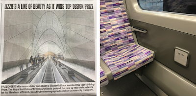
My first experience of was from Stratford to Romford, having reached the former via the Overground line from Highbury and Islington. On that occasion, with my iPhone low on juice I was keen to recharge it and so I walked up and down the carriages scanning the walls and seat backs for charging points, a facility that is easily available on many other train lines including Thameslink and the Overground line, albeit not on the tube lines. But I couldn't find any sockets at all on the Lizzie line. I have subsequently discovered that there are a few USB ports on some of the trains – they can be found under the windows between the pairs of front and back-facing seats, as shown above = four ports per carriage.
A second thing I found disappointing was the color used for the interiors of the carriages, which is shades of gloomy gray. It's not so noticeable when traveling above ground in daylight but after dusk and/or when train goes underground within tunnels, it's gloomy. London is gray grey gray these days – I have often written on here about buildings being painted gray.
Last year, I was near in near Cabot Square, Canary Wharf, when I saw a directional sign to the Elizabeth line so I thought I'd go and check out the station to see what it was like, and to and take a speedy route into town. With hindsight, I should have stayed above ground and walked to the nearest DLR station because it took ages to get anywhere near the trains. I had to navigate corridors, tunnels, stairs and escalators to finally reach a crowded dimly-lit platform where people queued at the door openings waiting for the next train to take them to their destiny (or doom), like living in a dystopian nightmare or being part of an immersive theater production of Orwell's 1984* or Fritz Lang's Metropolis. I couldn't understand why there were so many people using the service at 4pm on a Wednesday afternoon? Did they do this every day?! It was horrible. Once on the train, it was packed with people, and dark and foreboding. I felt like I was being taken to an abattoir. Oh the joy when I escaped at Whitechapel. Phew!
But back to this year's RIBA Stirling Prize where the Elizabeth line is described as "flawless, efficient... beautifully choreographed solution...". Efficient perhaps, but 'flawless'?
Earlier this year, on 17th May 2024, I used the service from Farringdon station, a few days before the line was approaching its 2nd birthday. I'm here using the pics I took on that day to tell the story from street level to the eastbound platform.
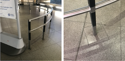
As you enter from Cowcross Street, go through the ticket barriers and take the escalator to your right (not the escalator ahead of you unless you want to get a Thameslink train, the two lines not being interchangeable at lower level). At the bottom of the [correct] escalator you'll see that there is another escalator to the left of you, but a freestanding temporary signboard directs you to the right around a lightweight curved railing.
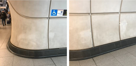
If you look closely at the floor you can see that this curved railing has been installed as an afterthought, probably after they suddenly realised the clash of people on this concourse. Flawless? Efficient? I see poor planning, no forward thinking.
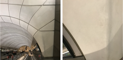
Then, as you approach the second escalator, there are dirty marks on the walls. Why? How? Do passengers (customers/clients/whatever we are these days) reach out and touch this, or is this mess made by maintenance staff?:
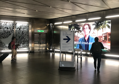
Down into the depths of the beast and, if you are in a hurry or have never been here before, it's hard to ascertain which way to go, left or right, to East or West? All it says is 'Elizabeth Line' in both directions, which is unhelpful to say the least. Certainly not efficient or beautifully choreographed. Only at the far end, beyond the people in this photo, will you finally find the information you seek:
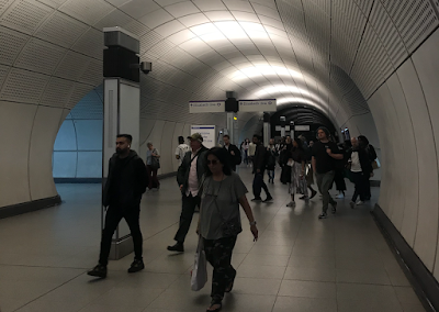
People often tell me I am moaning or complaining. This is not so. I'm all for improving things, making them better. If a job's worth doing it's worth doing well, and all that. I am simply disappointed, especially as, in the case, the creases could have been ironed out before the project was completed. I am simply disappointed. This could have been so much better with a bit of forethought. Signage is key. Especially for the uninitiated, the one-time user, the visitor, the confused soul who has lost his way. But, here, the designers do not seems to have looked at these environments from the viewpoint of a user. Nor have they adequately tested the products used to see how they will fare going forward, never mind how they will be cleaned/maintained, evident by the many dirty, smeary marks along the corridors and platforms that it seems will now be with us until the station gets a complete makeover. Perhaps they'll simply paint it gray.
The walls panels are simply the wrong products for this environment. There are two issues here. First, the surface makes them perfect for holding onto dirt and, secondly, the dirt is therefore difficult to remove for the same reason, hence we see unsuccessful attempts to scrub away the filth by hand.
Note that we are looking at just two years of grime and degradation on a product that should have never made it through all those years of R&D. I mean, jeez... Crossrail, as it was back then, was over ten years in the making, let alone the pre-planning. One would surely assume that they tested many different surfaces to see which would best suited for this situation. Also, what about all these silly undulating curved walls! How did the designers think these would be efficiently and adequately maintained?
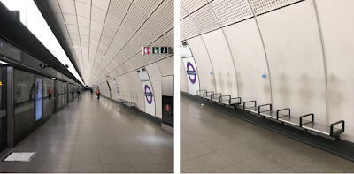
On the platform at Farringdon, you can find examples of ghostly shadows of people who have sat on the seats. I recall when this 'phenomenon' hit the news last year, thinking, 'er, wrong product, stop scrubbing, simply replace the wall panels.
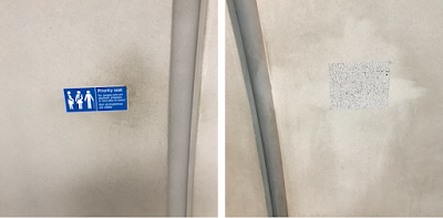
It's clear that they also didn't look into how this surface texture might also be problem in conjunction with their own self-adhesive information signs. Next time you are a platform, look out for strange stone effect patches of varying shapes and sizes that aren't quite the same as the walls, such as the one shown below right. This, I am reliably informed, is their solution to covering up the gluey mess left behind where a sticker has been removed. Efficient? I think not.
In conclusion: Disappointing. Not flawless. Efficient as a train service, but not in the respect of interior design. They should look to the past to see that there is nothing more suitable than ceramic tiles, as within the old Victorian and Edwardian stations.
*This is a reference to a version of 1984 now on at Hackney Town Hall. All I can say is, don't expect too much, because it's disappointing. The word 'immersive' is misleading, the condensed storyline is poorly imparted and the sound and visuals are hard to comprehend. You'll bet to walk up some stairs, put on an armband, walk back down the stairs, strain to see the 'stage' and then "bang!" it's over, please return your badge and armband on the way out. It was nice to see the inside some of the fabulous town hall though.
