At MiaFleur we are always repainting backdrops for photographing our products, and in fact I’m pretty sure one of the rooms in the house is decreasing in size due to the successive layers of paint it’s acquiring, which makes us extremely fussy about quality! So fussy we don’t use cheaper brands because they just don’t work hard enough. The coverage isn’t as good (and time is of the essence) and the colours never seem to come out right. You know how when you look at a paint color card and find the one you like and then when it’s on the wall it really isn’t what you thought it would be? Well that’s what always happens to me when I use a cheaper paint brand – the depth of color isn’t right, the nuances of color aren’t there, the finish isn’t right – so I always go straight for my favorite brands now. They being Little Greene, Farrow & Ball and Paint by Conran. I am sure there are more out there but time being critical I stick to the known and tested ones. Kimberly at Swoonworthy recently reviewed whether Farrow & Ball was worth the money and she too has been converted to the merits of up market paint brands!
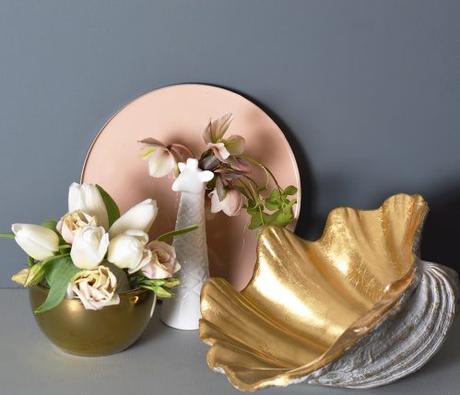
Inchyra Blue by Farrow & Ball
The science of color is not something I’m going to go into here as that’s a whole book’s worth that I do not have the credentials for, but I know what I like! And I very much like the new ‘Inchyra Blue’ from Farrow & Ball for its subtlety and moodiness. If you like the current trend for gray walls but want something with that added touch of excitement and a bit different then this is the color for you.
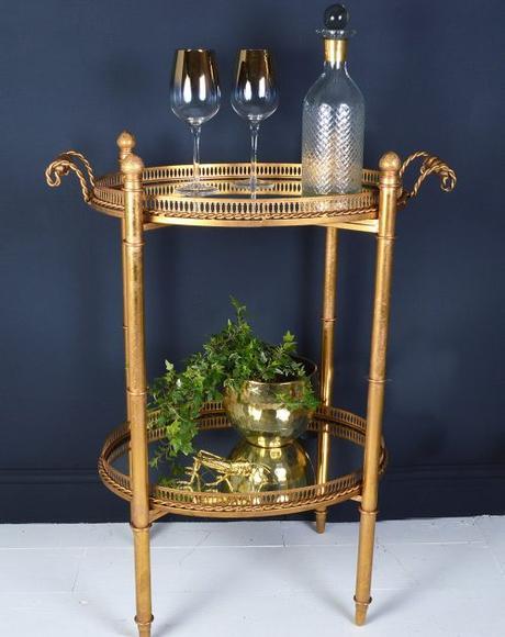
Basalt by Little Greene
‘Basalt’ by Little Greene is a stunner of a color and changes from black to deepest blue depending on the light, and if you’ve a mind to go over the blue side (so to speak) then read Kate Watson Smyth’s blog post on the blue shade card from Little Greene.
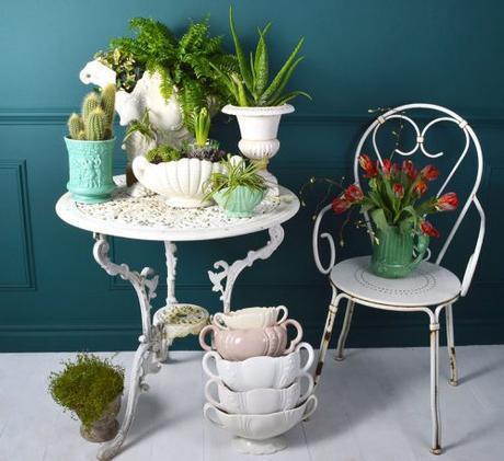
Dark Lovage by Paint by Conran
And while we are on the subject of the dark side then consider green, another hot trend that’s gaining popularity, with good reason for its ability to make everything around it glow. My two favorite greens (at the moment!) are ‘Dark Lovage’ by Paint by Conran and ‘Studio Green’ by Farrow & Ball and we have used both as back drops for photography. ‘Dark Lovage’ is an intense, jewel like color that positively hums with excitement whereas ‘Studio Green’ is a sedate and calming influence. ‘Yeabridge Green’ by Farrow & Ball is a color I am desperate to have on the walls and ceiling of my garden room to create the feeling of a tropical conservatory – but that is for another blog post!
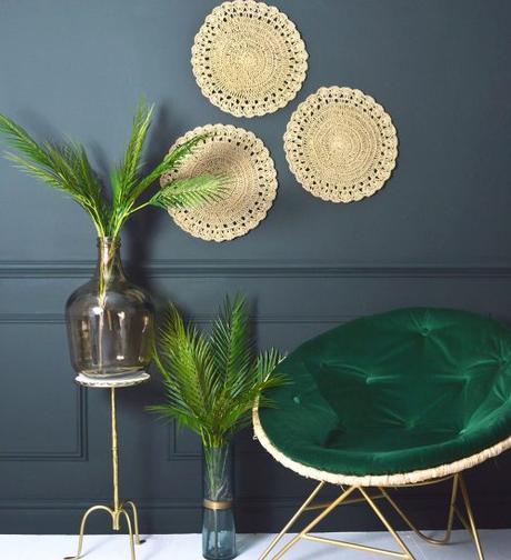
Studio Green by Farrow & Ball
Little Greene and Farrow & Ball’s websites are full of inspiration and advice on color schemes that helps to minimize the mistakes – and inspire – of course, and the Paint by Conran shade card, which is inspired by the color of the British landscape, is curated into complementary color collections that makes it easier to partner colours.
When choosing colours for the photography it has to be a color that enhances furniture and accessories, but doesn’t shout, and all the paint colours I’ve mentioned here have that quality. Next time I will go over to the light side and tell you about some of my favorite pale (but definitely not boring) colours.
Jacqui x
Never miss a post: follow us on Bloglovin’!
Photography: Amelia Brooks/ Styling: Jacqui & Amelia Brooks
