When I was a lad and merely 8 years old, my Dad picked up a camera from a customer in lieu of cash payment. It was a Kodak Retina. That camera and I quickly became inseparable. I photographed EVERYTHING, from my dog, trees, hummingbirds and ants (very blurry though). Like most everyone that starts looking at the world through a lens you become very conscious of your subject matter and then comes color. Oh so wonderful color!

Kodak Retina Camera - I still have it in a box somewhere.
Without color…there is no life. It’s the ethereal element that creates pleasure to our most precious gift…vision. In the world of advertising it is a pivotal element. Color has its emotion… it can be soft, subtle, sweet, dominate, anger, relax, and entice. In our daily lives color is homogenized. More often than not just part of the background we live in. For most people they become conscious of color when they see a beautiful sunrise or sunset filled with different shades of reds, blues, oranges, yellows, grays and sometimes greens.
“I have finally discovered the color of the atmosphere…it is violet.” Claude Monet
In a recent conversation I had on Twitter with a new friend from the Dordogne area in France he added to the Monet quote, “It’s thru violet is what the atmosphere makes. Red-violets in the front and blue-violets for the distances.” Which just goes to show you how artists can be pretty picky & exacting when it comes to color and theory. I can appreciate that.
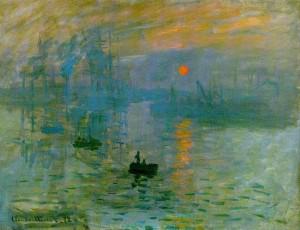
Monet's Painting Impression Sunrise - This is the one that triggered the big movement.
In art, especially paintings you will find the greatest concentration and use of color. No other medium better utilizes the subtleties of color and creates such an amazing amount of shades. Does anyone really know how many shades of yellow are out there?? According to Google…here’s the answer: There are an infinite number of different shades of every colour.
The immeasurable intensity of color and its impact on our lives is most profoundly demonstrated in the world of abstract art. Abstract art depends heavily on two elements, composition and color…color being the predominate force. The colors touch the emotional core within the viewer. Some denote light-hearted tones and others promote perceptual light and space, consolidating the imagery.
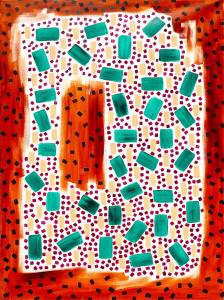
Williams -48”h x 36” w- Oil on Canvas - Rod Jones Artist
Abstract art is perhaps the most generous when it comes to defining color. A painting in the Impressionistic style uses a masterful array of colors which helps the viewer understand the composition. The colors hold the image together. Not so with an abstract painting…colors may float like those found in color field paintings. You are first drawn to the painting almost purely by the predominate colors. Then you start the process of immersion. Your mind may embrace or reject the various elements but at some point your emotions take over and the painting starts a dialogue with the viewer. At first quite surfacy and then mutates to prolific thoughts.
Visual energy & the senses…It’s no secret that I am completely smitten with abstract art. From it’s earliest evolution in the late 1800′s all the way up to early 1980′s, I have been fascinated by the hidden meanings trapped within the paintings of artists like Kandinsky. Who probably more than anyone artist delved into the psychological and spiritual aspects of this dynamic style of painting. There have been numerous styles and iterations along the way and some of these greats managed to carve out a consistent look that they became known for.
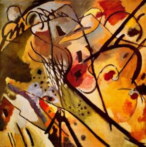
Wassily Kandinsky-Improvisation
Painted with skill and sensitivity that creates visual tension and visual force are some of my favorite artist’s Rothko, Barnett Newman, Hans Hoffman, Helen Frankenthaler and Morris Louis. Their styles are relatively simple but they had a profound sense when it came to the use of color.
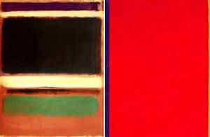
Rothko-Newman - side by side
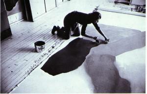
Helen Frankenthaler Painting in Her 83rd Street Studio, 1969
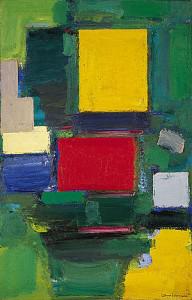
Hans Hofmann -The Gate
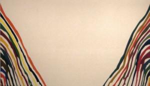
Morris Louis
Take the time to reintroduce yourself to color. There is certainly no shortage, and it changes every second of every day…even in the darkest night there are monochromatic colors…blacks, blues, whites, etc. Color isn’t just in sunrises & sunsets… it’s in your hair, it’s the beautiful color of his or her eyes that you were attracted to, it is the first thing you see when you look at your plate of food, try buying a car without thinking about the color. It enhances all elements of your life and for me it makes up the palette that every abstract artist embraces. Giving way to an emotional voyage that is without end.
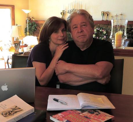
Blog Writing-This is where I write my blogs with my wife & muse Angelica by my side making sure that it all makes sense.

